
Duration
~90 hours across 5 days
My role:
UI/UX designer and researcher, illustrator
Tools
Visual Studio Code
Figma
Adobe Illustrator
Procreate
Miro
Prompt
(Provided by the hackathon)
"Create an entertaining, engaging, and accessible application which generates a sensory experience for users and aids in CHAS’s mission in creating a ‘moment of joy’ for children and young people referred to CHAS.
CHAS supports a wide range of children and young people, with a diverse set of needs, including hearing or visual impairment, developmental delay and learning needs, fine-motor control challenges and mobility limitations, with one application unlikely to be suitable for all. Bake in accessibility from the start."
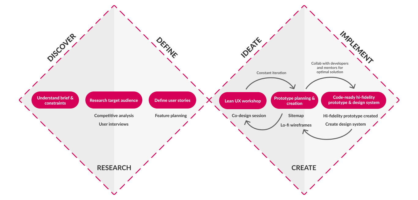
1. Understand
. . . the prompt
There is no one-size fits all solution when creating an accessible product. We had to define our target user and build our solution aligned to their needs.
Our goal was to innovate on existing accessibility technologies by introducing something new that would enhance our user's experience.
. . . the constraints
Time: We had approximately 90 hours to research and create the entire product.
Manpower: Our team was cut down from 9 members to 4 members over the first two days. We had significantly less people to do what we wanted, thus we had to streamline our idea.
Research: We didn't get to directly gain data from the target demographic. While completely understandable why this happened, our solution would have benefitted from tailored research from the actual users. The risk of assumptions and generalisations were high.
Plan:
Day 1: Research technologies and user base, brainstorm ideas as a team
Day 2: Decide on main idea, direction, and features. Do foundational UI/UX work (sitemaps, low-fi wireframes, high-fi prototypes)
Day 3: Code. Illustrate or design graphical assets
Day 4: Code
Day 5: Turn in project. Practice presentation for demo that night
What actually happened:
Day 1: Research technologies and brainstorm ideas individually
Day 2: Discuss possible ideas, direction, and features. Lost 5 members of team.
Day 3: Decide on main idea, direction, and features. Research. Do foundational UI/UX work (sitemaps, low-fi wireframes, high-fi prototypes). Code. Illustrate graphical assets
Day 4: Illustrate graphical assets. Code.
Day 5: Turn in project. Finish presentation, did not get to practice before demo.
2. Research
Competitive analysis:
Our analysis of over two dozen existing games and apps for disabled children showed a lack of diversity of accessibility technologies and oversimplified game design.
Key insights:
- Many existing products assumed users had reliable coordination with their hands/body to interact with product
- Products often came with proprietary hardware or toys. Decreases accessibility due to cost for involvement
Takeaway:
- Utilise technologies that overcomes motor issues
- Product must be fun, but easy to learn and follow along
3. Ideate
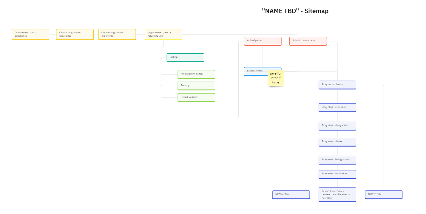
Sitemap:
Working off of my teammates existing low-fi wireframe, I had the team take a step back and work collaboratively on the sitemap to really nail down the flow between pages without worrying about the UI on each page yet.
While we discussed its creation collaboratively, I created this diagram to clearly define the page hierarchy
Purpose: to ensure the site architecture was logical and we included everything we wanted to.
Diagram by me.
Made in Miro.
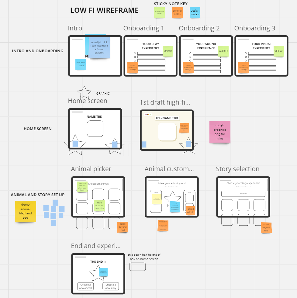
Low-fidelity wireframe:
After creating the sitemap, a new low-fi wireframe was created from that.
Notes/ideas through sticky notes and symbols were used to communicate with developers asynchronously.
While we discussed features and layouts collaboratively, I made the decisions on UI layout and screen order
Purpose: all the planning for page layout, component design, interactions and animations on screen. Focus on implementation as plan was cemented.
Diagram by me.
Made in Miro.
4. Design
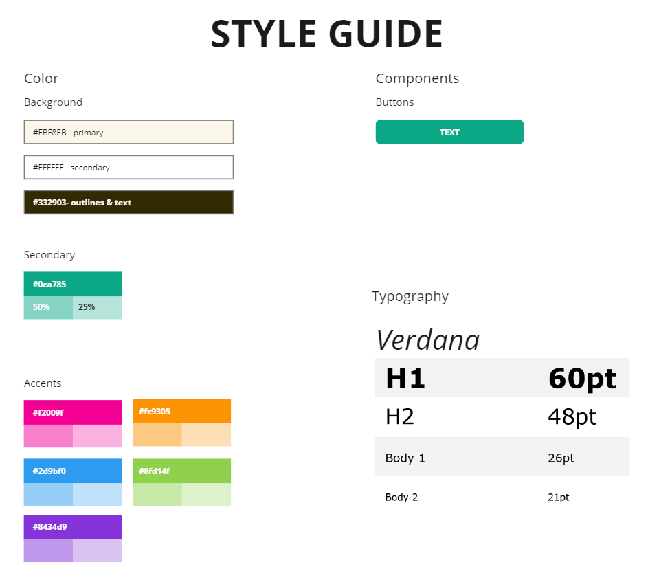
Style guide:
Purpose: To streamline implementation for our front end developers. They could easily reference the general design decisions without needing to double check every element on the high-fi prototype.
All colors, components, and assets compliant with Web Content Accessibility Guidelines (WCAG).
Verdana was used as research showed it's one of the most accessible fonts.
Diagram by me.
Visual assets:
Process: Paper or Procreate sketch → Adobe Illustrator
Illustrations made with the goal to inspire feelings of friendliness, approachability, cuteness, and fun.
Illustrations drawn by me.
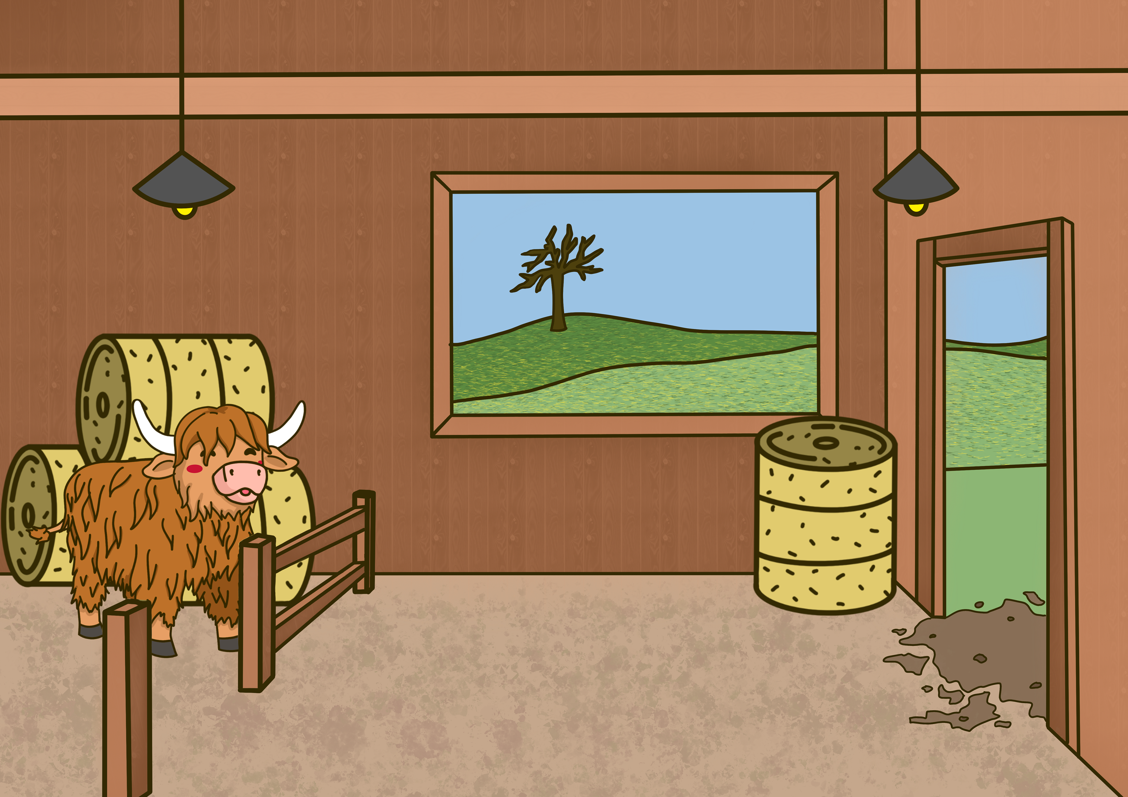
Example 1 of a page from the storybook
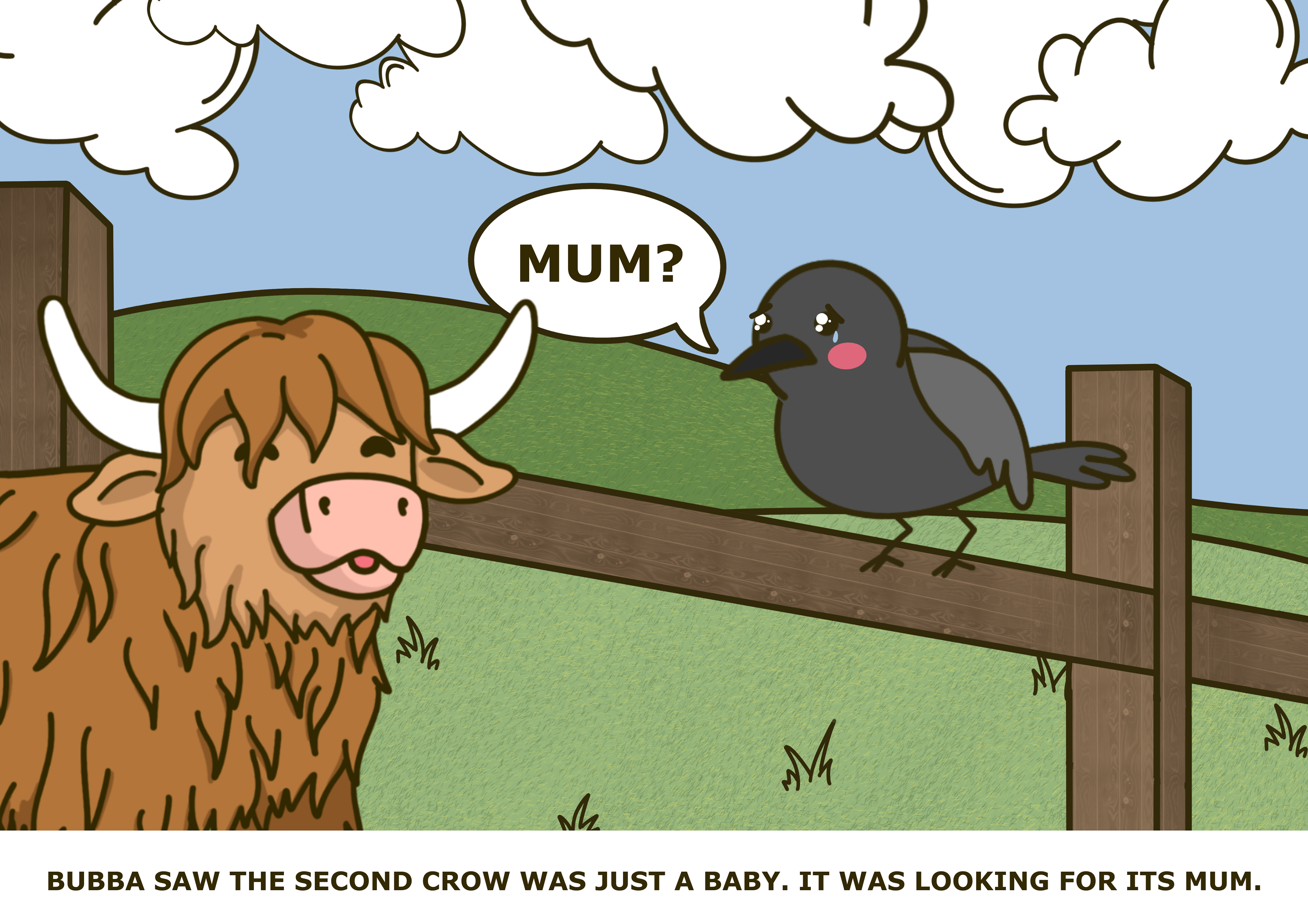
Example 2 of a page from the storybook
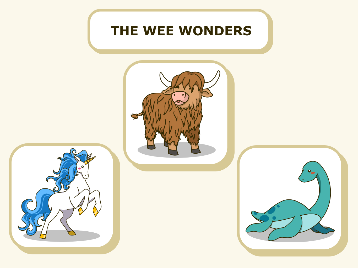
Player characters in the app
5. Code
Click here to view the team's code: https://github.com/nkdem/ms-group-5-hackathon
*Code written by my other team members*
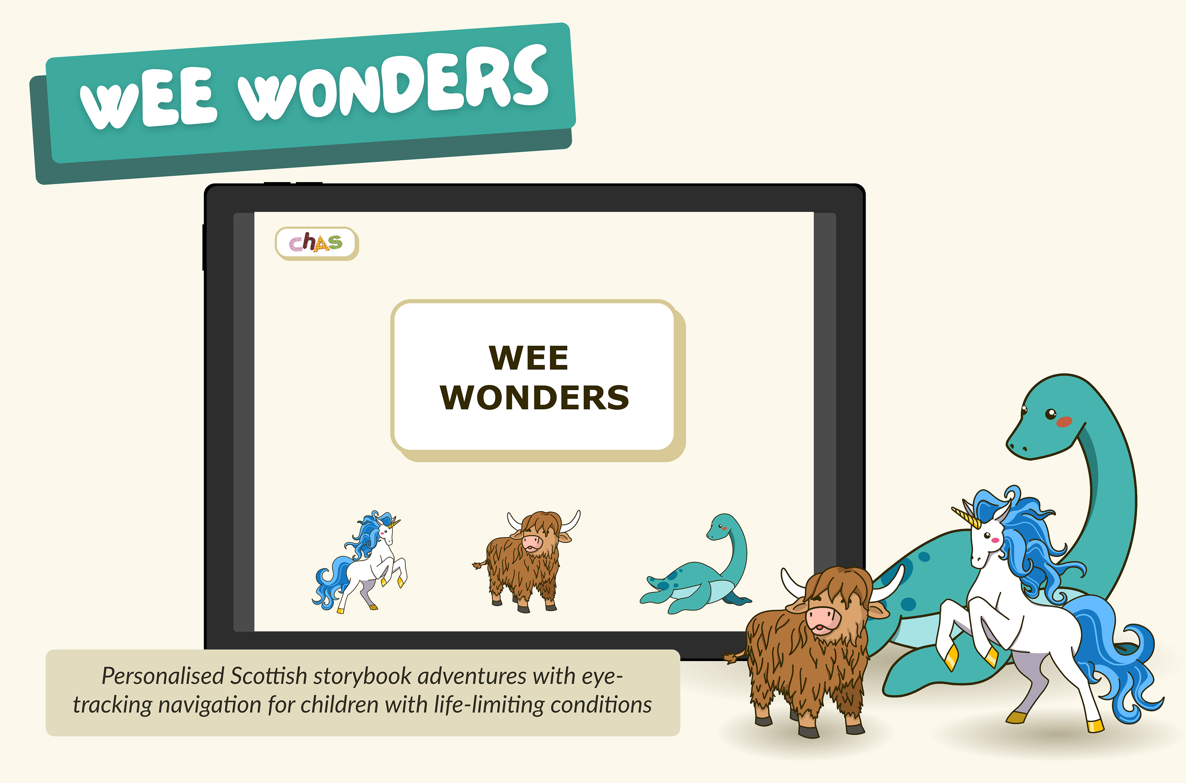
Final deliverable:
Reflection:
I learned:
- Working closely with developers, such as how to collaborate and communicate my designs to them
- Effective prioritisation of features under high stress and pressure
- Maintaining team morale
- Optimising each person's individual strengths and capabilities, and
- Knowing when to make hard decisions that ultimately steer the team towards success.
If we had more time:
1. Improve the visuals through additional character customisations, more storybooks, more detailed illustrations, and animations.
2. Next, further research into other accessibility needs, such as cognitive disabilities, and how to design solutions in our product for that.
3. And lastly, implementation with CHAS's TacPac toys to give a physical sensory experience outside of the iPad.
We were extremely ambitious. However, we had a clear idea of what our product was and its identity, and we held firm to that. We adapted well to roadblocks we encountered and grew together as a team that communicated and worked together well.
By learning to prioritise tasks and features, and delegating work to who has the best skillset for it, we achieved a successful final product that secured us the win.