Duration
8 weeks
Tools
Adobe Illustrator
Adobe Photoshop
Procreate
Project brief
Our goal was to create a visually interesting, fun, and playful poster design for an event of our choice. From there, the design of the event merchandise would be based off of the poster.
The event itself must be driven by a unique name and the illustrations must have a strong, flat graphic look.
1. Understand
. . . the brief
To understand merchandise design, I researched existing events on how they advertised and created their merchandise.
We were free to pick the merchandise we created. So I researched the statistics from events and shops about what kind of fandom memorabilia sells the most.
What I discovered:
- Good designs that are: lowkey and have minimal branding are always bestsellers
- The most popular kinds of event merchandise are t-shirts, cups and mugs, tote bags, and posters.
. . . the constraints
Time and ambition:
I only had 3 weeks for the project and I wanted to create 6 merchandise designs, in addition to a highly illustrative poster.
Hardware limitations: For the kind of event and visual style I wanted to achieve, I found it very difficult to source software that allowed me to create pixel art easily and efficiently.
So, I created 3 different sized pixel brushes in Procreate to create the illustrations for the graphics.
2. Ideate
Sketches:
I created over a dozen pages of thumbnail sketches to work out the event logo and poster design. Some of which are pictured here.
This process helps me flex my creativity and easily compare what ideas are working and what isn't quickly.
Event name: Pixel Quest
Event company: JACK BOX
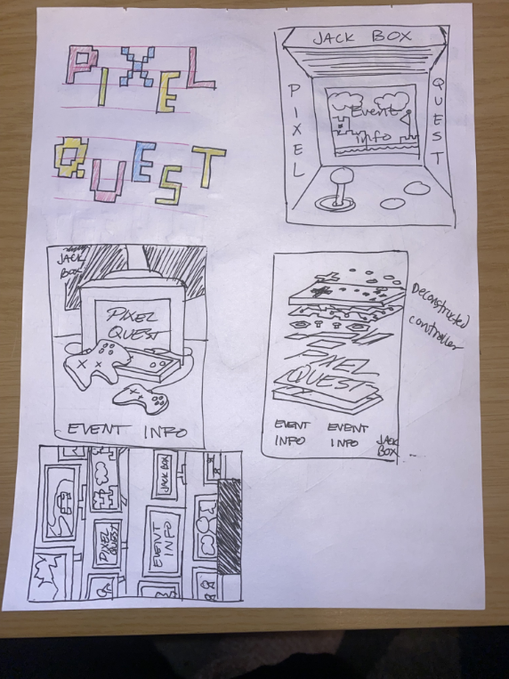
Poster sketches
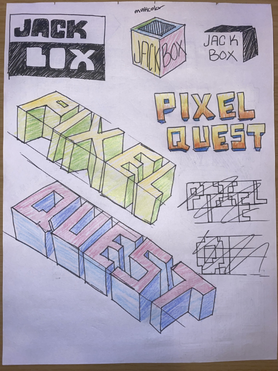
Event logo sketches
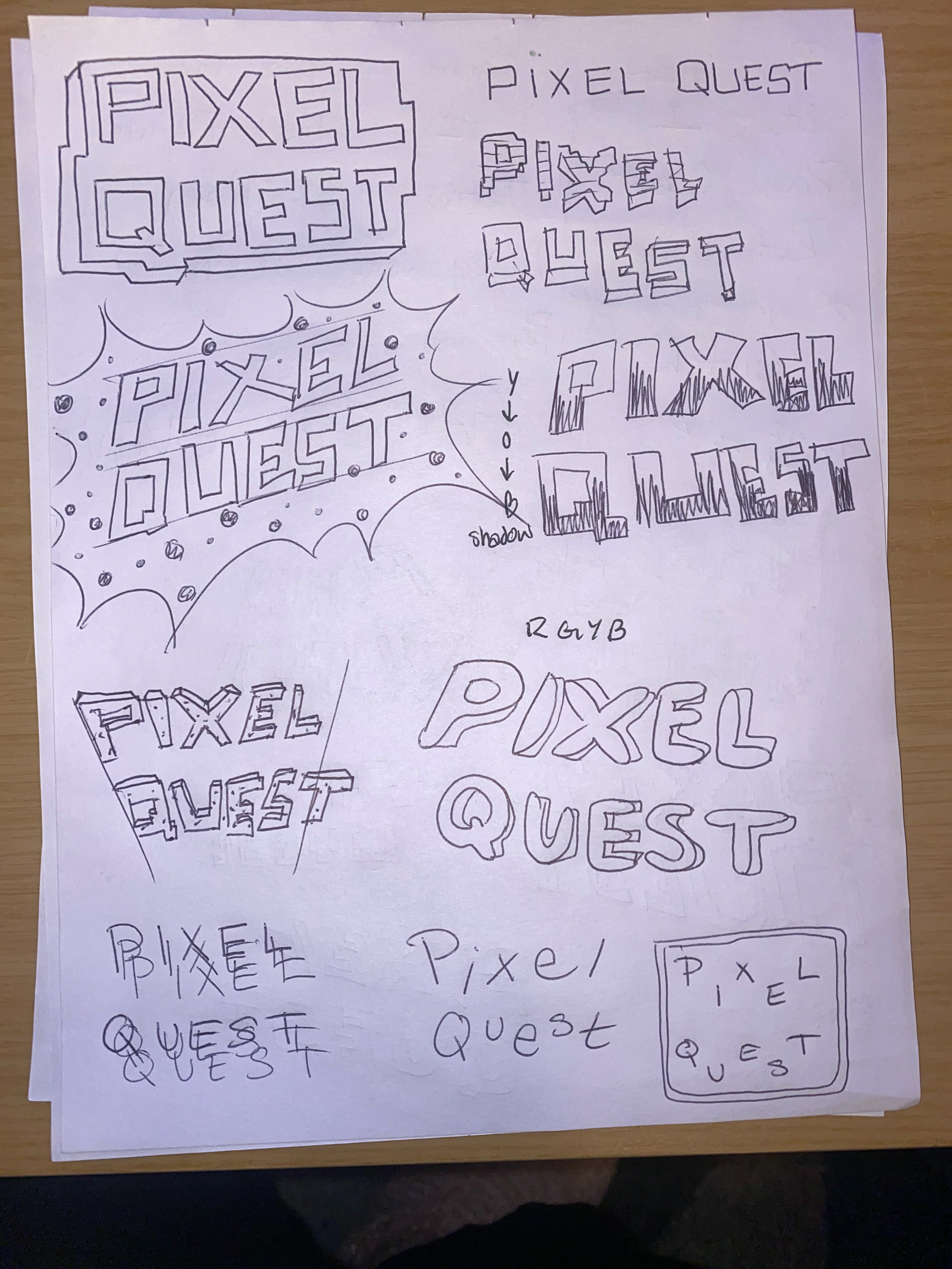
Event logo sketches
Illustrations and graphics:
Created with Procreate, Adobe Illustrator, and Photoshop
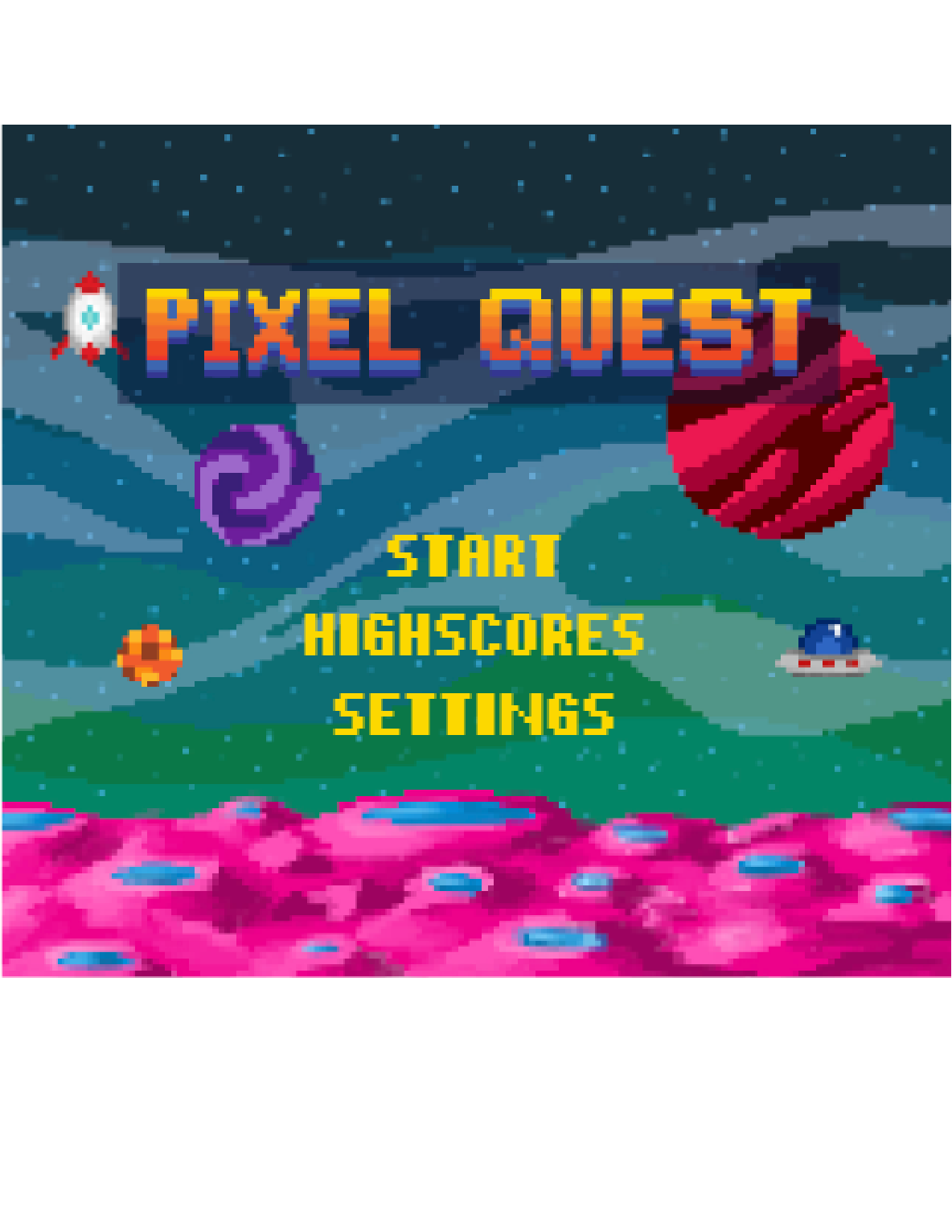
Made in Photoshop
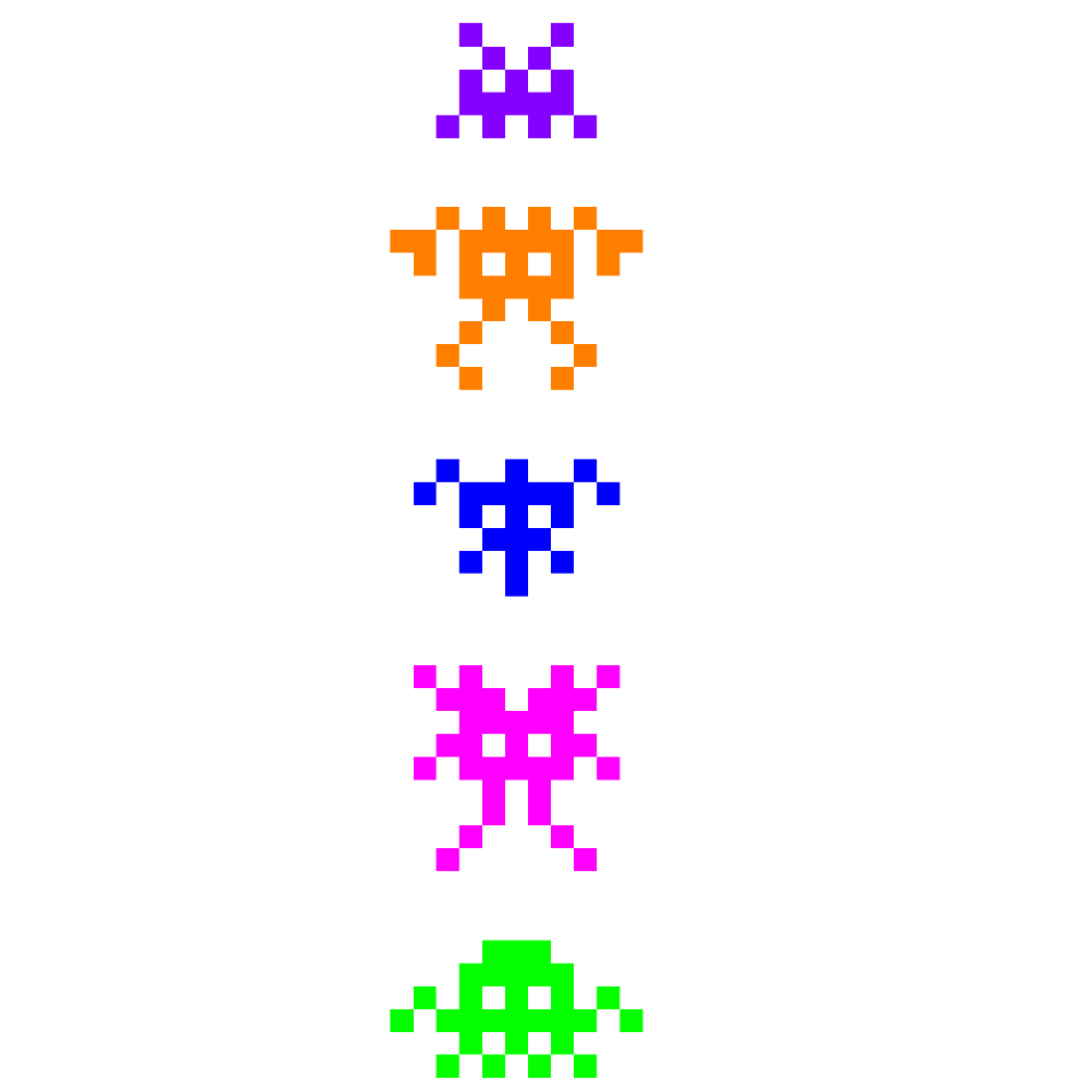
Made in Procreate
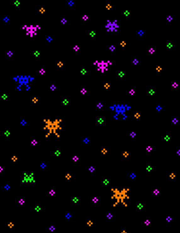
Made in Procreate
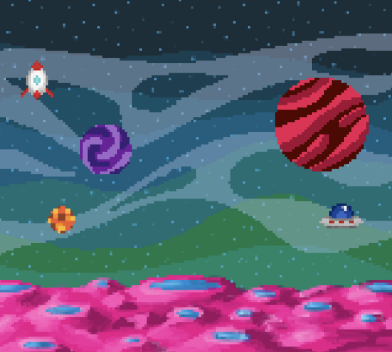
Made in Procreate

Made in Adobe Illustrator
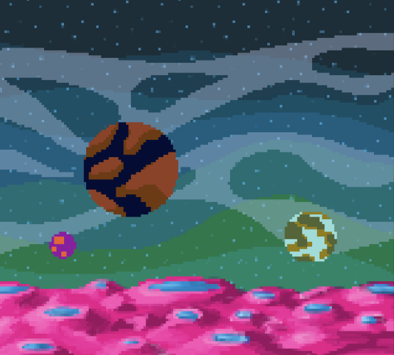
Made in Procreate
3. Design
Rough draft for feedback:
Partway through my design process, I submitted my poster designs onto my school and other online forums to obtain feedback.
Feedback:
- Colors and layout are great so far
- Logos are on brand, eye-catching, and fun
- Concerns about legibility of informative text
Final Deliverables:
Reflection:
I learned:
- Pixel art, creating custom brushes, and gained a better understanding of Adobe Illustrator
- Experimentation to create fun, yet event-related designs for different merchandise
- Capturing public's attention and text readability for large event posters
What I would change:
- Improve readability of the information by adjusting font style, size, and color
