
Watch the 20s app showreel below!
Duration
Primary research and app development: 3.5 months
My role:
UI/UX designer and researcher
Tools
Figma
Miro
Microsoft Excel (Data collection)
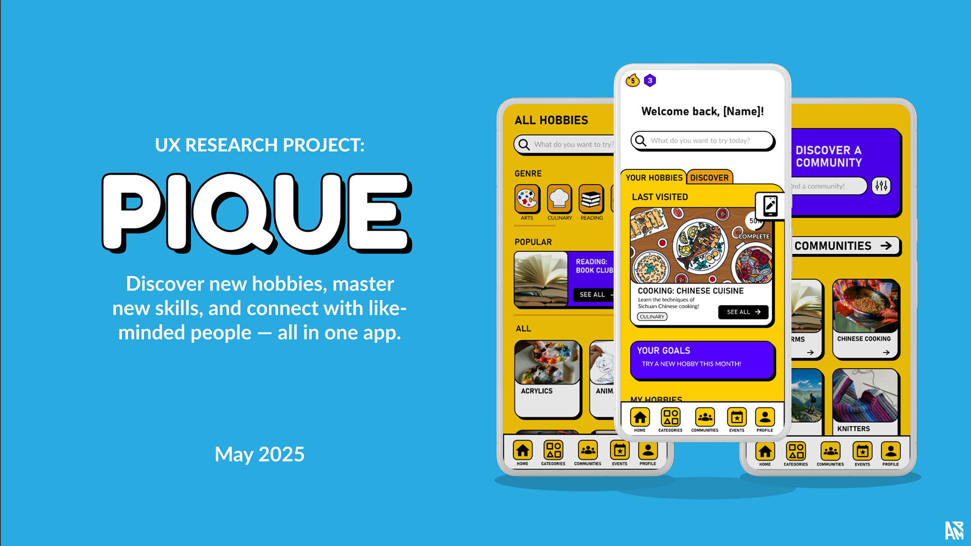
Summary:
Brief:
Senior university project
"Investigate into a topic of interest in your field (UX) and conduct an independent research study to answer your chosen research question. Apply knowledge from literature and theory, conduct primary research, and critically evaluate data to develop findings.
Develop a non-trivial deliverable relating to the research."
Project details:
- Aim: To investigate whether best practices in inclusive and persuasive design are still relevant to Gen Z and Millennials, and to develop an optimised prototype modelling a real-time, adaptive user interface (AUI) to evaluate its suitability in improving accessibility.
- Deliverable: Figma prototype
Key Findings:
- User-driven adaptive user interfaces (AUI) with explicit user confirmation is the best approach for utilising LLM-powered adaptive interfaces
- Events being the favourite feature with 88% of users highlighted how digital products can transcend the experience, creating real, positive impact on users' lives
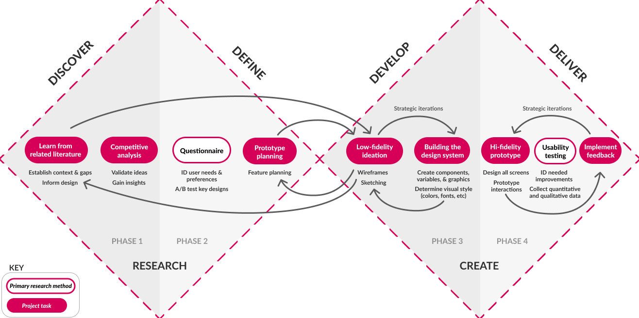
1. Understand
. . . the prompt
The brief gave freedom to explore any topic we wanted. As it has been my interest throughout university, I focused on accessibility and new assistive technologies.
My research covered:
- How to make e-learning experiences more motivating and engaging for Gen Z and Millennials
- Evaluating if current industry-standard guidelines for accessibility and persuasive design are still optimal for Gen Z & Millennials
- If LLM technologies like generative UI (GenUI) or AUIT can make accessibility adjustments more convenient for Gen Z & Millennials
. . . the constraints
Time: Supervisors were not allocated till January, with the dissertation due in May. Work could not properly start without a supervisor.
This restricted the development timeline from 8 months to 3.5 months.
Technical feasibility: Due to being on the Figma student plan, not all prototyping features were available (limited to 4 variable modes) to fully realise the complex interactions planned for the prototype.
Plan:
January: Create low-fidelity wireframe, run the questionnaire
February: Analyse questionnaire data. Create high-fidelity prototype
March: Usability testing (3 weeks). Analyse data. Implement changes based off testing
April: Finish writing dissertation
What actually happened:*
January: Re-vamped the primary research plan. Ran questionnaire
February: Created low-fidelity wireframe, then high-fidelity prototype. Analysed questionnaire data
March: Usability testing (2 weeks). Analyse data.
April: Implement changes based off testing. Finish writing dissertation
*schedule changed because revision of primary research plan & insights from data collection impacted development
2. Research
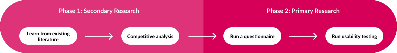
PHASE 1: SECONDARY RESEARCH
Literature Review:
This project identified a gap in accessibility research for Gen Z and Millennial mobile app users.
Key insights:
- There's a significant research gap in accessible mobile e-learning design for Gen Z and Millennials.
- Gamification and competitive elements dominate academic persuasive design strategies, but their relevance for younger users needs further exploration.
Takeaway:
- These insights collated into 12 design guidelines which were tested with the target audience through the prototype
- The literature provides a strong foundation, but gaps remain in target users' accessibility needs and learning motivations.
Competitive Analysis Takeaways:
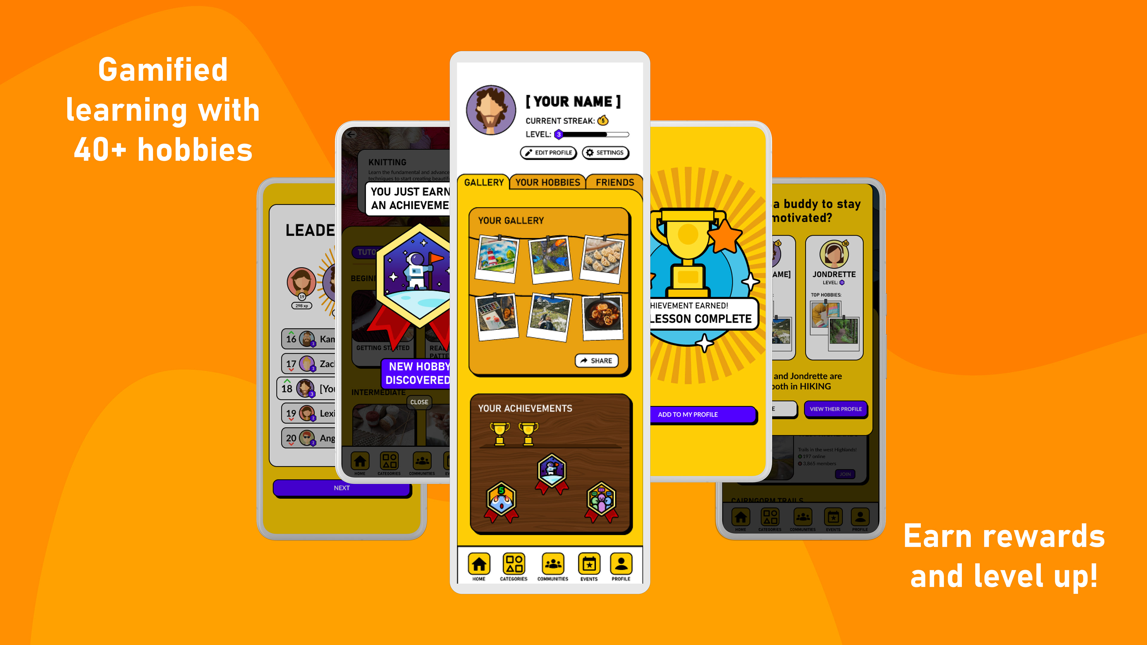
Duolingo app: Its simple, gamified learning structure inspired the lesson flow and motivational features in the prototype
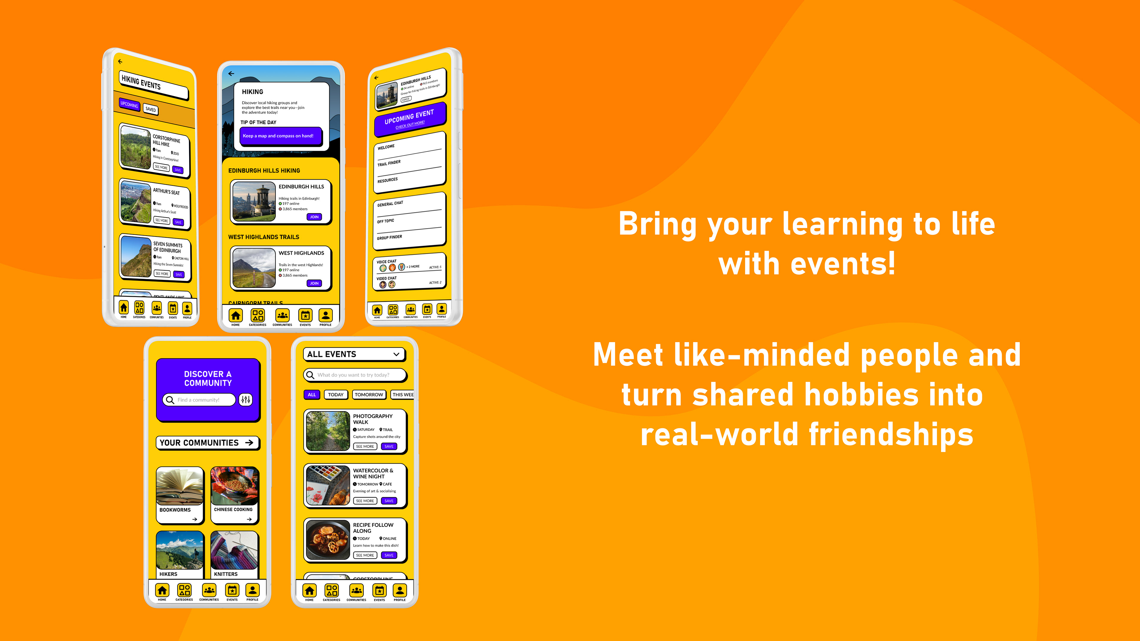
Meetup app: Its community and event discovery features shaped the design of the ‘Discover’ page, focusing on intuitive navigation and real-world connection.
PHASE 2: PRIMARY RESEARCH
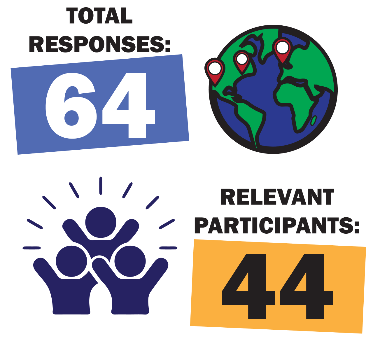
Questionnaire:
- Collected exploratory data to close the knowledge gaps from literature
- A/B tested UI designs and custom iconography
Research output:
- Graphs (pie charts and bar charts)
- Correlation analysis
Takeaways:
- Allowed for correlation data analysis to further research
- Identified users' motivations, needs, and pain points with online learning
- Popular vote determined the UI design for key screens, and iconography used
- Curated a list of future usability testing participants
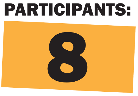
Usability Testing:
Conducted moderated usability testing with a short follow-up interview to evaluate the prototype's accessibility, intuitiveness of the design, and relevance of features
Output:
- Affinity diagram
- Usability testing report
Takeaways:
- The favourite feature: In-person events
- UI customisations made users feel in-control and supported
- Learning can act as a catalyst for connections
- Gamification drive user engagement, for some
3. Ideate
Low-fidelity sketches:
Sketches were made to quickly visualise and iterate on ideas before committing to more finalised, digital designs
Purpose: to explore ideas, then combined the best elements into a digital wireframe.
Some of the sketches are pictured to the right.
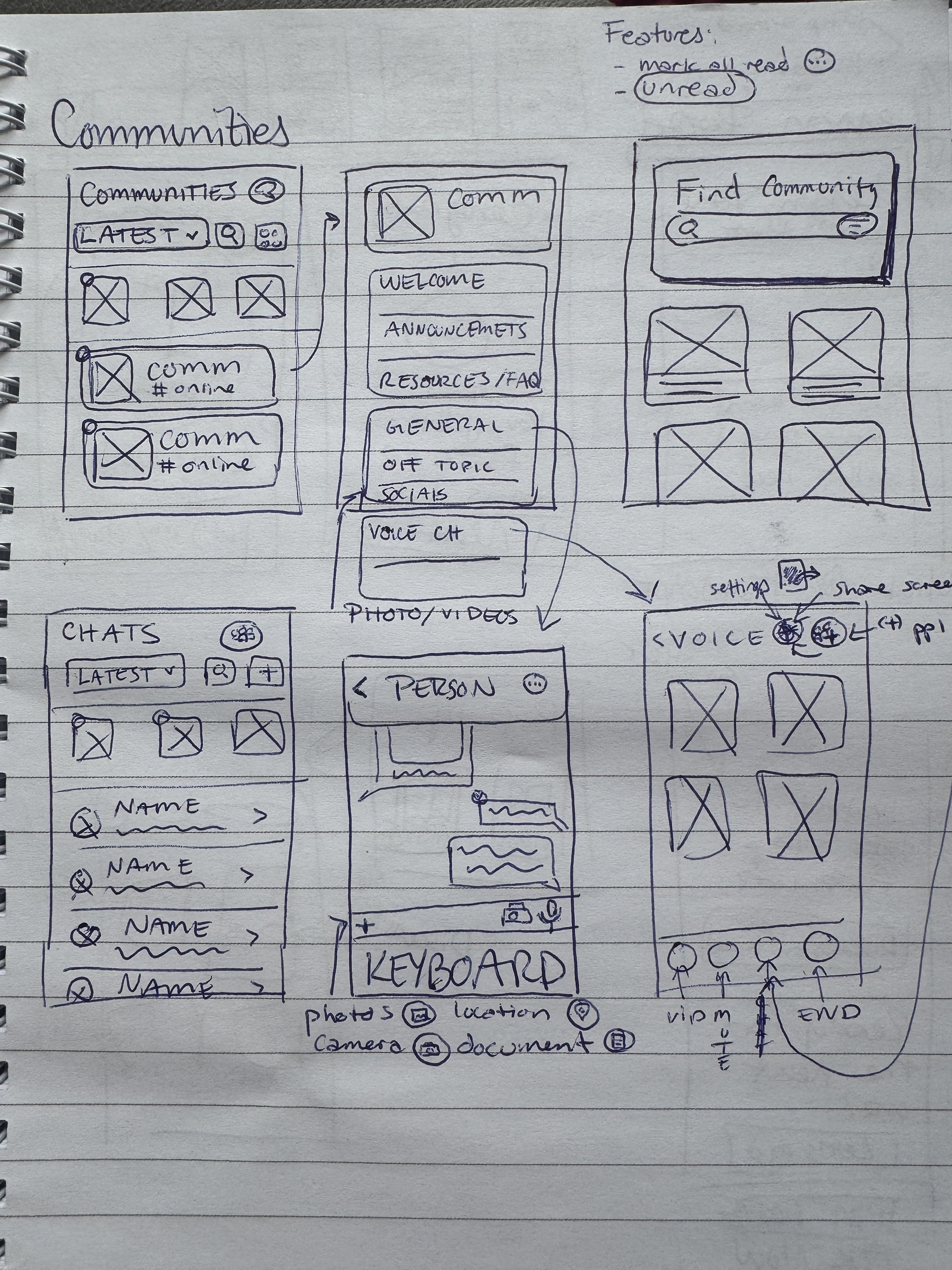
Brainstorming UI designs for the main 'communities' page
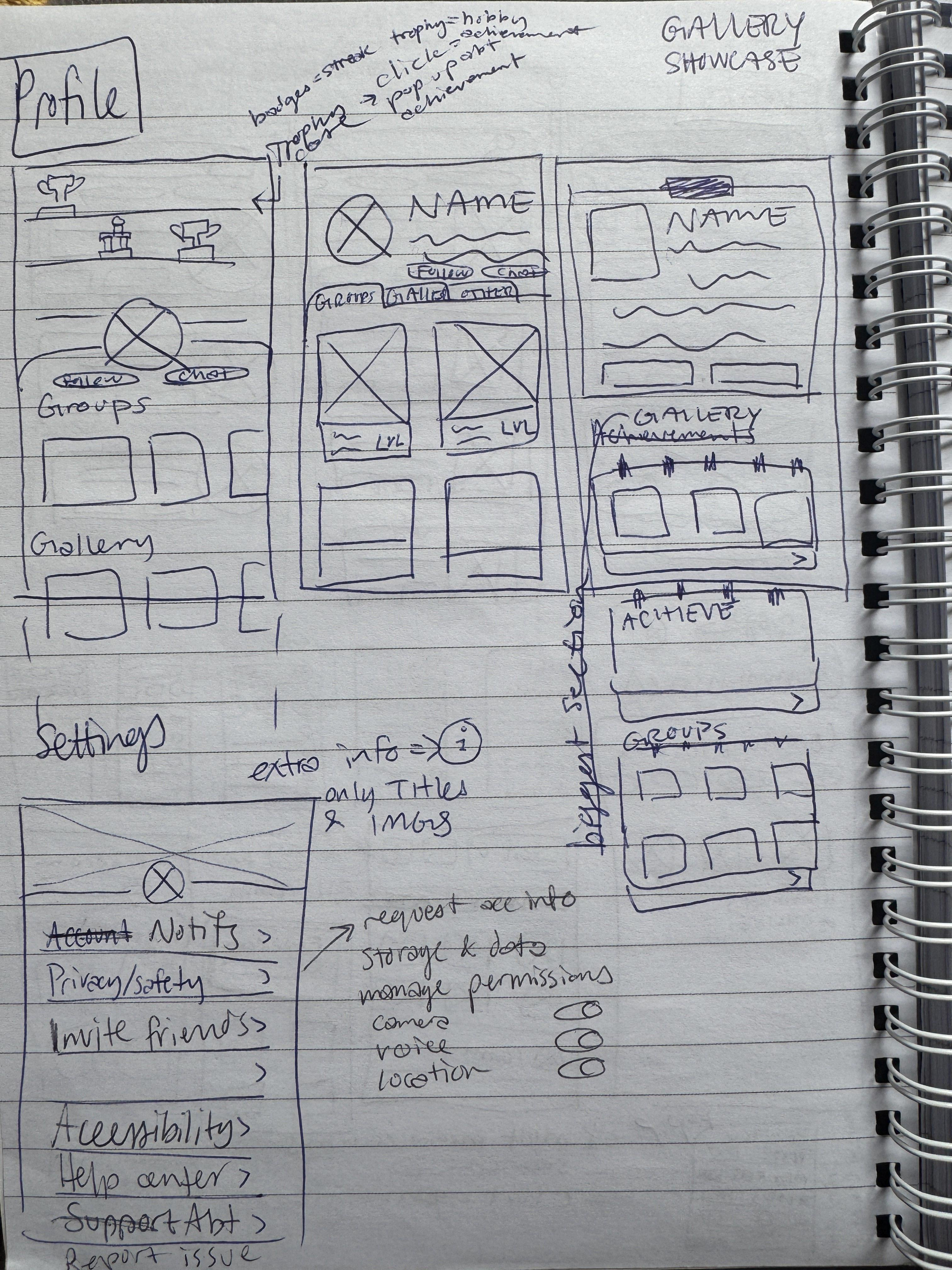
Brainstorming UI designs for the 'profile' page
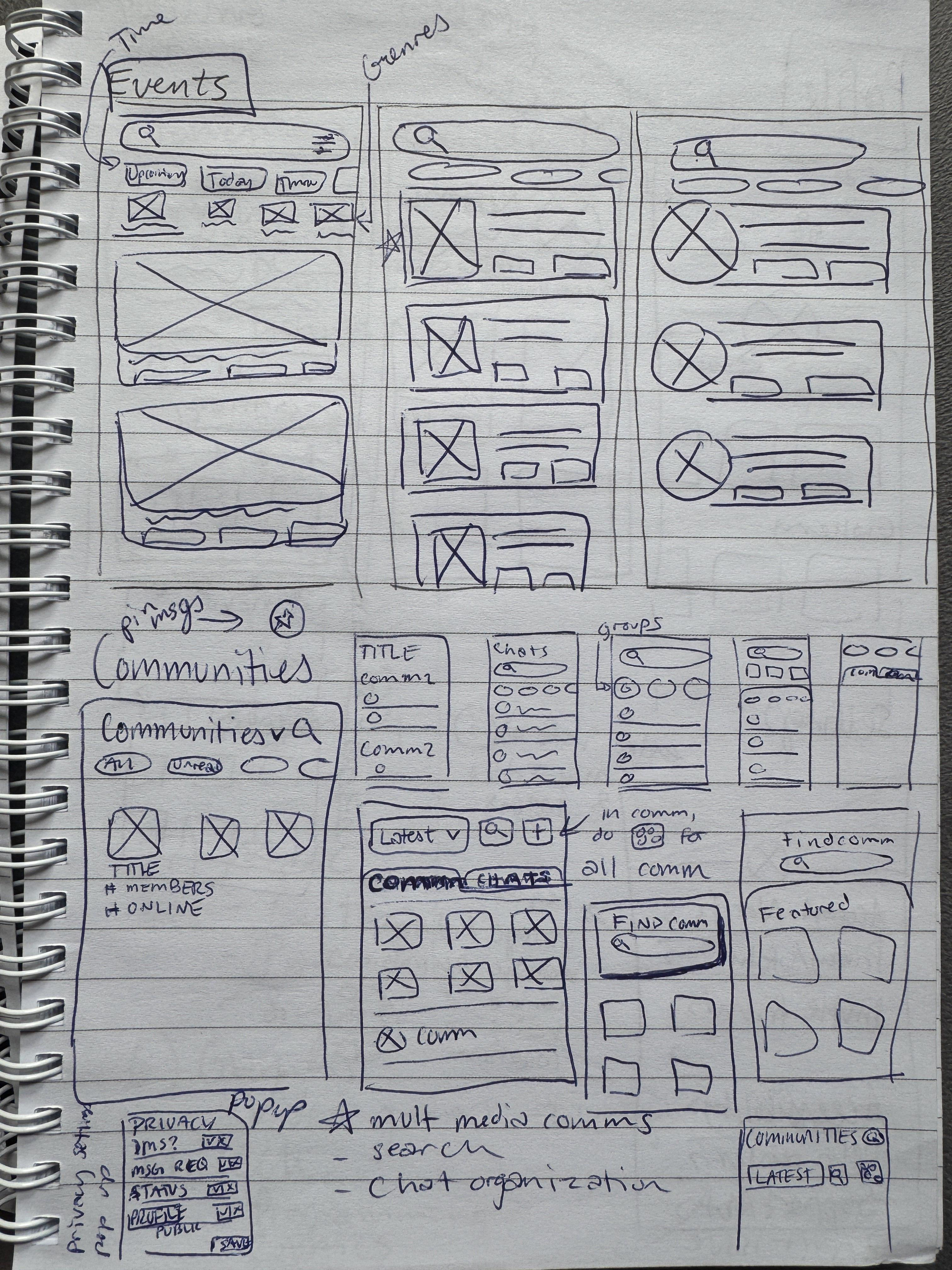
Brainstorming UI designs for the main 'events' page
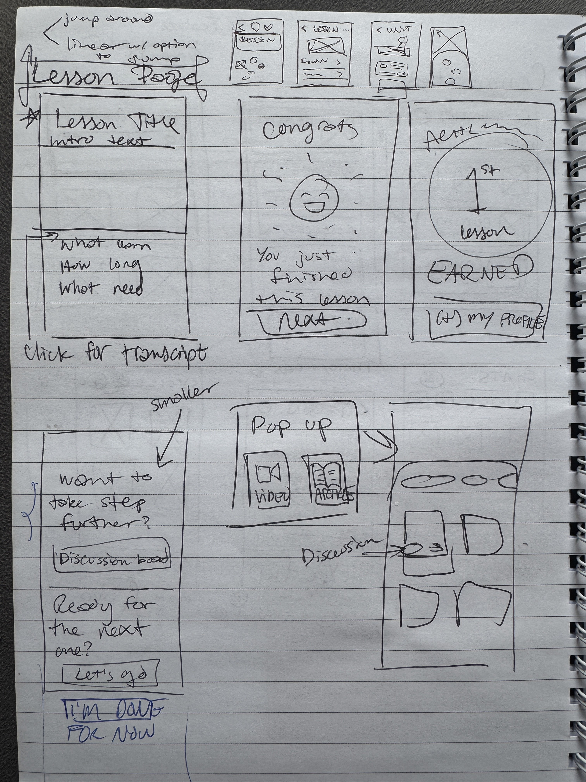
Brainstorming UI designs for the main 'lesson' page
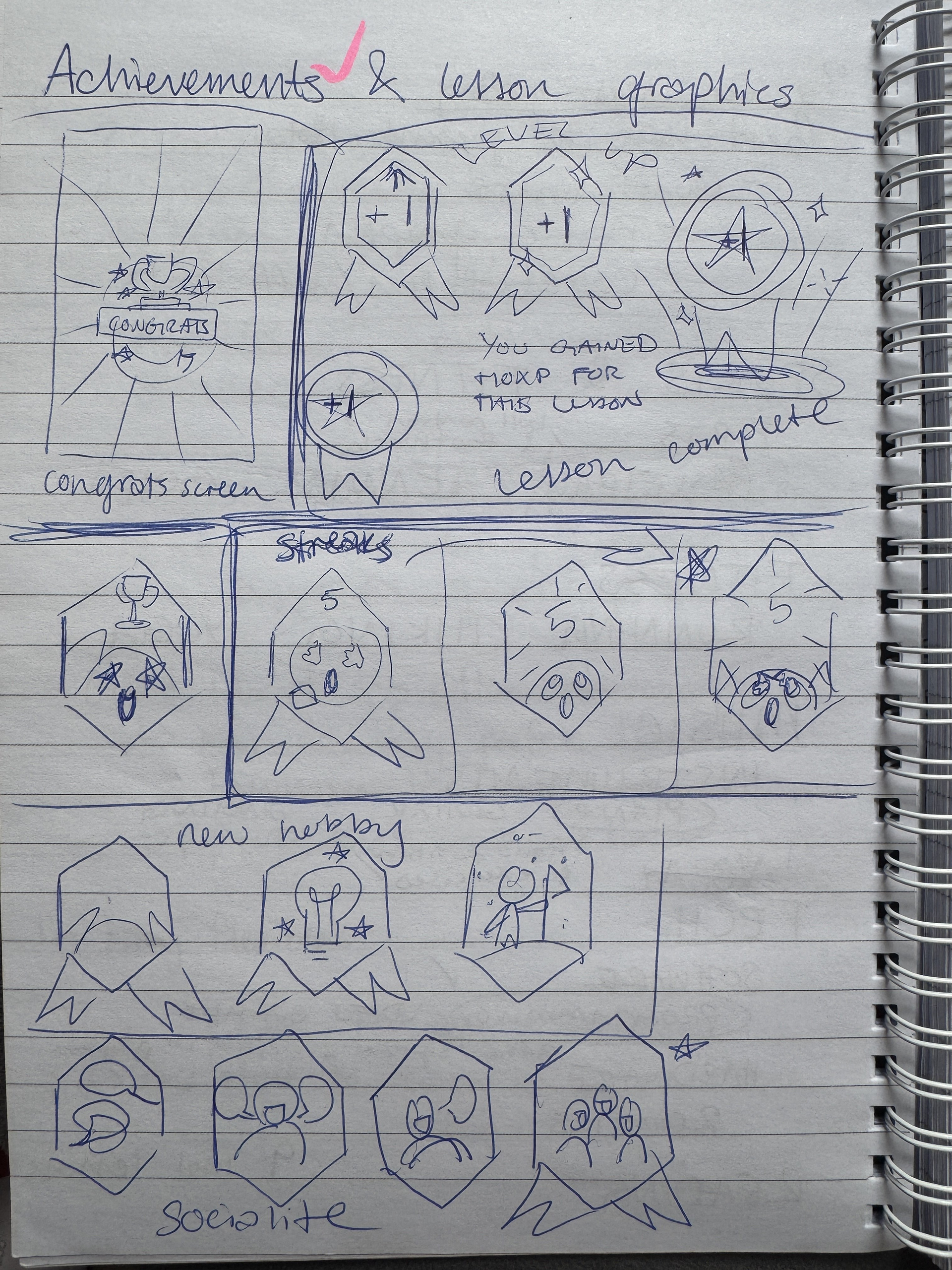
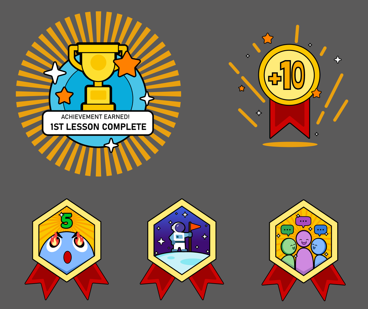
Some of the sketches planning the achievements and badges
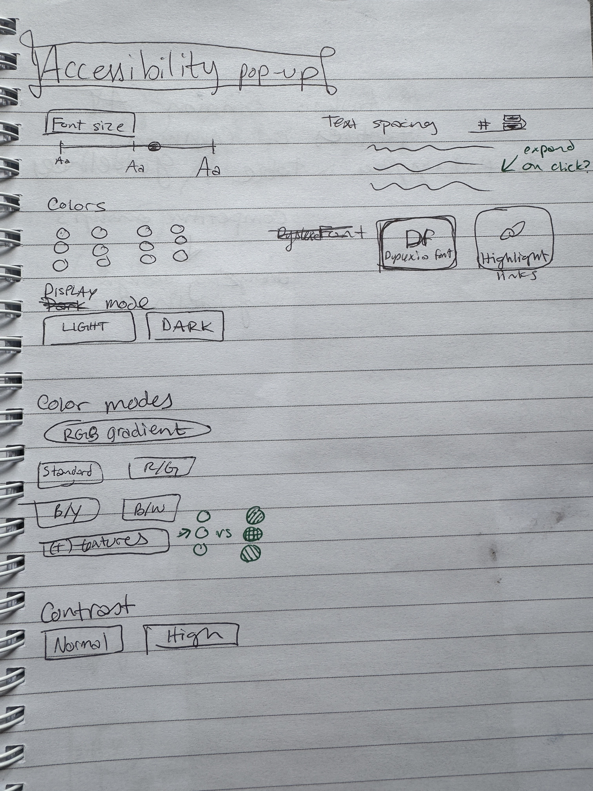
Planning for some of the accessibility features
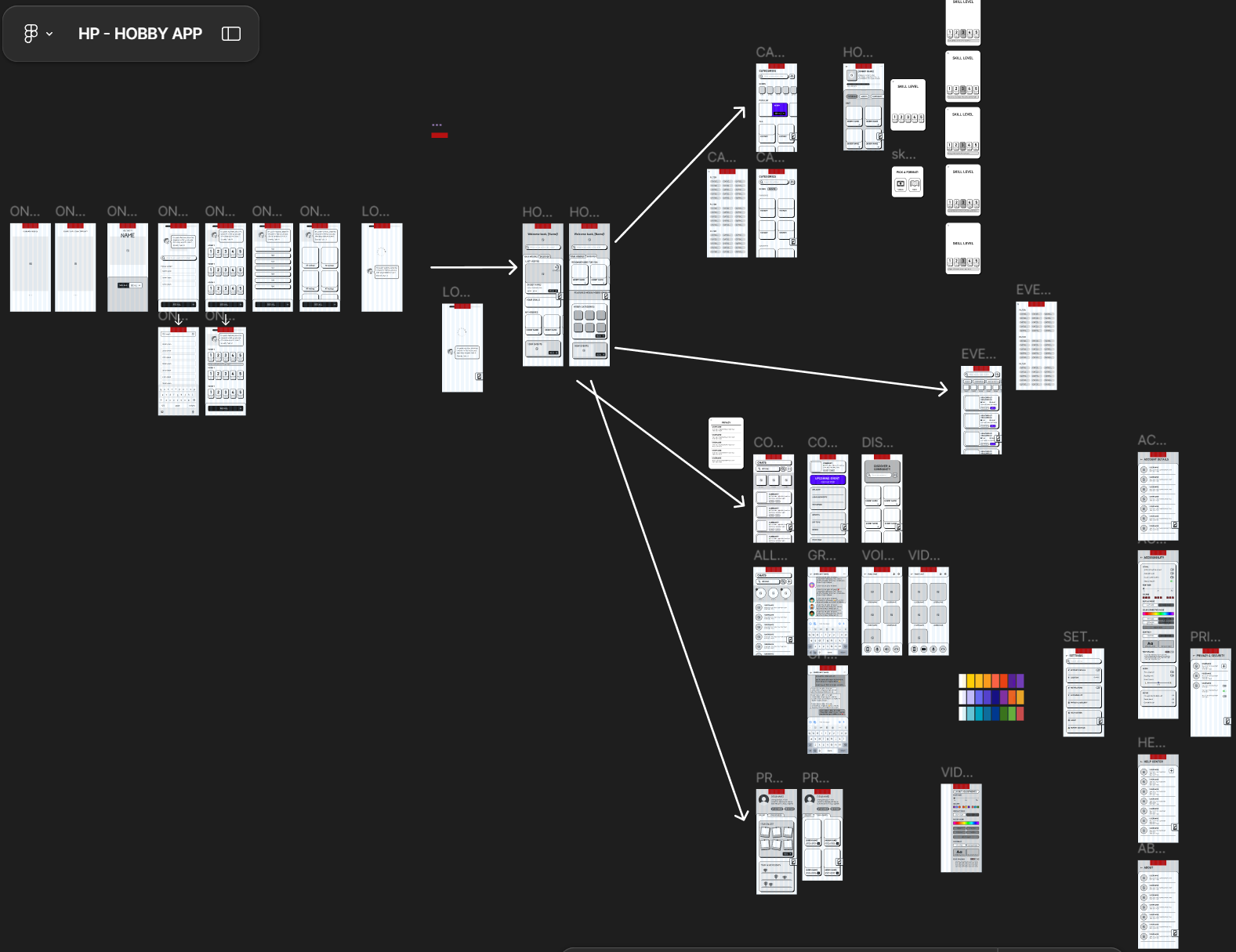
Low-fidelity wireframe:
After creating the sitemap and the sketches, a new low-fi wireframe was created from to plan out the information architecture and UI.
Screens shown were finalised based off the concepts tested in the questionnaire.
Purpose: Work out all of the details for the components, interactions and navigation.
Made in Figma.
4. Design
Style guide:
Purpose: Ensure visual consistency, speed up the design process, and make collaboration smoother.
Made in Figma.
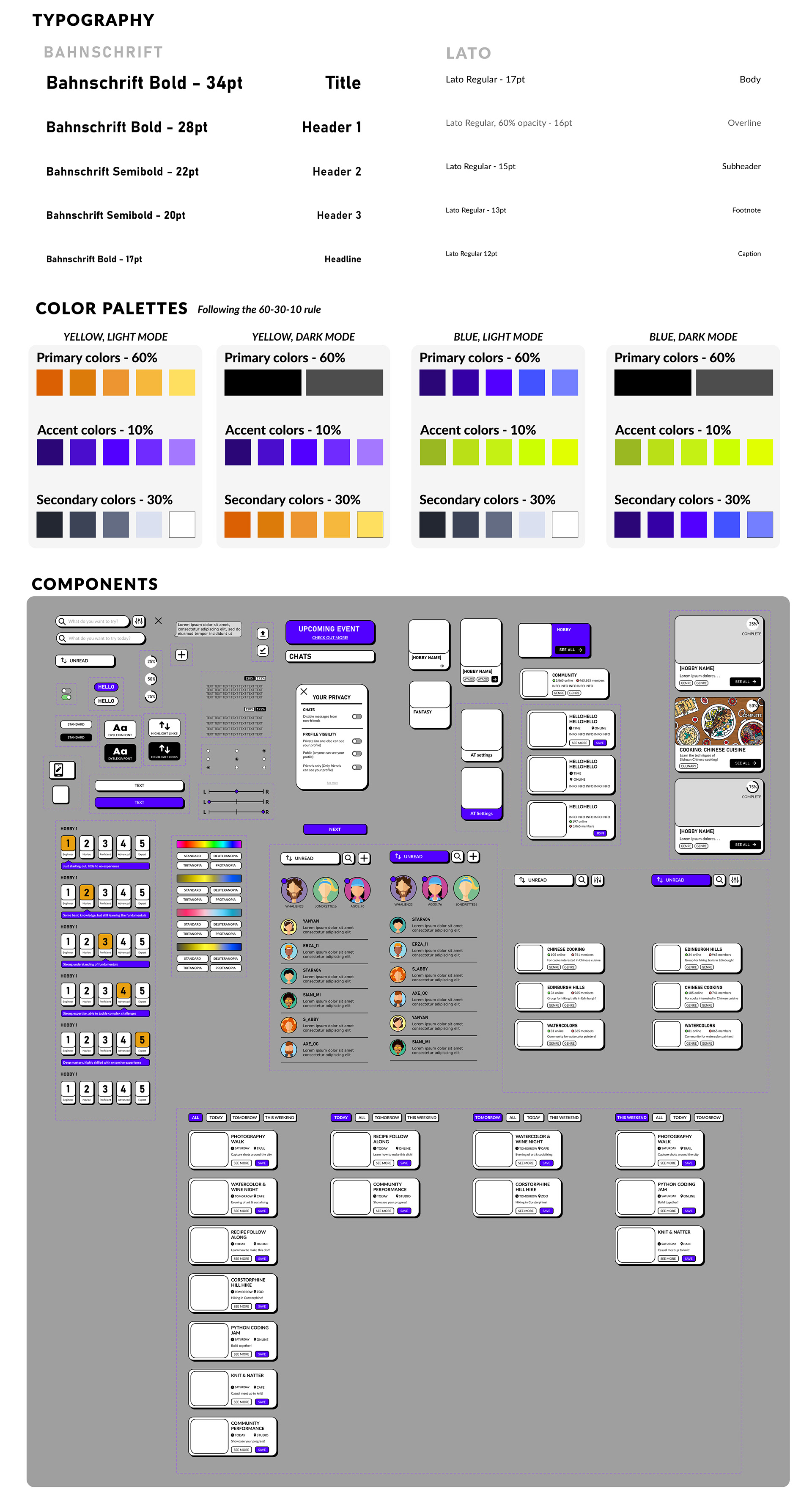
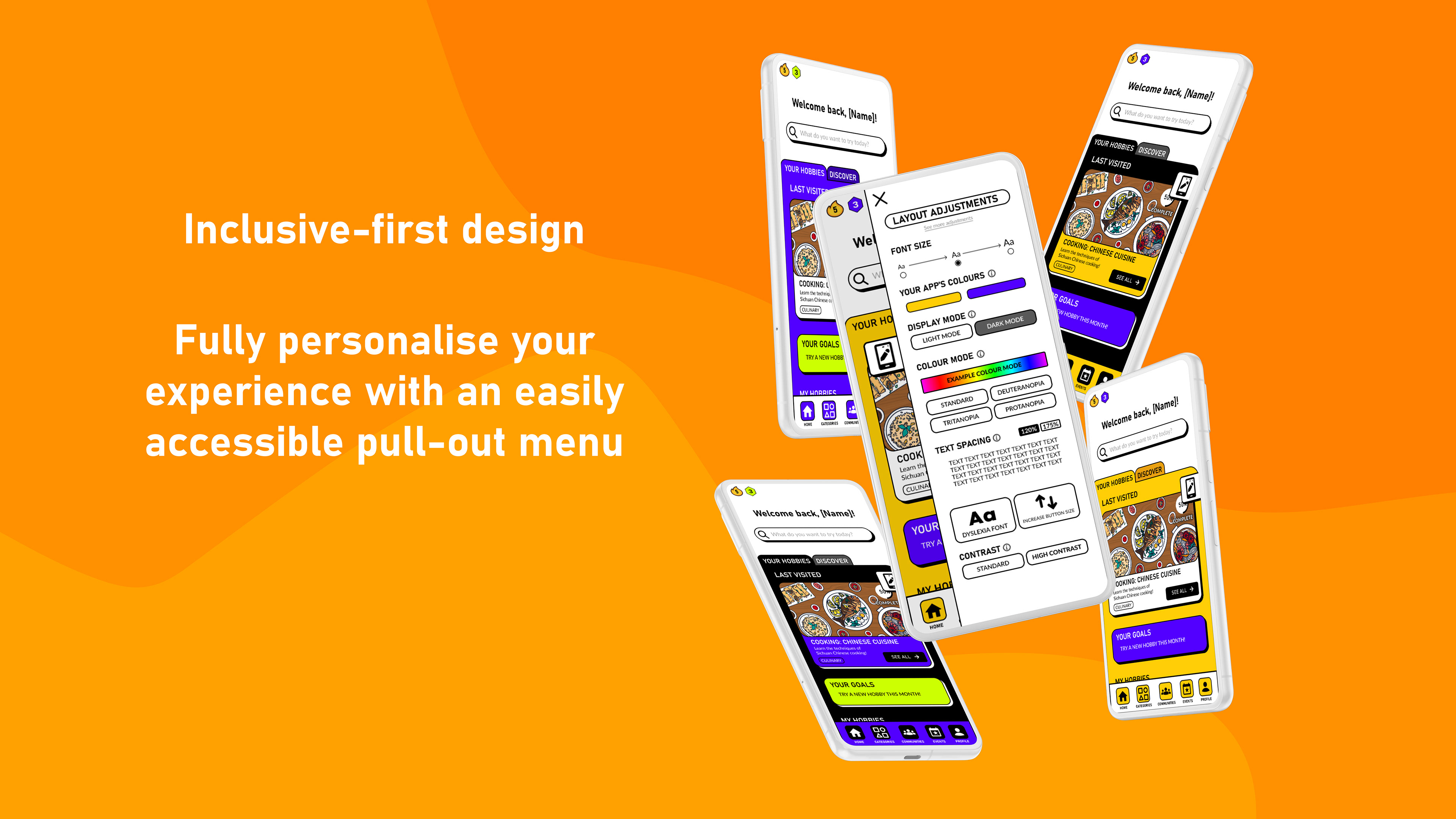
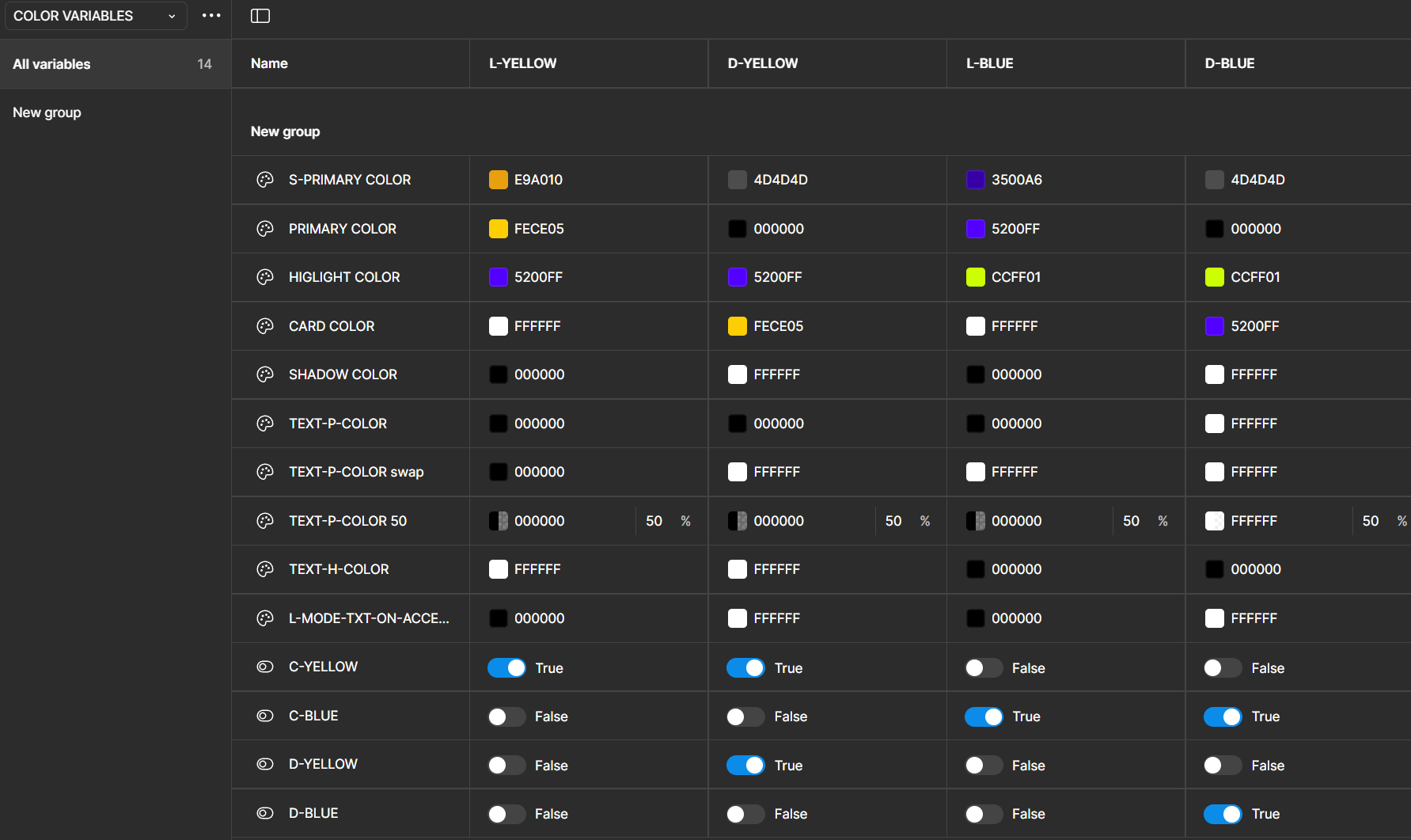
Variables:
Created a variety of variables to realistically prototype the different colour themes and their respective light/dark modes
102 variables were originally planned (90 for colour, 12 for text size)
Graphics:
Based off of the sketches above, graphics for the achievements and badges were made
Made in Figma.
5. Changes After Usability Testing
The usability test report collected:
- Quantitative metrics on user performance (Time to complete, CSAT, task failure rate)
- Qualitative data on users' feedback
- Usability issues
- Short-term and long-term design recommendations
The next design iteration was based directly off of this report
Some of the most major changes are featured below. Click on an image below to view the reasoning behind the design change
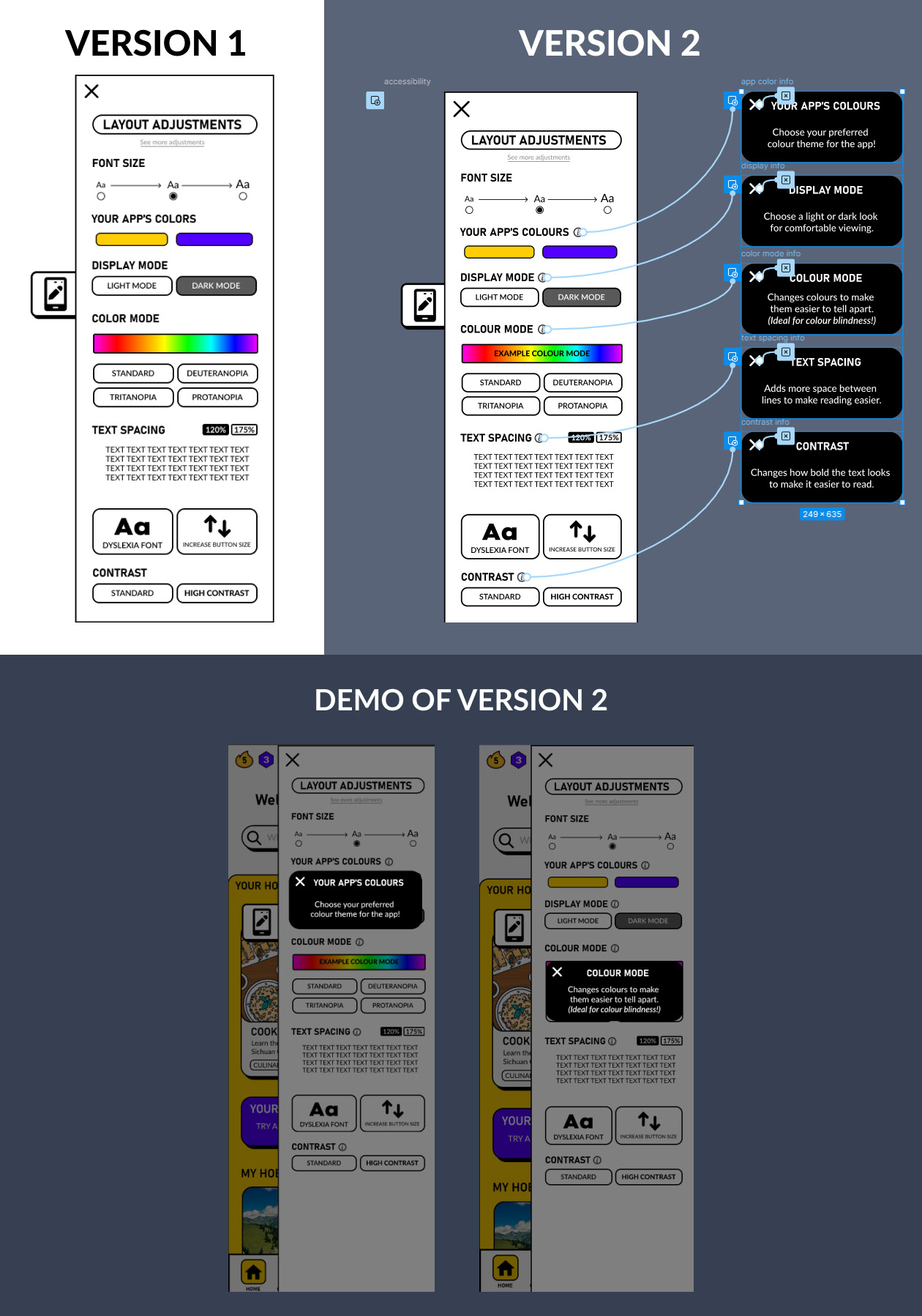
User feedback was analysed to arrive at two design solutions: First, adding ‘example colour mode’ to the colour spectrum example to clarify it’s an example of the colour modes, not a colour picker. Second, added info icons that when clicked, pop-up information on what the setting does.
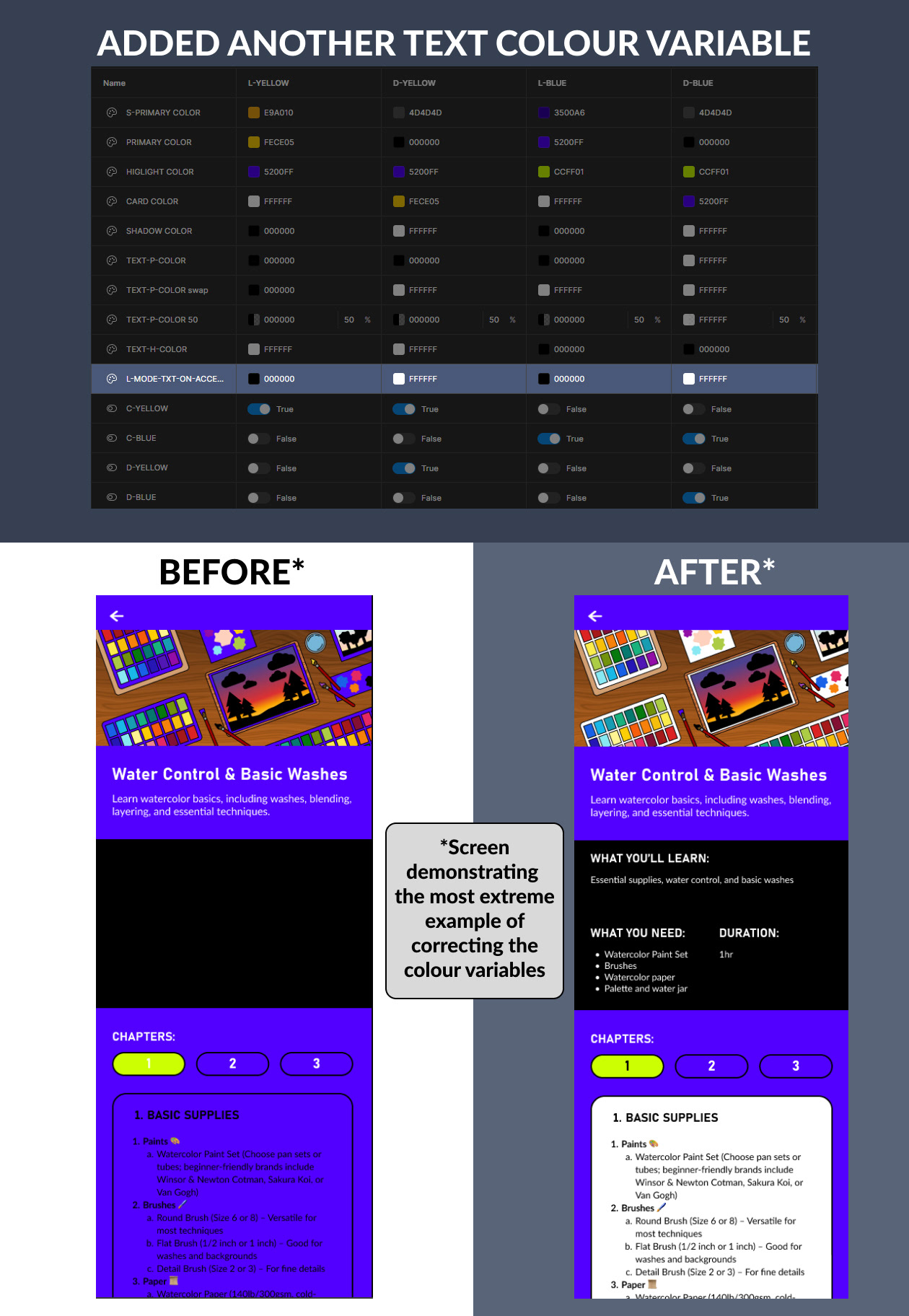
Added a colour variable to correct the text colours on certain screen in “Light mode, blue colour theme” or “Dark mode, blue colour theme”.
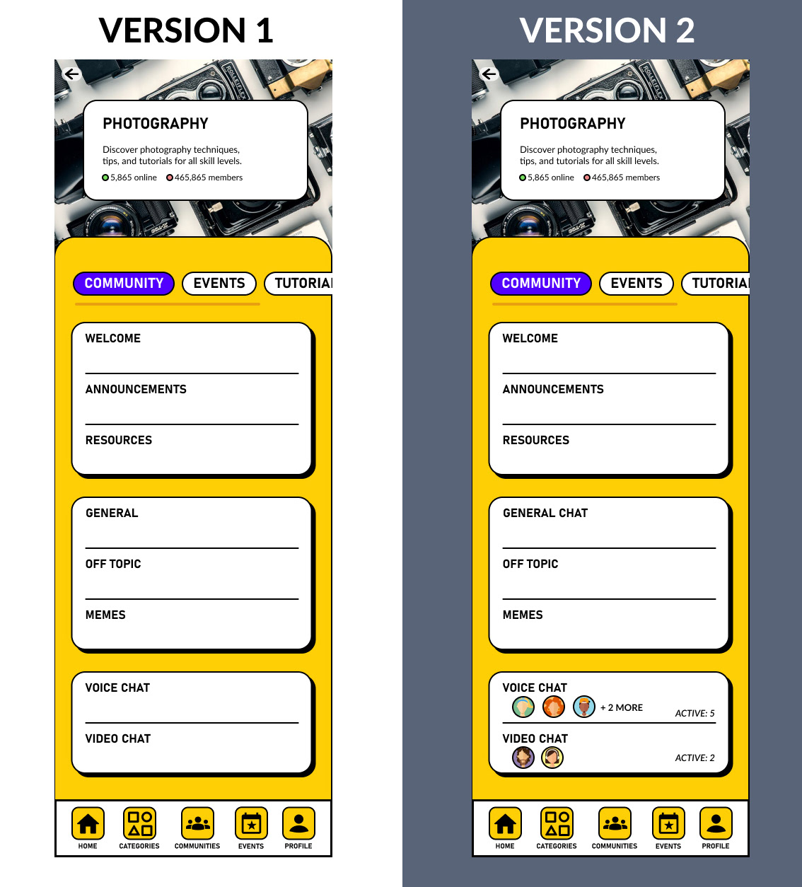
Edited based off of user feedback from testing. Changed “General” to “General Chat” to clarify the location of the group chat. User profiles and indicators were added to show who is present in voice and video channels.
Reflection:
I learned:
- How to balance accessibility, motivation, and usability in a mobile learning experience
- The value of real-world connection in sustaining user engagement
- How to translate research insights into meaningful design decisions
If I had more time:
- I would conduct long-term testing to observe sustained engagement
- I’d refine the adaptive UI settings based on more diverse user feedback
- I’d prototype additional features for in-app community building
As my senior honours project, this was the most ambitious UX case study I'd done to date. I learned so much about project management, accessible design, assistive technologies, e-learning design, and better design practices for mobile apps.
I also vastly improved my Figma skills, self-learning auto-layout, variables, styles, and other best design practices that not only made designing more efficient, but allowed the prototype to simulate realistic UI customisations.
I truly believe adaptive UI is the future of UX. I believe in its potential to improve the lives of users through its ability to make accessibility adjustments easier and more intuitive. My research strengthened the finding that user-driven AUI with explicit user confirmation is the best approach, and I look forward to exploring this technology, and other assistive innovations in future.