
Duration
4 weeks
Tools
Adobe Xd
Adobe Illustrator
Adobe Photoshop
Project overview
Rebrand the logo and design a responsive landing page for PC and mobile for a local business of our choice.
Since I had time, I took this school project a step further by designing the full user flow of the main pages with considerations for increasing site visibility and appealing to the target demographic.
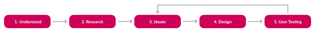
1. Understand
. . . the problem
To whittle down the problem to its core and gain focus, I considered my personal experience with the salon:
- Better tailor the site to its audience: people who enjoy bold, alternative looks
- Guiding questions for my research such as: What are the most helpful features? How do the preferences of existing vs new clients affect what their goals are?
- Defining success: Creating a modern, clean, and aesthetically appropriate logo and web design to match the work of the salon and its clients.
- Brain dump session of writing every and any thought, question, or idea to unearth truly innovative solutions.
. . . the constraints
Limited access to client and client base: while the client was happy to let my project be inspired and based on their salon, they did not want to commit to a logo and website redesign. Conversations were hypothetical and data derived from the salon's clientele was limited.
Time: I chose to significantly add to the initial project brief. Thus, I could not fully explore the pages and interactions I initially envisioned.
2. Research
Disclaimer: Research participants equals a mix of the salon's clientele and the general public
Interviews, co-creation workshops, and a Likert scale
Data from research were compiled into a Likert scale.
Primary research: co-creation workshops and user interviews
Key insights:
- Most of users primary purpose for visiting a salon's website is to book an appointment. Highest priority for returning clients.
- Users want examples. A photo portfolio of each stylists work is high priority for prospective clients.
- Users want convenience and independence by having things like service lists with pricing and onsite booking essential.
Competitive analysis:
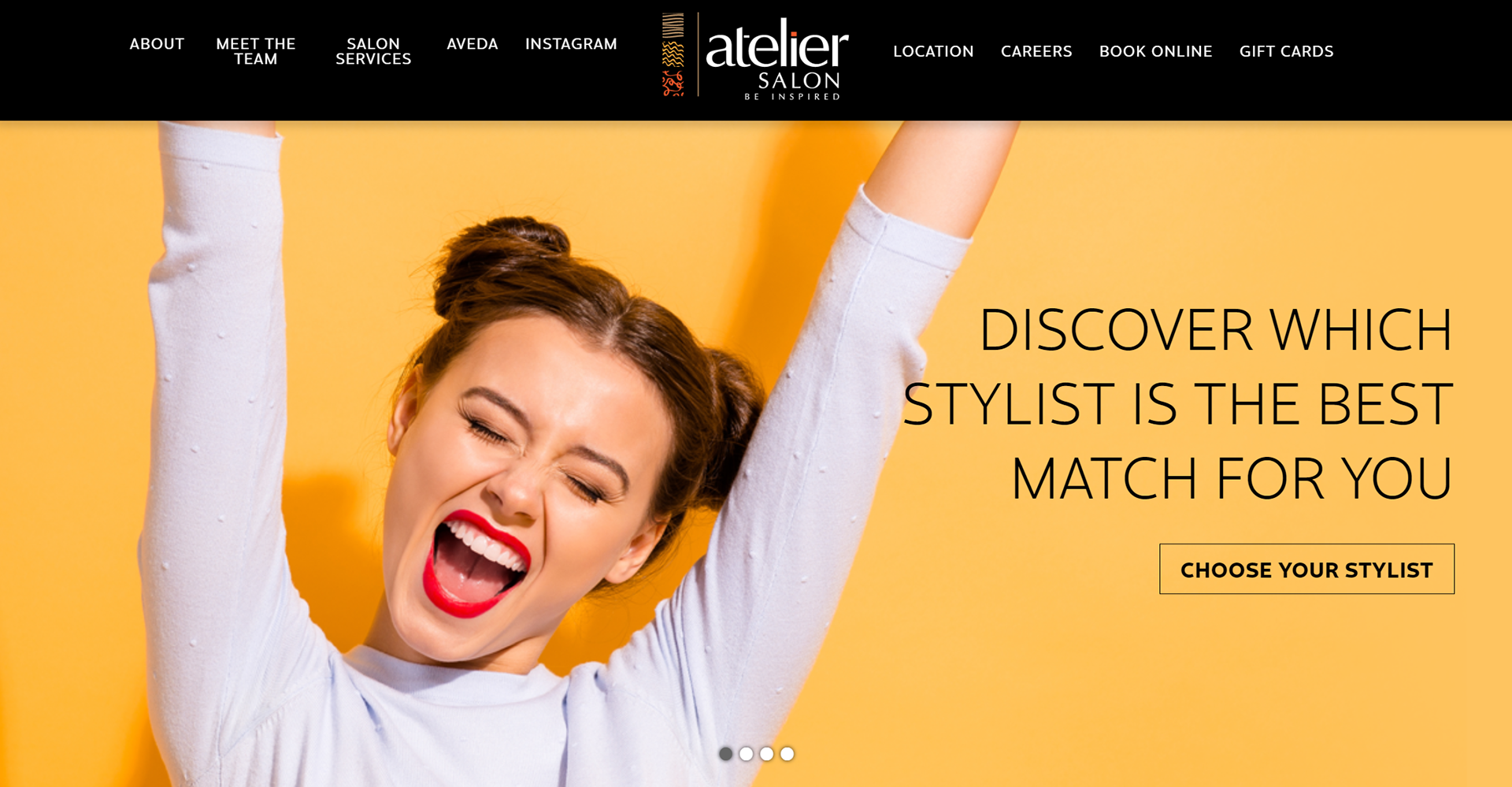
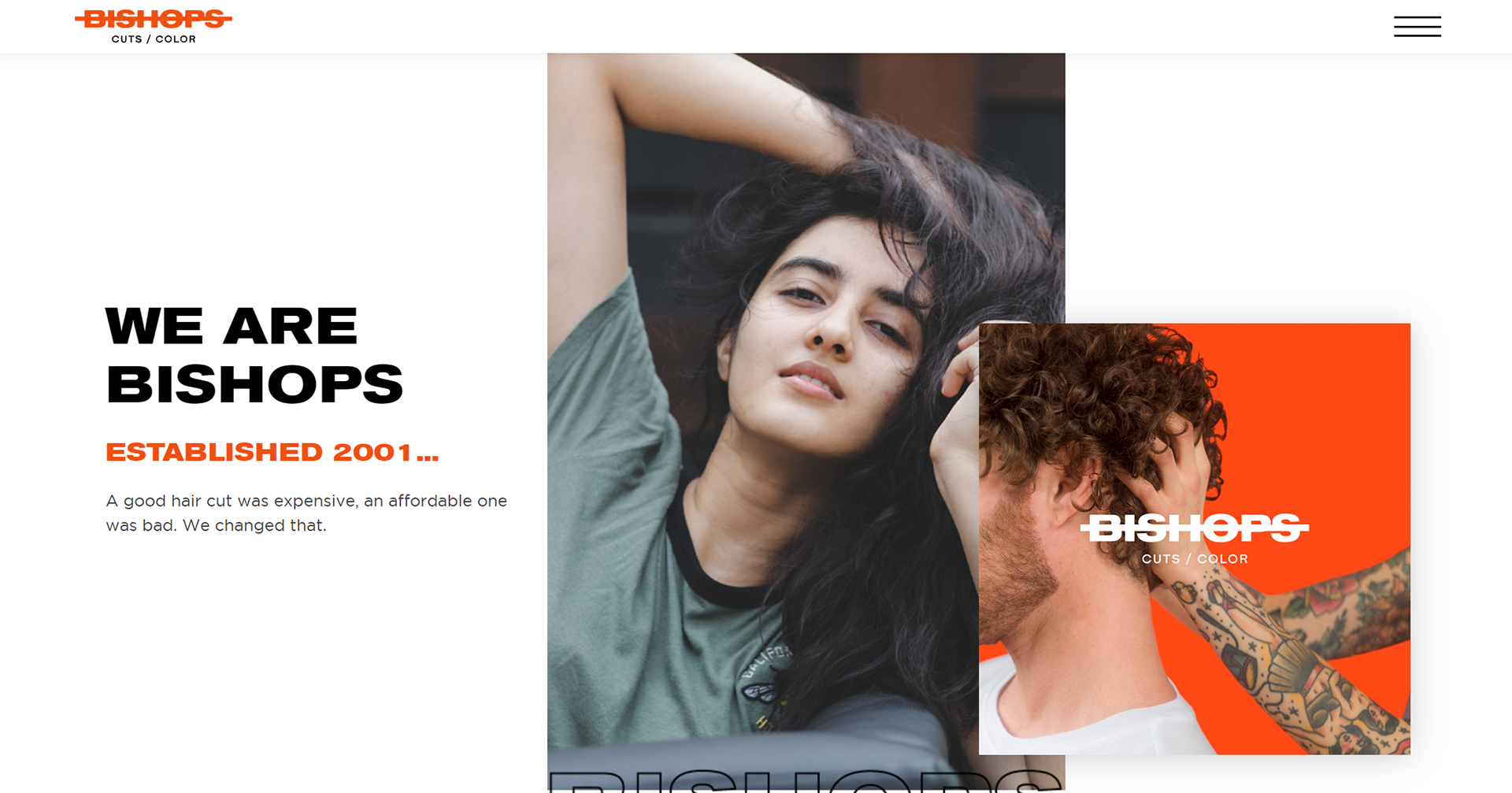
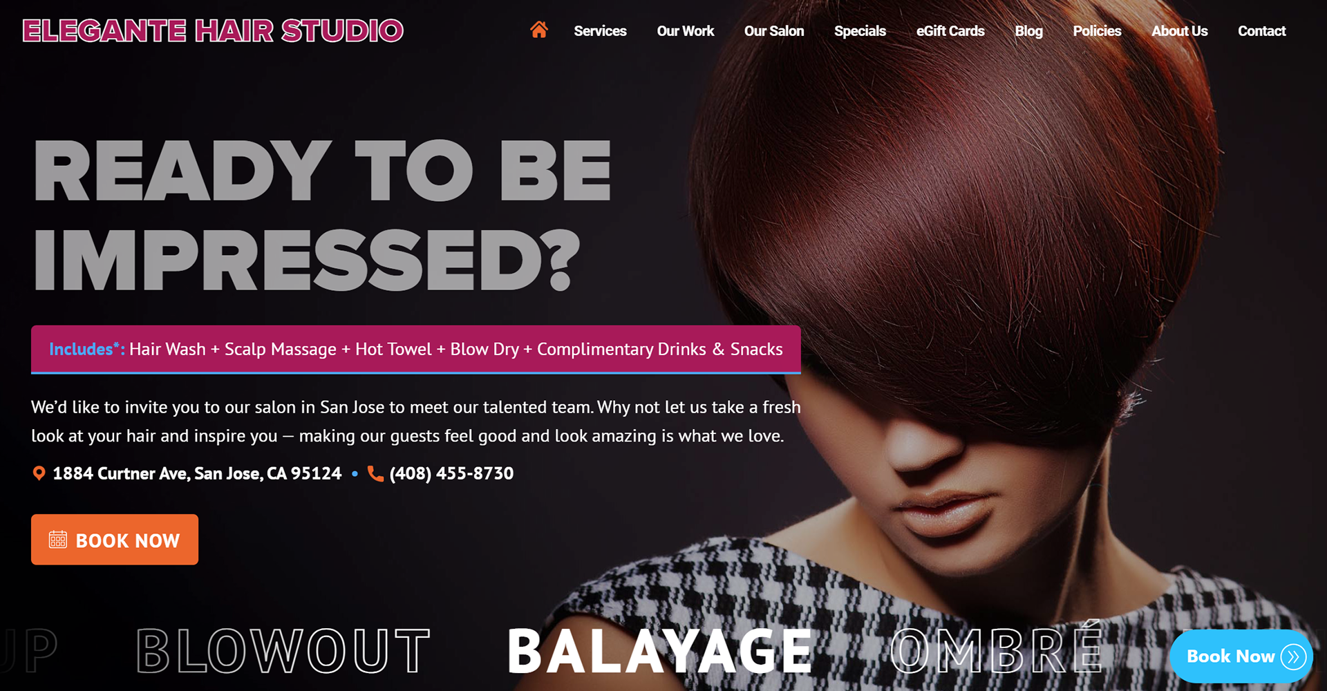
I poured over countless local hair salon websites to benchmark what the standard was and aim to surpass that with better aesthetics, features, and user flow.
Key insights:
- Little design cohesion between the website and the actual salon (interior design and overall vibe)
- Clunky UX with too many pages or confusing navigation
- Essential features like booking or example work often off-site
3. Ideate
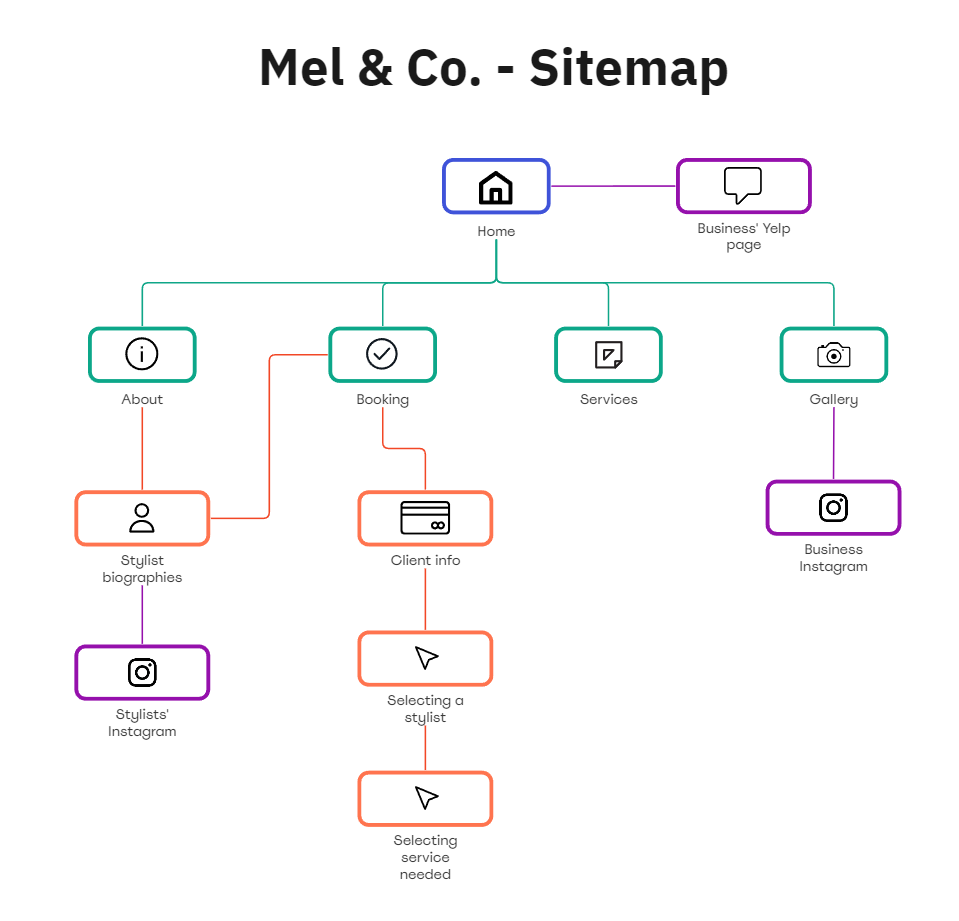
Sitemap:
To ensure I'm implementing all my solutions and user research, I start with a generic sitemap to plan the skeleton of the app.
This step is when I go and ask for professional feedback, usually from professors or other industry professionals. This gives me the flexibility to make changes if need be with low risk.
Brainstorm sketches and low-fidelity wireframe:
The landing page is the most important page on any website. I brainstormed 10 different landing page designs to determine the most eye-catching and useful for the site's purpose.
For the wireframe, I compiled the research and insights I gained from primary research to create an optimal user flow and useful features.
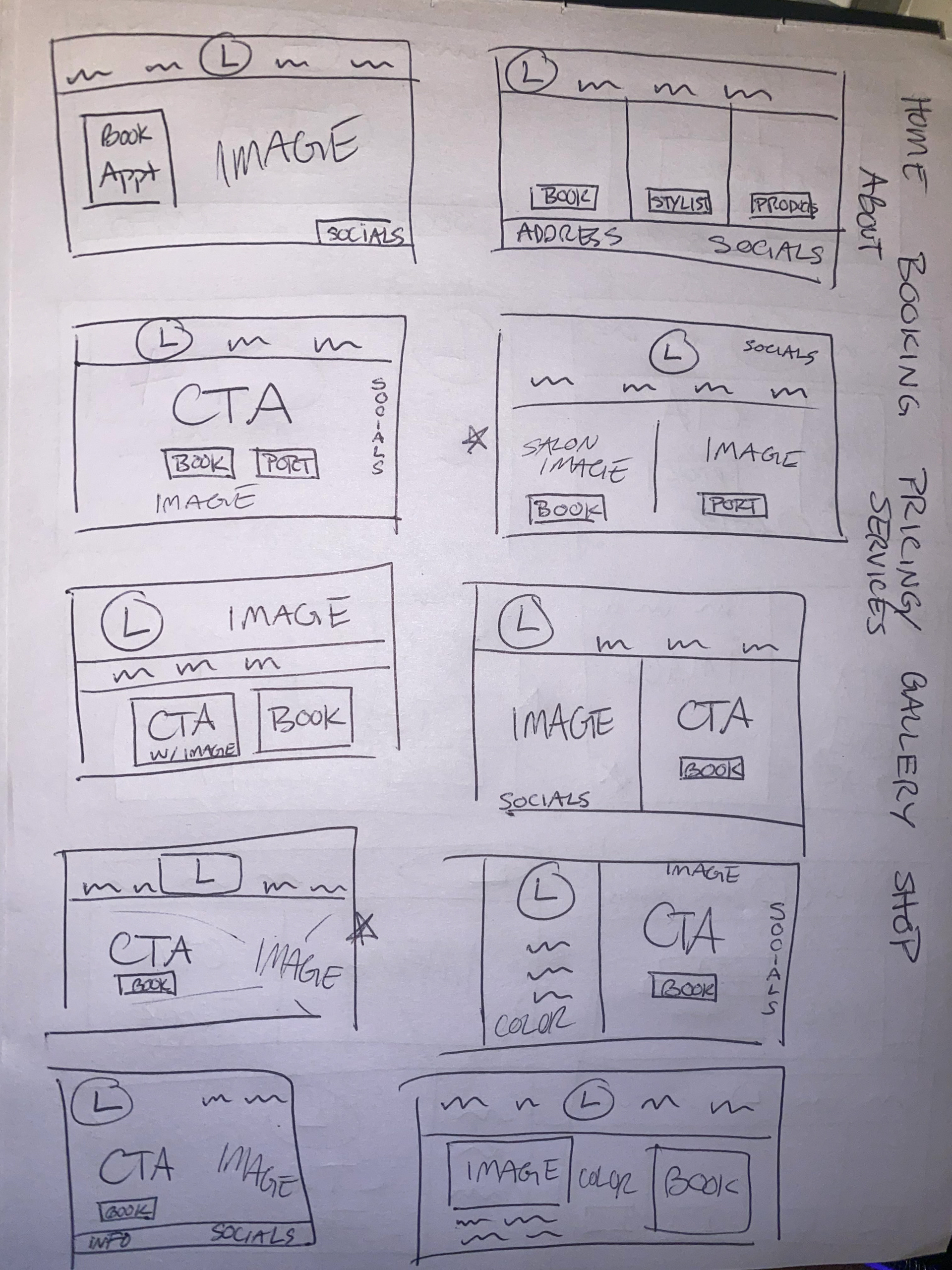
Landing page ideations
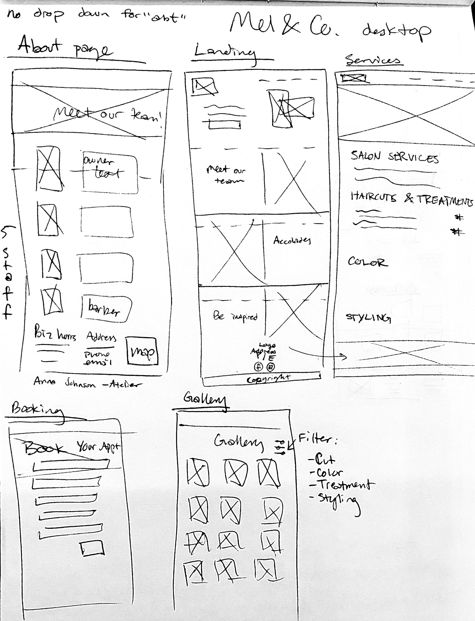
General wireframe
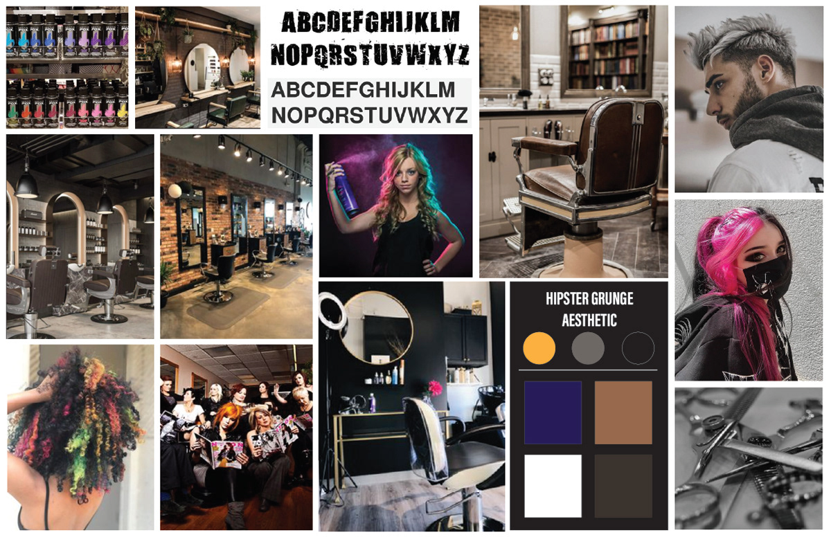
Mood board:
Created based on my personal experience with the shop, the owner's input, observations of the clients and décor, and the salon's specialty (fashion colors and alternative cuts).
This helps me determine the color palette, typography, and visual direction of the site, while also acting as a reference for the overall style.
4. Design
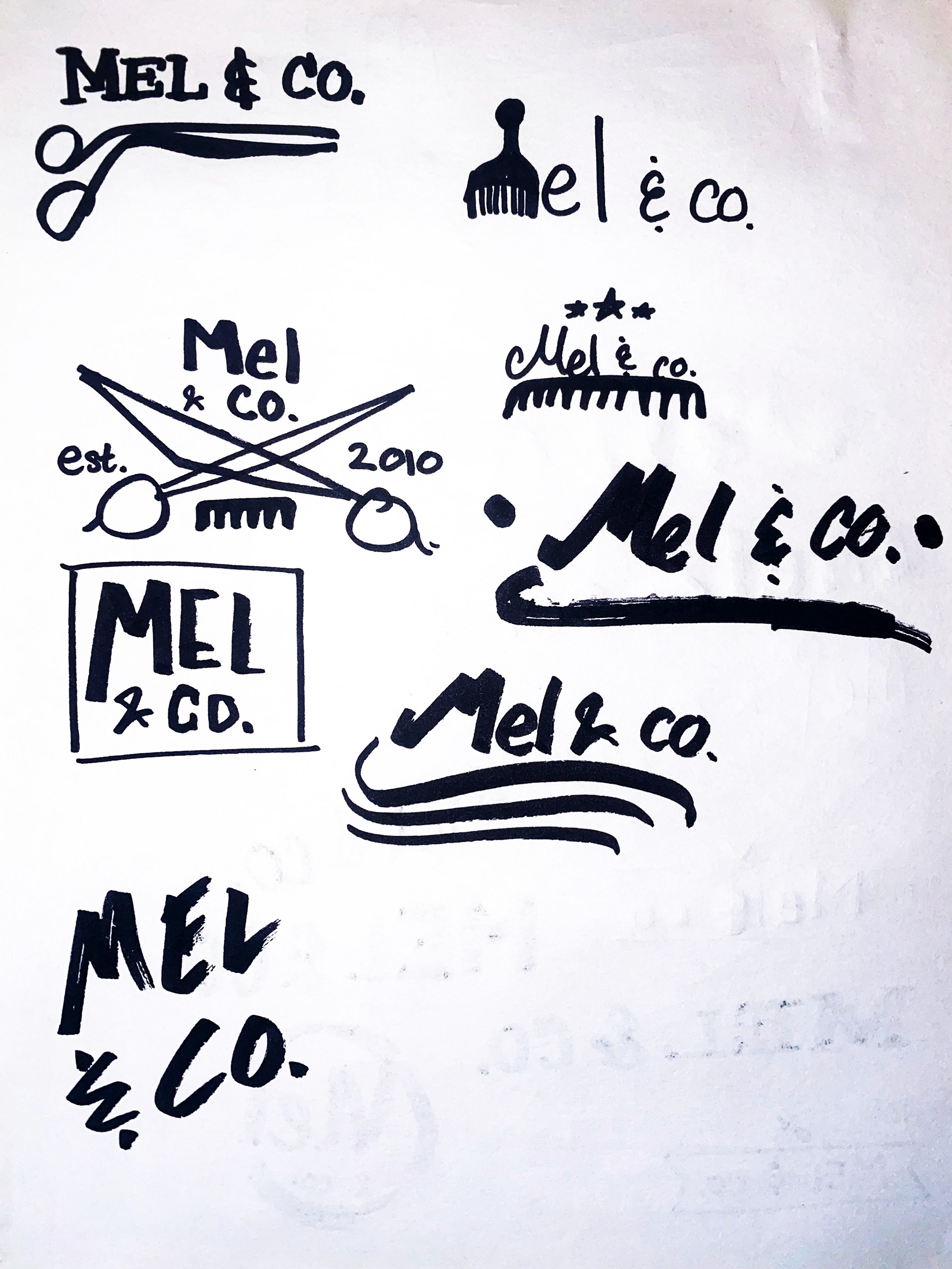
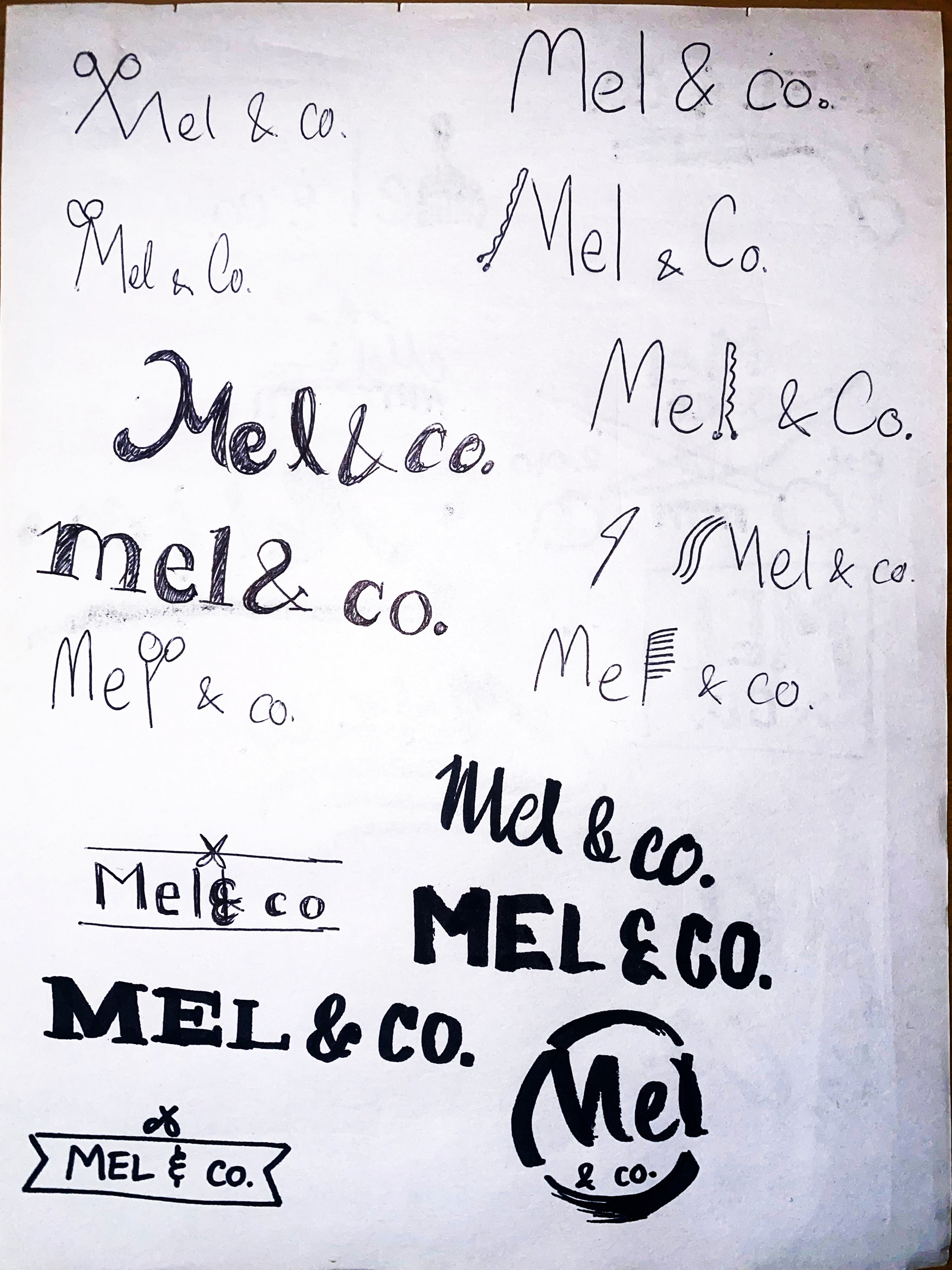
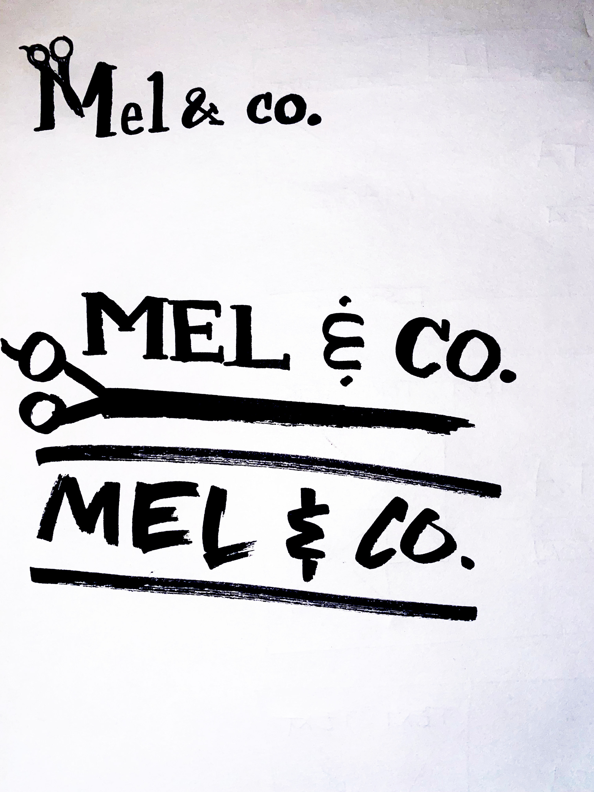
Logo creation:
Similar practice I employ when first understanding a problem, I drew out as many designs for the logo I could think of to weed out the obvious, cliché ones.
Final logo was picked based on my and the salon owner's preference.

Final logo redesign - black on white
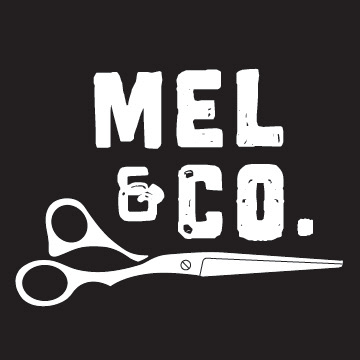
Final logo redesign - white on black
5. User testing
Open-ended, think-aloud testing:
I ran open-ended testing with two former research participants. They both frequent salons. I simply had them explore and verbalize their thoughts.
Feedback:
- Aesthetic of the site is a personal preference - can come across as too niche and deterred one participant
- Streamlined webpages were easy-to-understand and efficient
- Loved the on-site booking feature
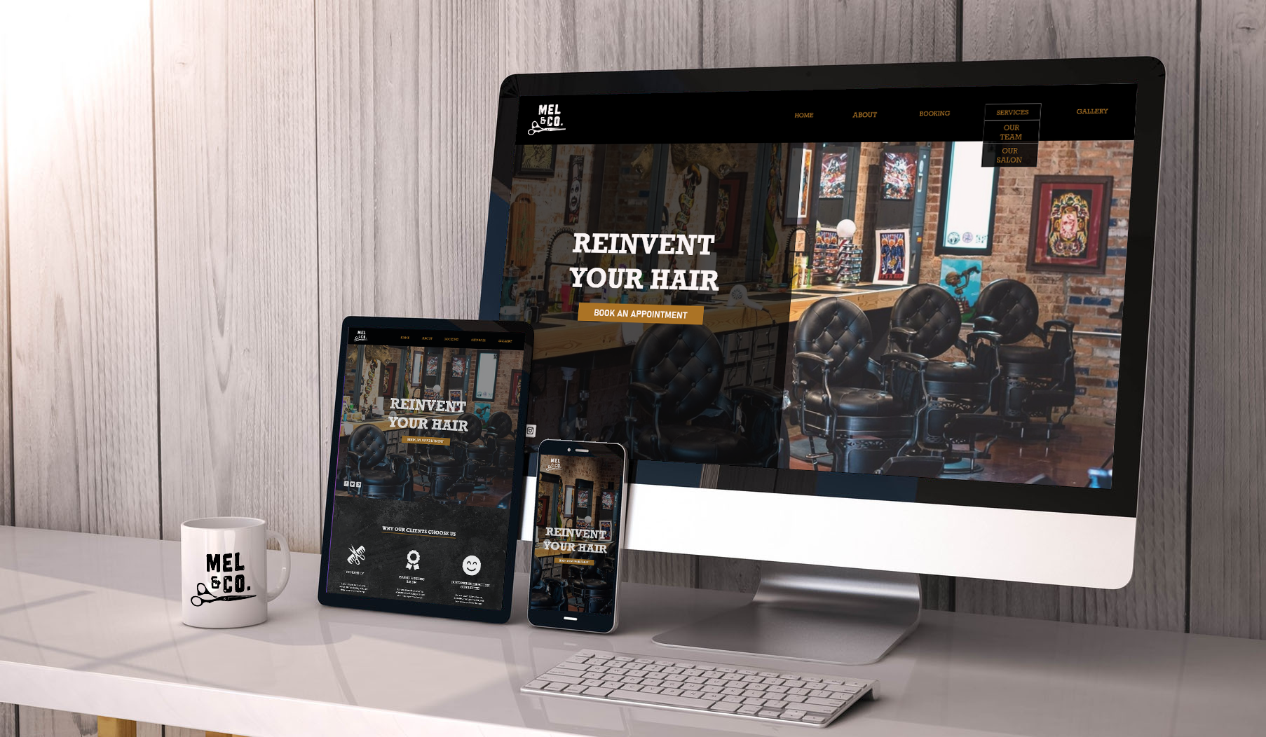
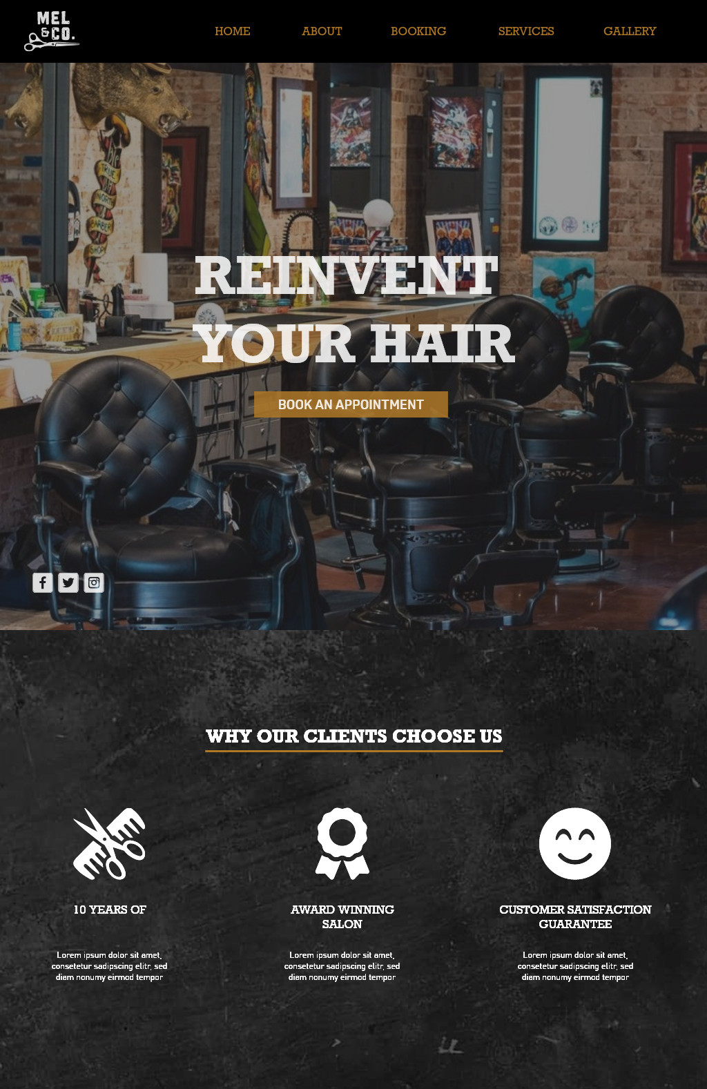
Final deliverable:

Mobile landing page - full spread
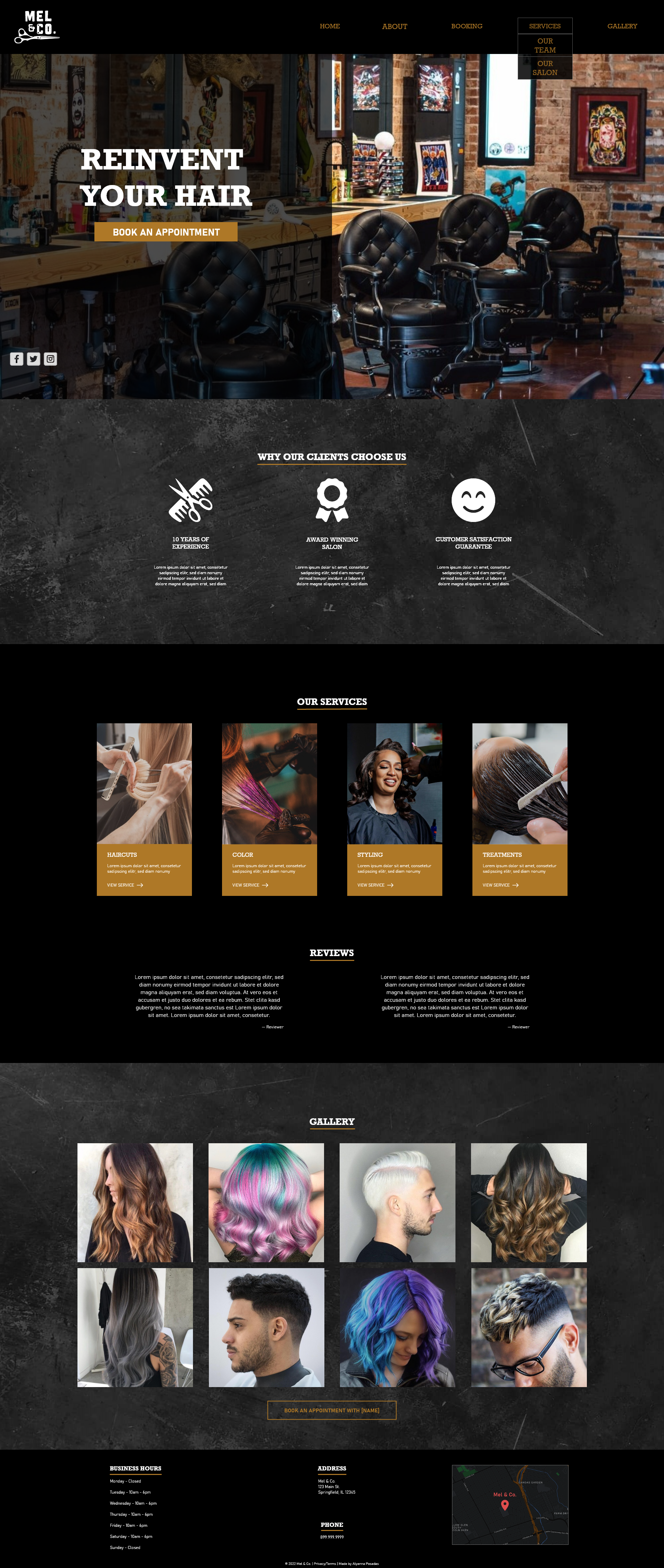
Web landing page - full spread
iPad landing page - partial view
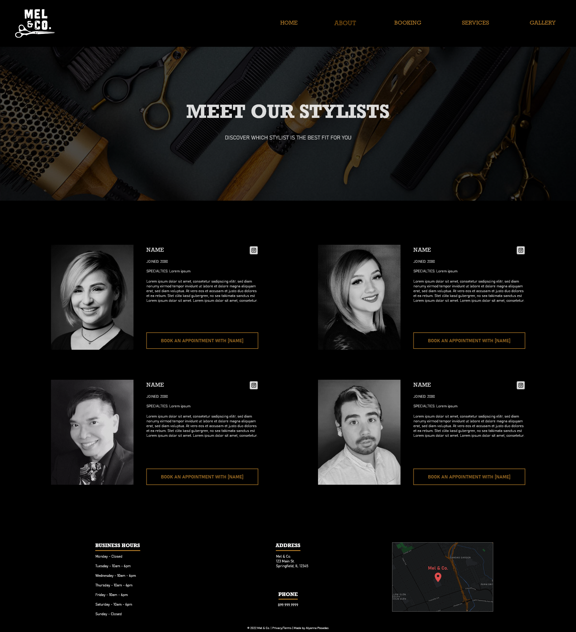
"About" page
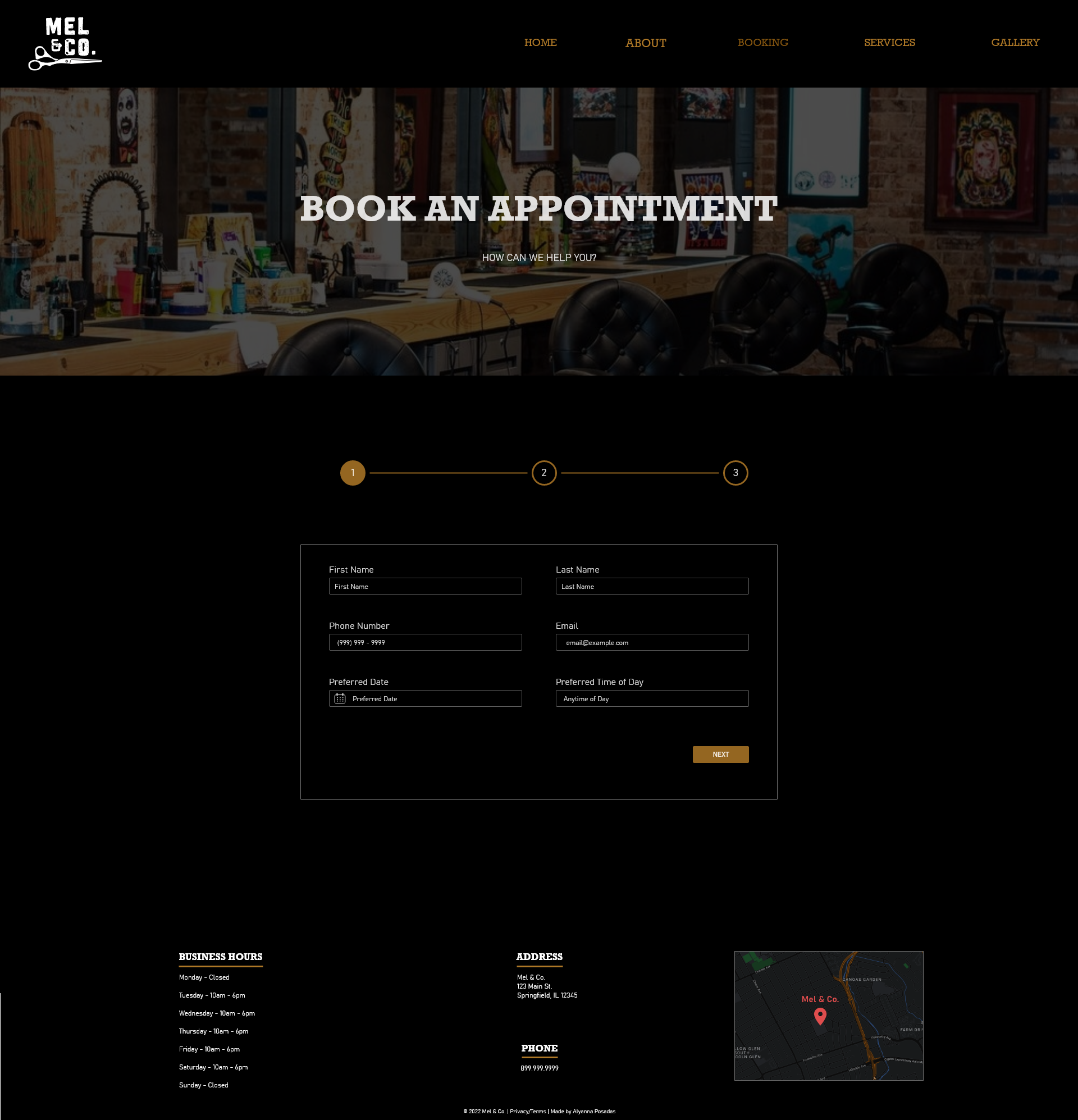
"Booking" page
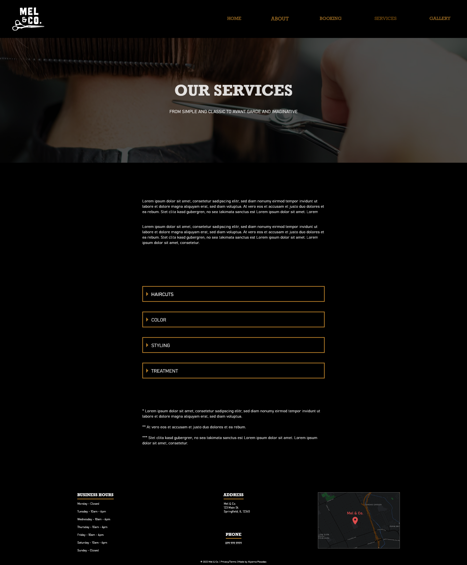
"Services" page
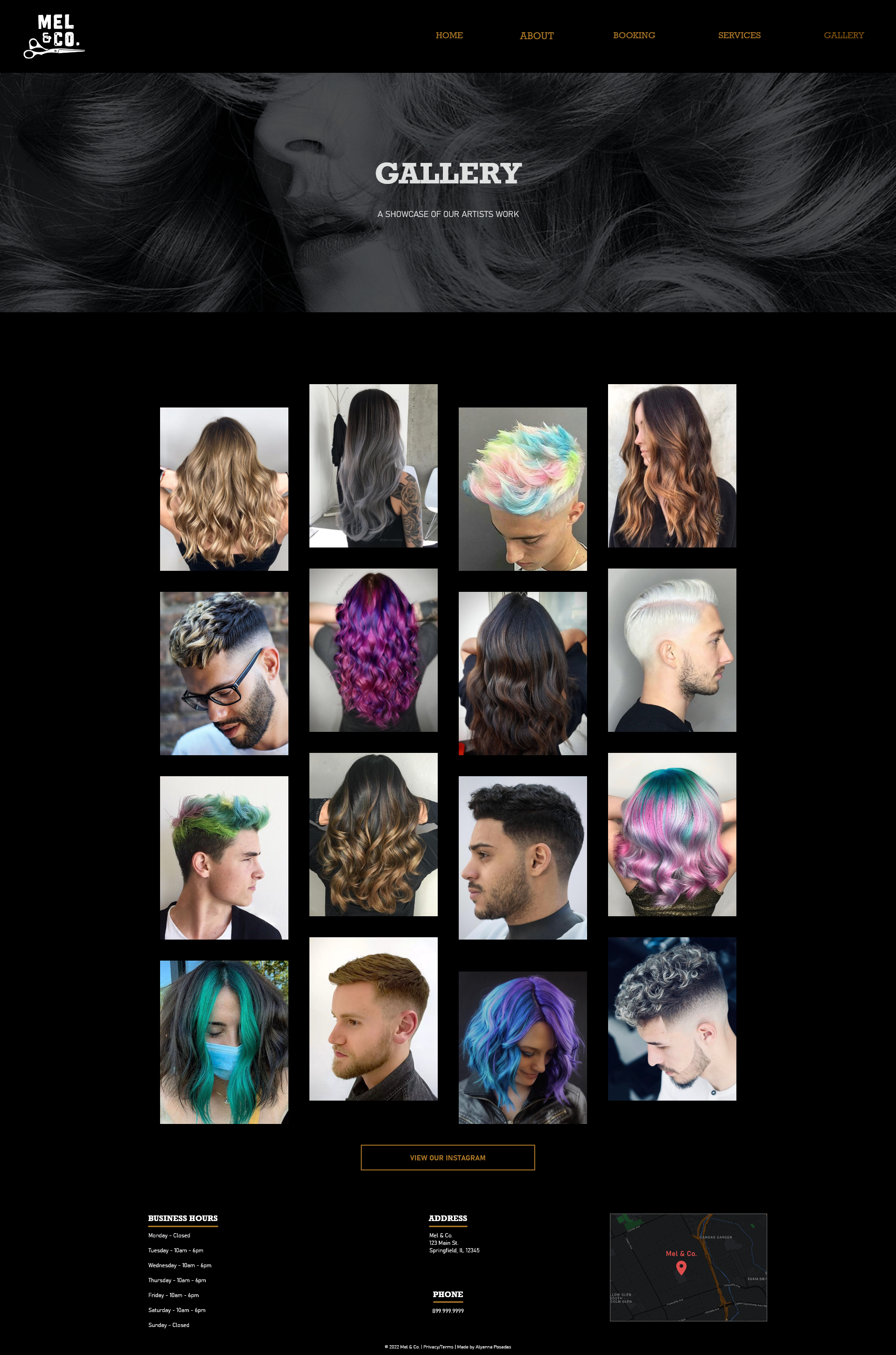
"Gallery" page
Reflection:
I wanted to embody the hipster/alternative aesthetic the salon is known for and really let that drive my design in terms of images, colors, and textures. I still wanted a sense of modernity and refinement and feel like I’ve achieved that through my layout.
I learned a lot about working for a client, adhering to a design aesthetic, and how to design efficiently for multiple aspect ratios.
If I had more time. . . I would create the full page spread for the iPad landing page and create the smaller interactions such as drop down menus, check out screens, etc.