Duration
6 weeks
Tools
Visual Studio Code
Adobe Illustrator
Procreate
Miro
Prompt
Create a food recipe website using HTML, CSS, and JS.
My idea: a recipe website featuring Filipino staples with interactive games to assist with recipe learning.
1. Understand
. . . the prompt
I treated this assignment like a real-world paid project. I researched the competition, defined the target demographic, created a style guide, and tested the site with users.
This helped me create a timeline with actionable goals to guide the project.
. . . my constraints
Coding novice: this was my first time learning, writing, and publishing code in my life. The class and my peers were at a higher level of understanding, so I had to do some self-teaching and catch up.
To overcome my coding novice status, I took over 100 lessons from www.w3schools.com for HTML and CSS, and most of them for JS. I took a separate online short course on HTML and CSS and took part in daily coding exercises to build my skillset.
2. Research
Competitive analysis:
I looked into existing PC cooking games, their mechanics, and investigated the complexity of their source code to see what was feasible.
I surveyed existing recipe websites and blogs to understand what others were doing. I looked for: similar features across sites, site layout and information architecture, UI, usage of imagery/videos, etc.
Key insights:
- A common and simple game was a drag-and-drop matching game. I decided on this for my interactive element
- Popular recipe websites had additional features beyond just directions and an ingredients list.
3. Ideate
Sitemap:
I always start with a sitemap with my digital products to easily create a framework for my ideas.
I decided on three main pages: landing page, recipe page, and about page.
User flow chart:
To better understand the user and accurately address user needs, I created a flow chart.
This helped me refine the landing page and individual recipe pages to accommodate user goals.
Low-fidelity wireframe:
Several user testing sessions were held with the low-fi prototype to make changes easily with little commitment.
Ideas, comments, and changes were put alongside the wireframe using sticky notes.
Made in Miro.
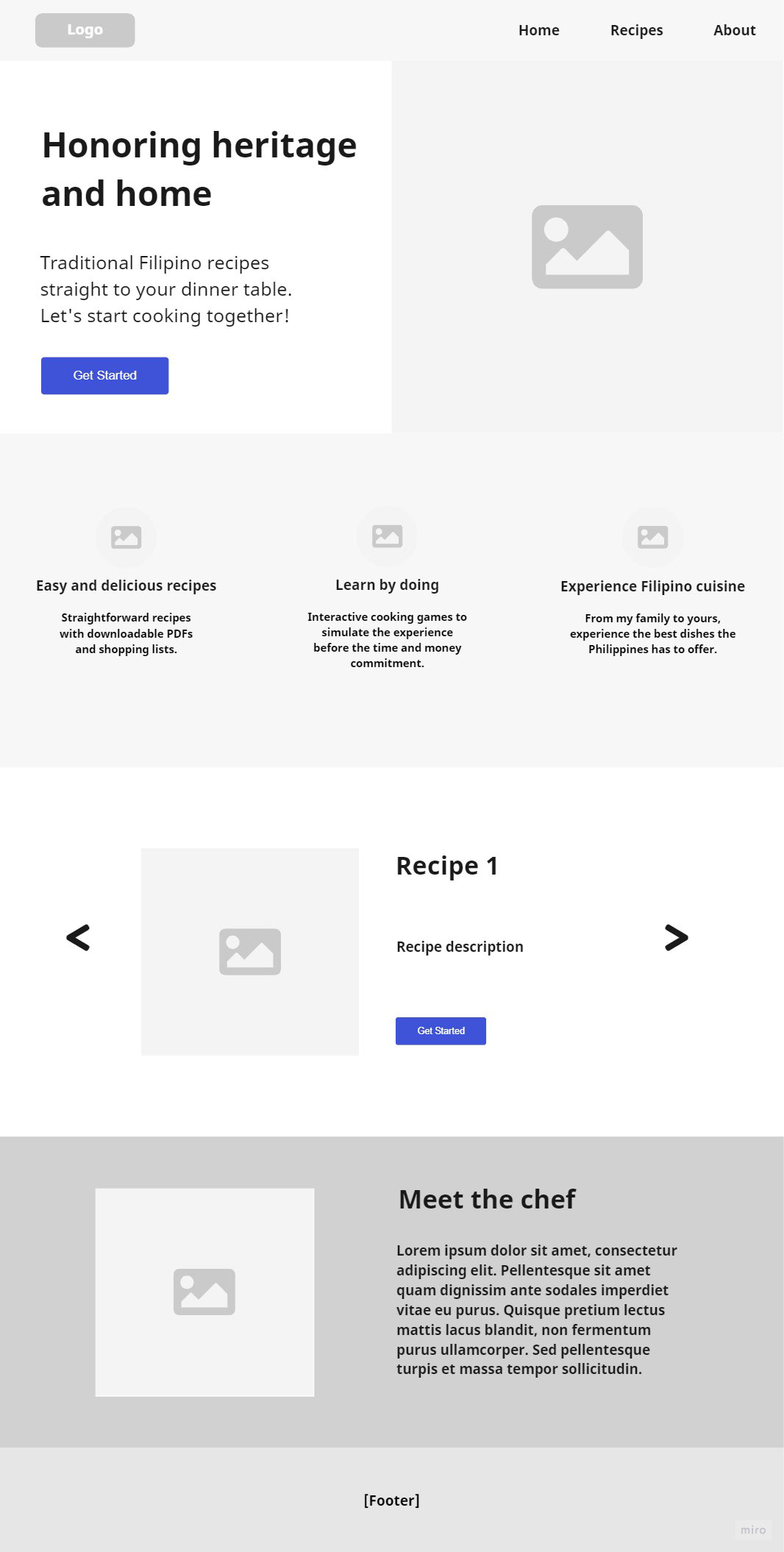
Home/landing page
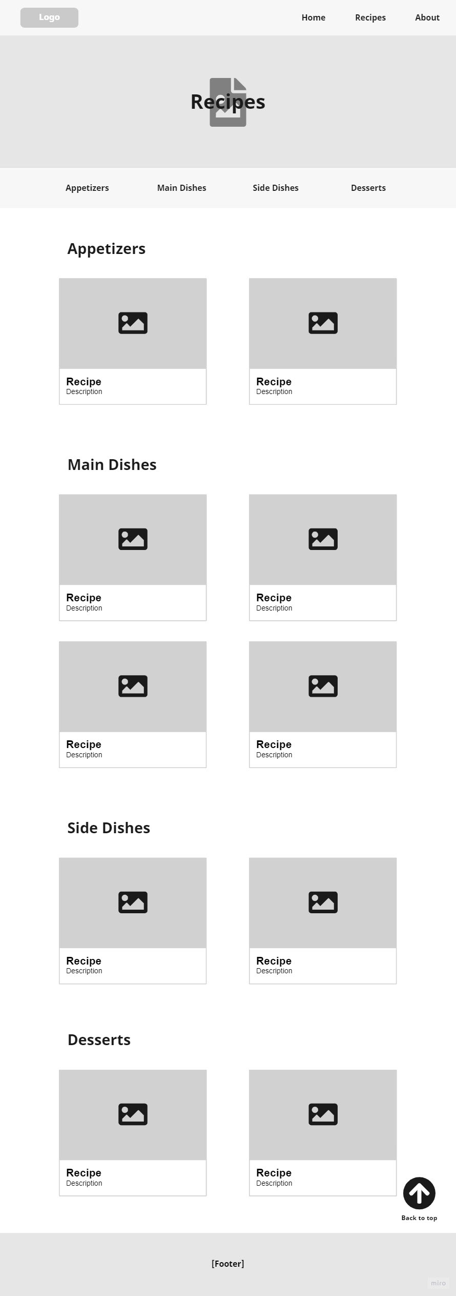
Recipe page
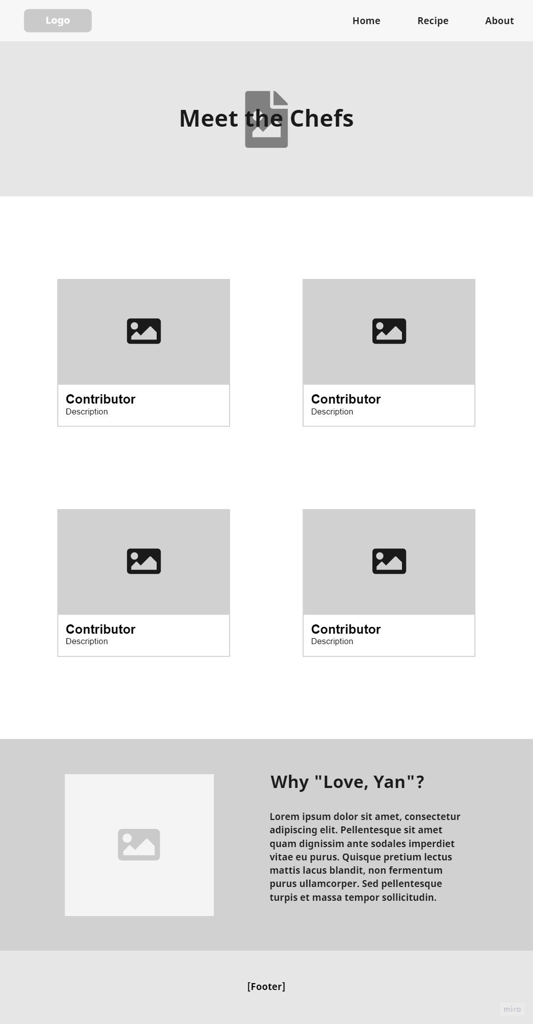
About the contributors page
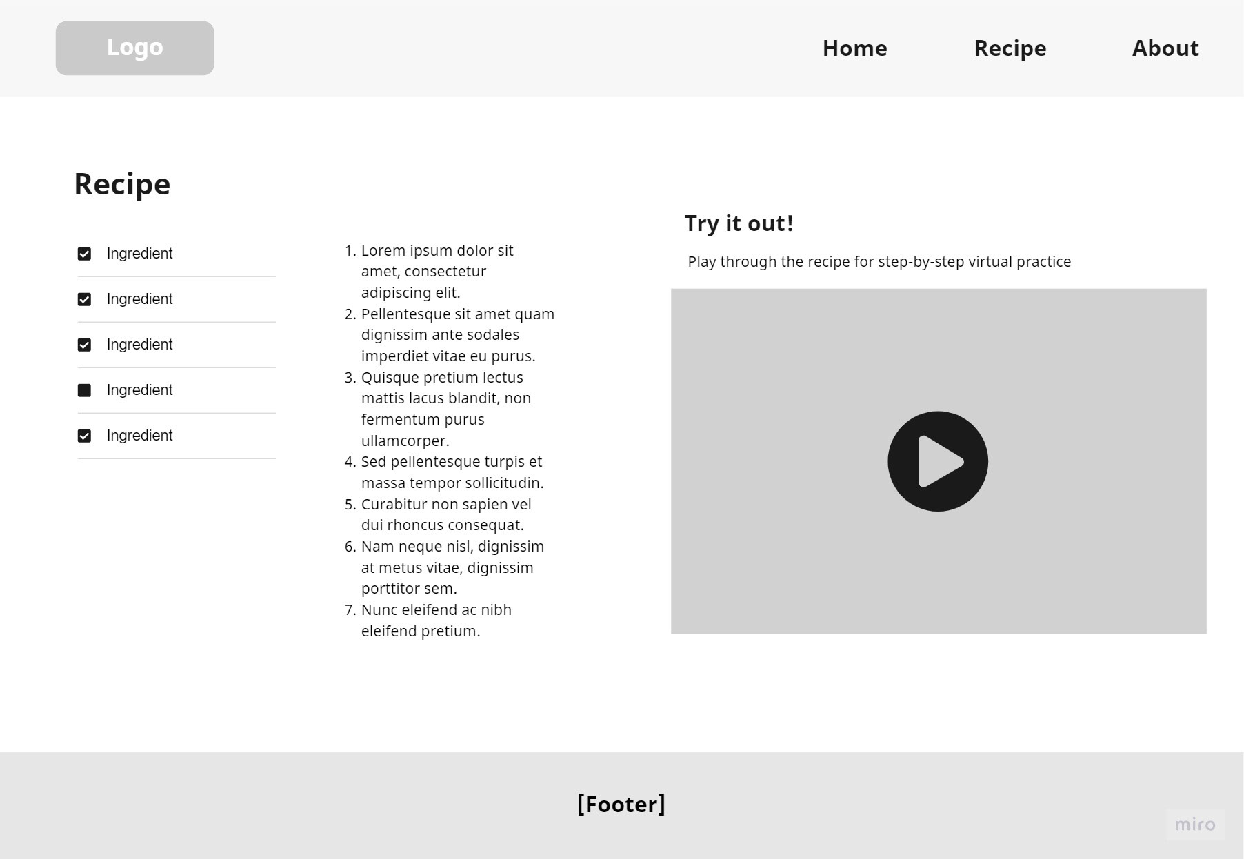
Individual recipe page
4. Design
Style guide:
To streamline writing the CSS of the site and creating the illustrations, a color palette and typography guide was created

Color palette
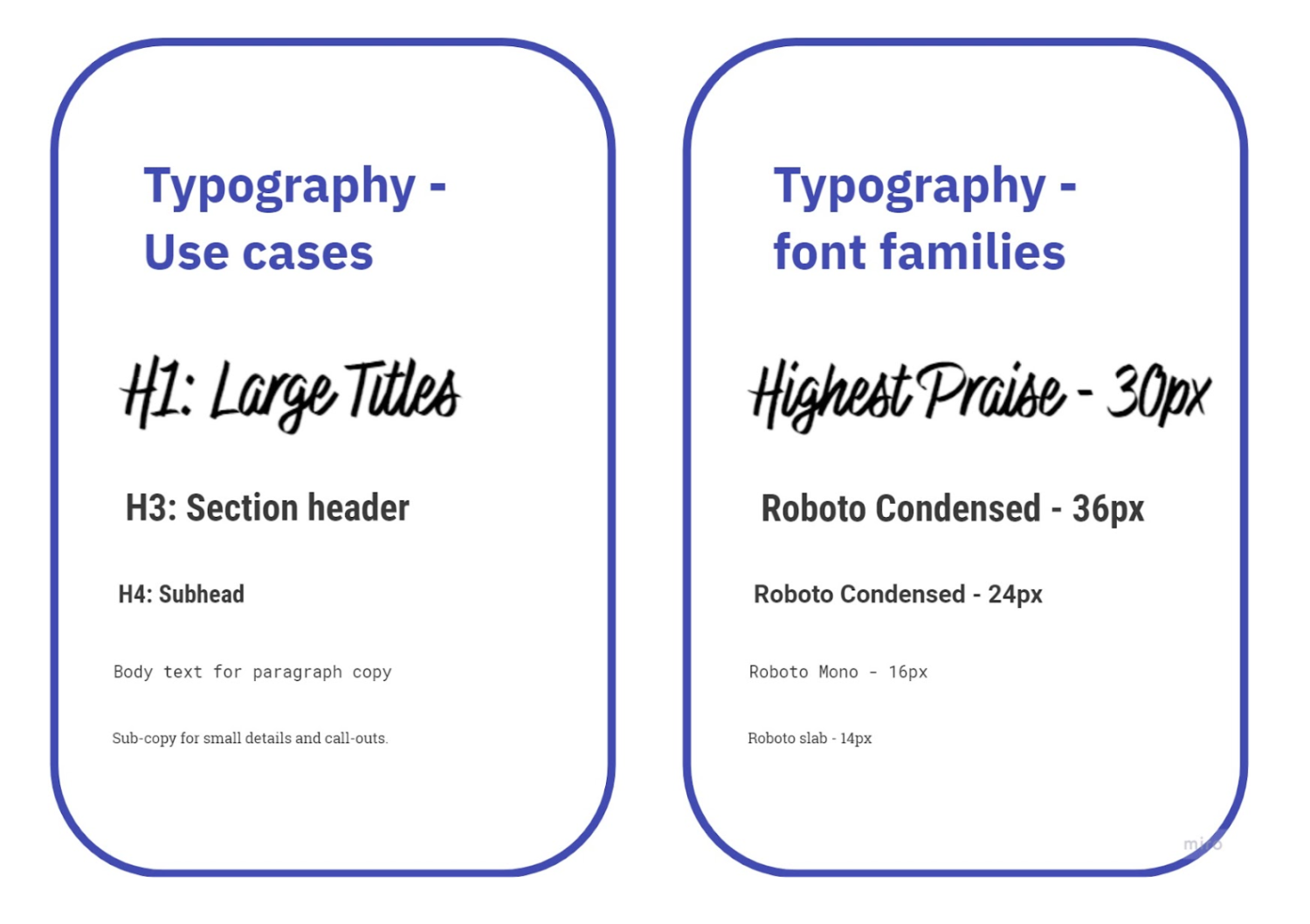
Typography guide
Visual assets:
Process: Paper or Procreate sketch → Adobe Illustrator
Illustrations made with the goal to illicit feelings of comfort, home, and simplicity.
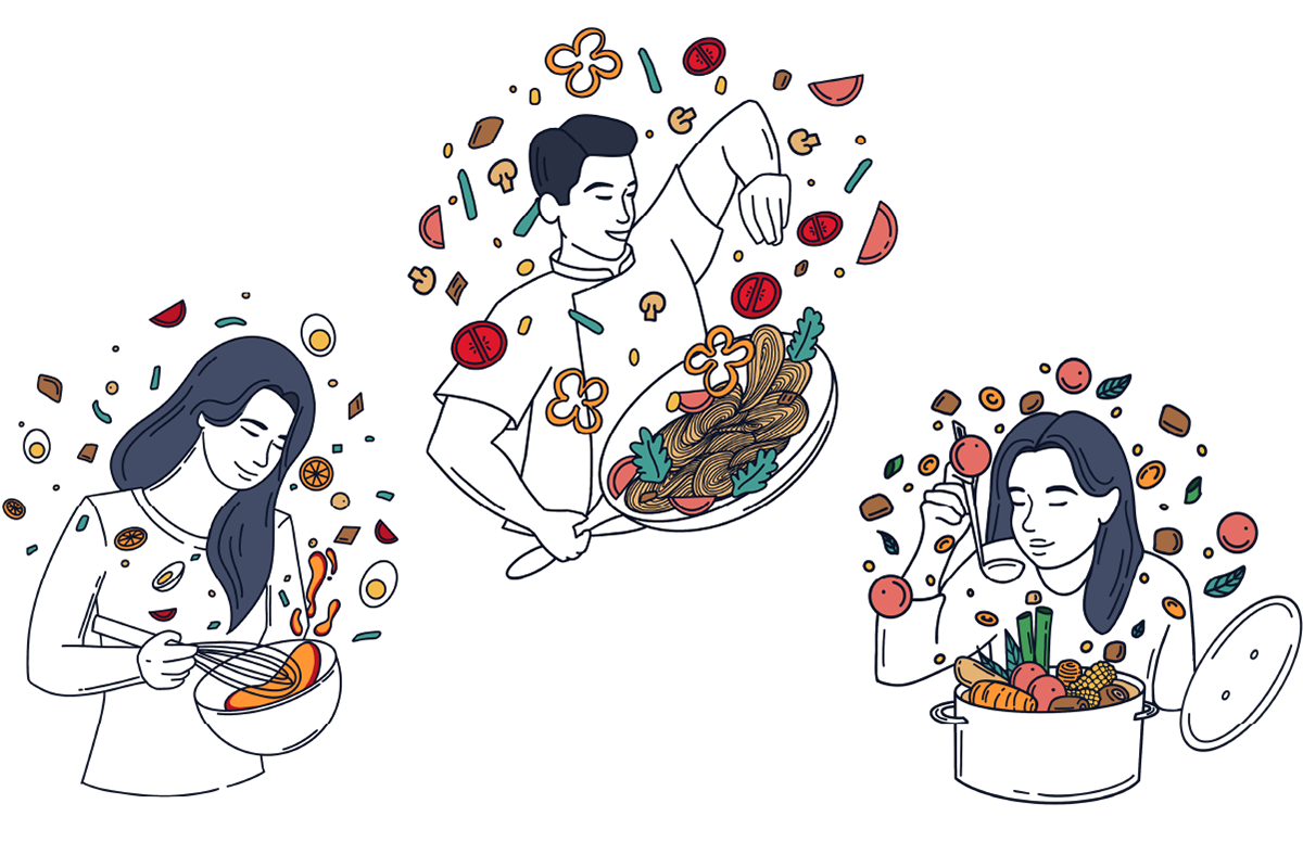
Contributor illustrations
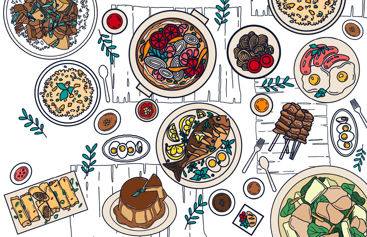
Hero image

Recipe header image 1

Recipe header image 2

Recipe header image 3

Recipe header image 4
5. Code
Click here to view my code: https://github.com/Alyannna/CW2
6. User testing
Think-aloud user testing: 2 sessions
User demographic info:
- 4 participants (3 males, 1 female)
- Age range: 17 - 55 years old
- Skill level: Novice - expert
Session A info:
- Participants were asked to pick a recipe as they browsed the site organically.
- Users were filmed for review later alongside live observation by me.
Session B info:
- Participants executed a recipe with the ingredients provided for them.
- Participants encouraged to speak their thoughts as I took notes.
- Encouraged to ask questions or voice confusion about the site aloud, but I was not answering their questions. I observed how they overcame problems to better understand how a user overcomes obstacles
This allowed me to gain qualitative data about features and test site functionality to see where the roadblocks were in the user flow, if certain features or copy were unclear, and if the site was an overall pleasing and engaging experience.
Feedback:
- Site looks well-designed and cohesive
- Interesting features of note: checklist on each recipe, downloadable PDFs of recipes and ingredients list
- Website should have a mobile version
- Click area of the food and text in the drag-and-drop game should be bigger
Final deliverable:
Reflection:
I learned:
- How to code a fully responsive website with unique site features such as a drag-and-drop game, checklists, downloadable PDFs, and more.
- Cohesive UI design for websites
If I had more time:
- Make it mobile-friendly (further research revealed most users would use this on mobile)
- Fix image compression with some of the graphics
- Refine the game element to be more visually complex.
I did not know how to code when starting this project. I was extremely ambitious with my goals, considering the deadline and the fact I had to self-teach myself a lot of basic skills. And I believe my ambition paid off as I have a website I am proud of.
