
Duration
4 weeks
Tools
Adobe Illustrator
Procreate
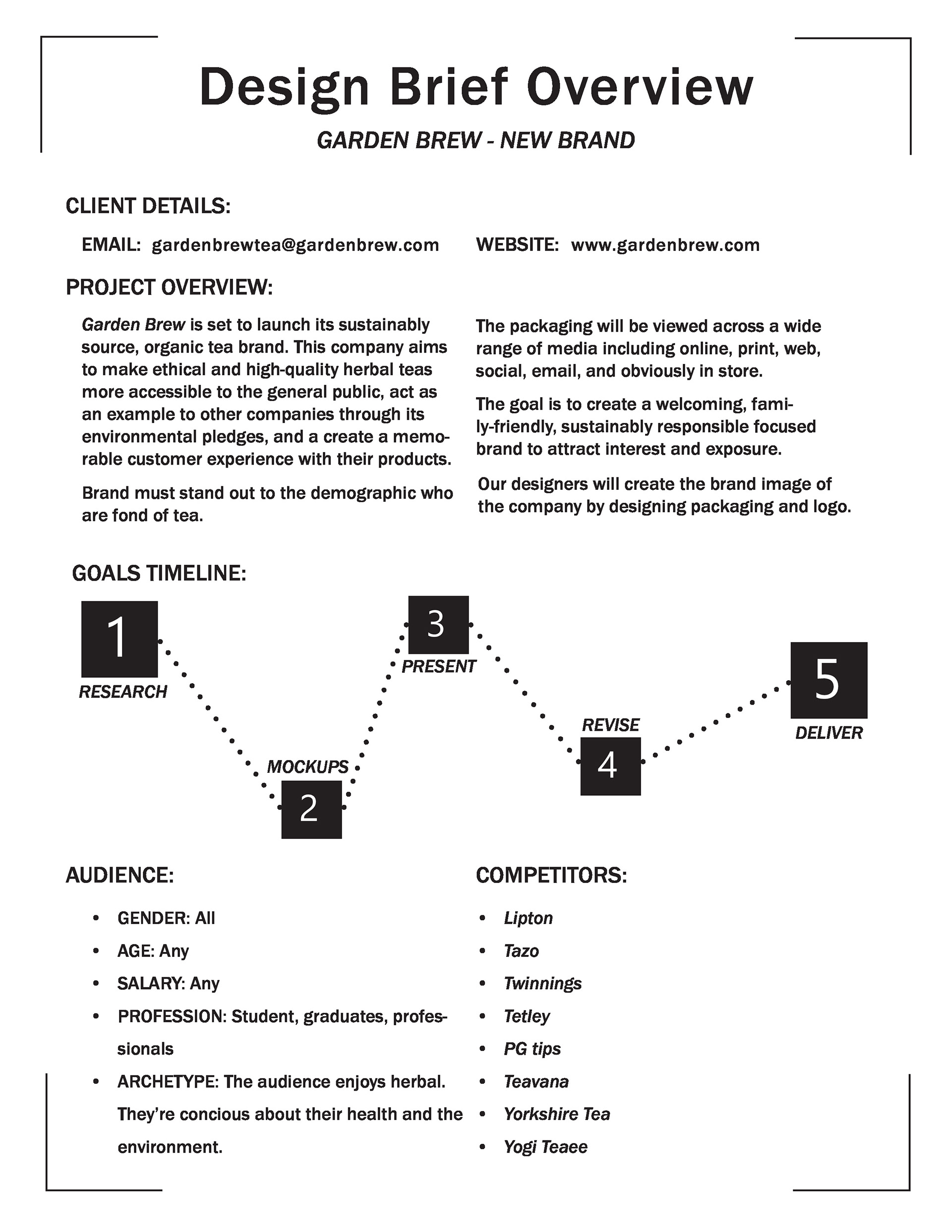
Project brief
Create the brand identity for a new tea company with a focus on developing the packaging.
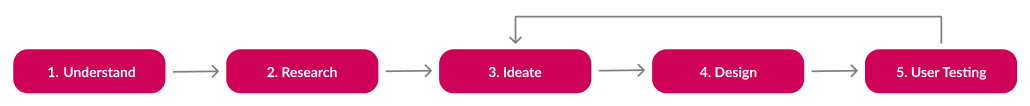
1. Understand
. . . the challenge
Research and conceptualize a new brand identity that will make an impact in a highly saturated market. Complete it with the packaging design of their first product.
. . . the constraints
Limited resources for testing: the goals for testing were difficult to achieve without enough participants and testing environment
2. Research
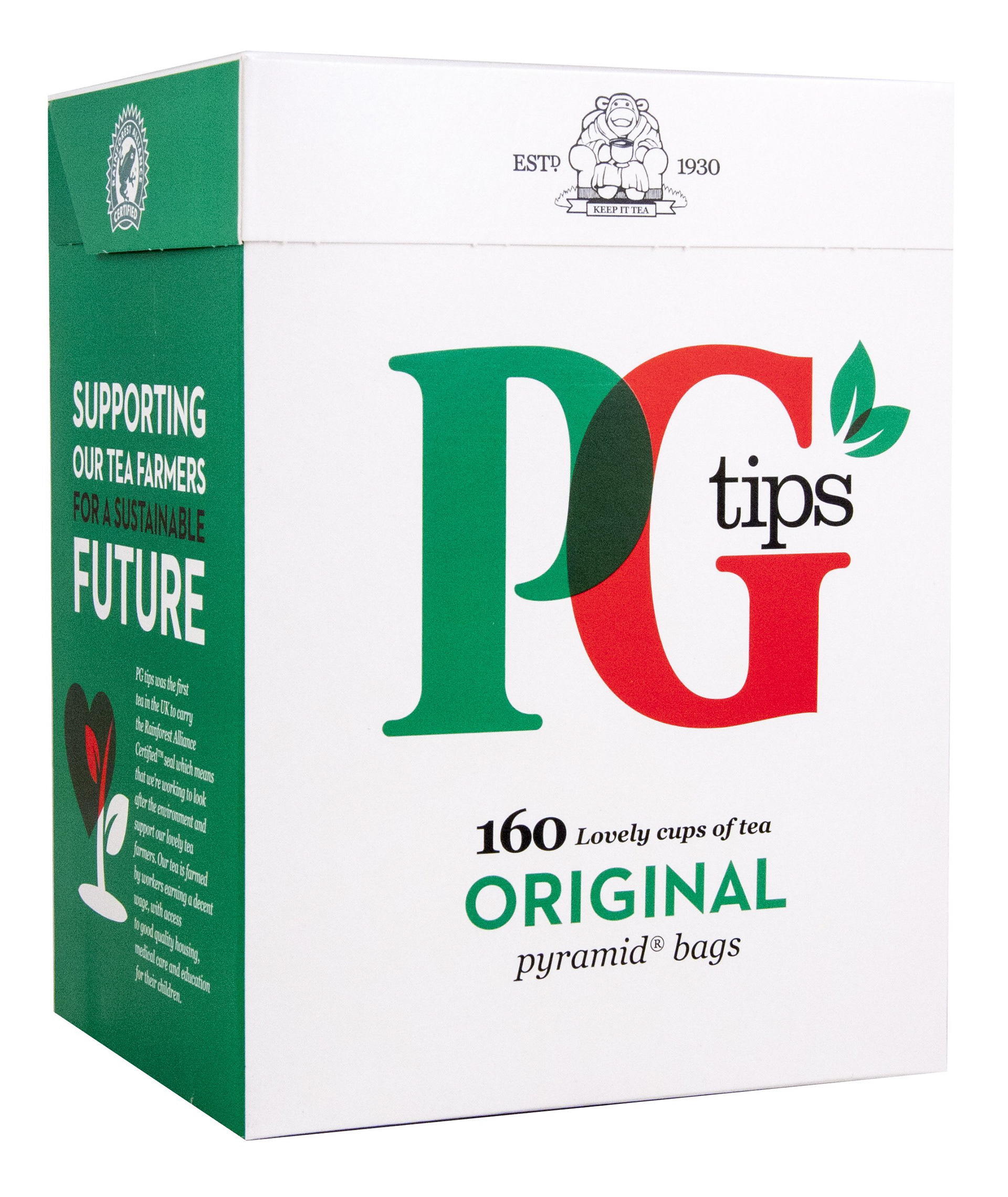
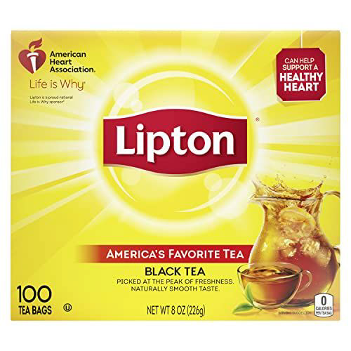
Competitive analysis:
I visited several grocery stores and looked at the tea brands they had to understand what other brands were doing in terms of design and ads.
Key insights:
- Most competition had simplistic, yet professional looking packaging
- Emphasis of the packaging was on the logo.
Creating a formal project brief:
I created a formal project brief document to give an easy, 1-page summary of the client, project parameters, and any info relating to the project.
3. Ideate
Brainstorm sketches and conversations:
I brainstormed 20+ different logo and packaging ideas to present and discuss with my client.
A few of the latter ones that helped narrow down the final design are pictured.
Using my research:
- Since most tea brands seemed to focus on logo/brand recognition, I decided to focus on flavors to appeal to customers taste buds instead of brand familiarity since "Garden Brew" is a new, unrecognizable brand.

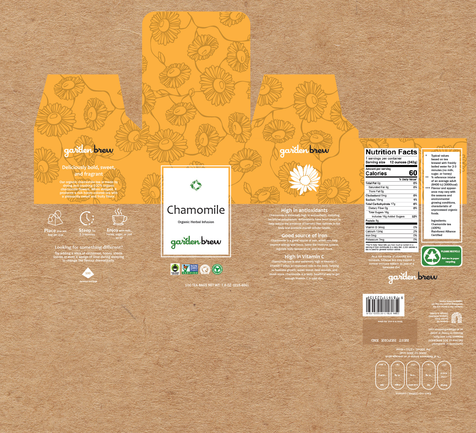
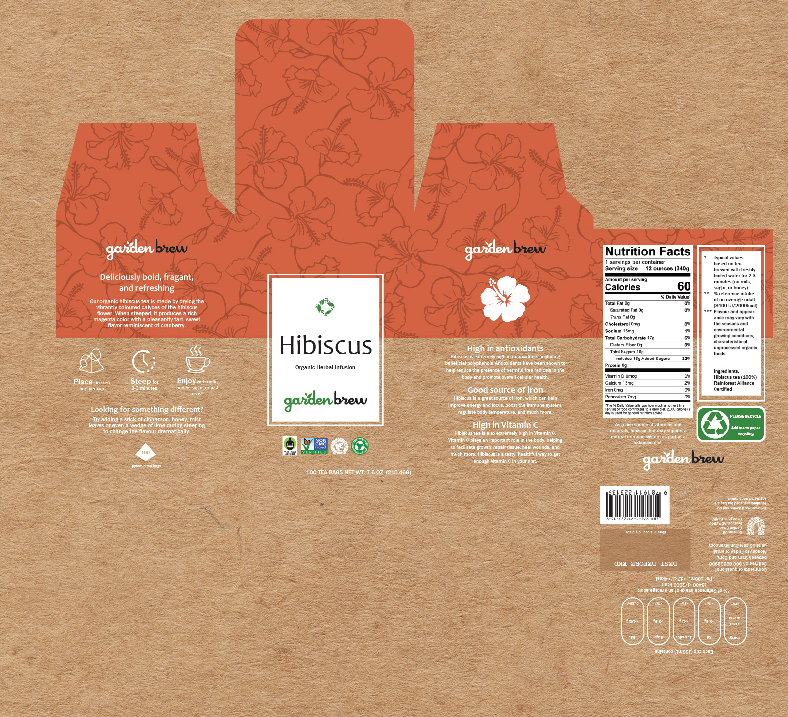
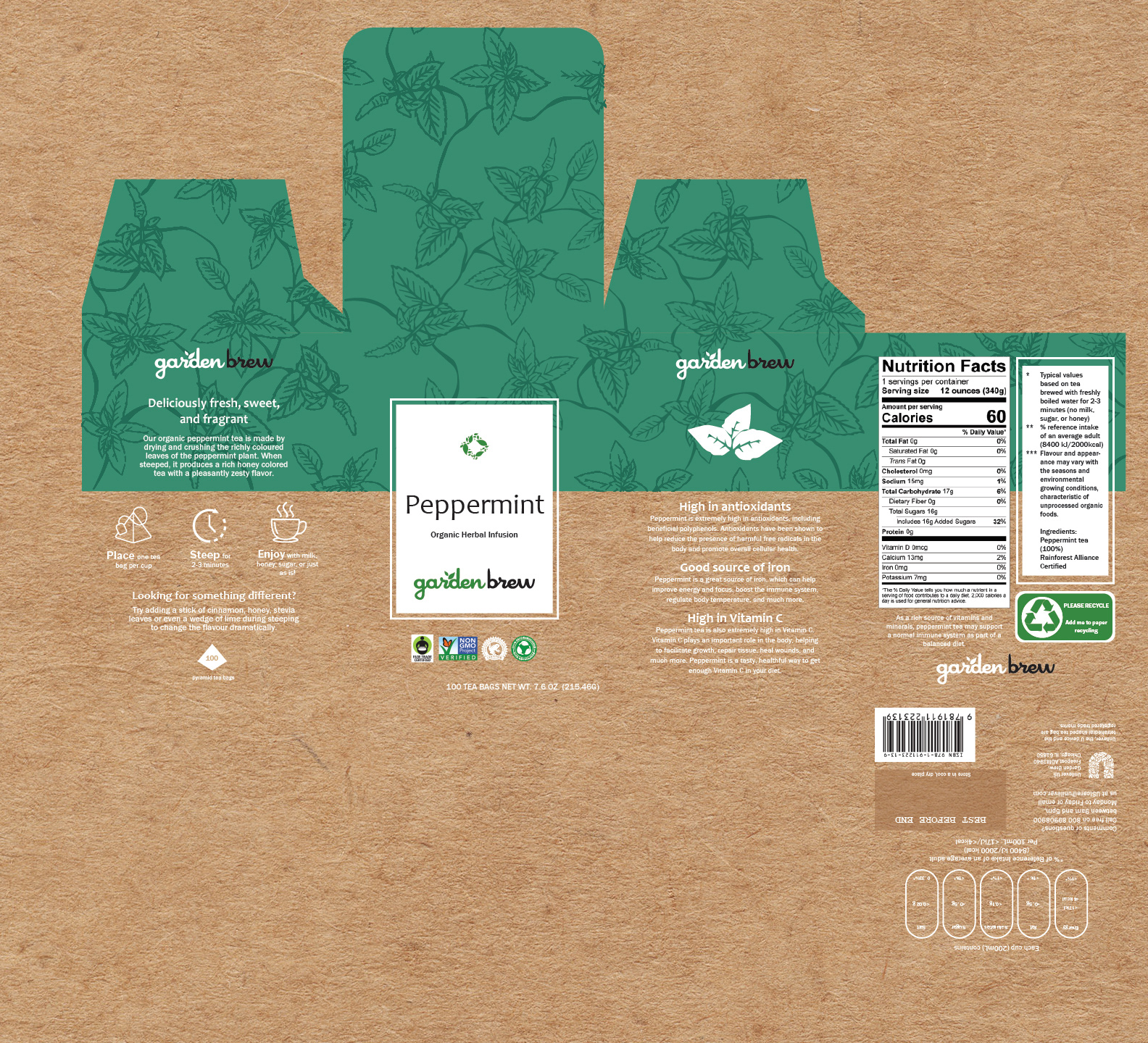
Packaging concept

Packaging concept

Packaging concept
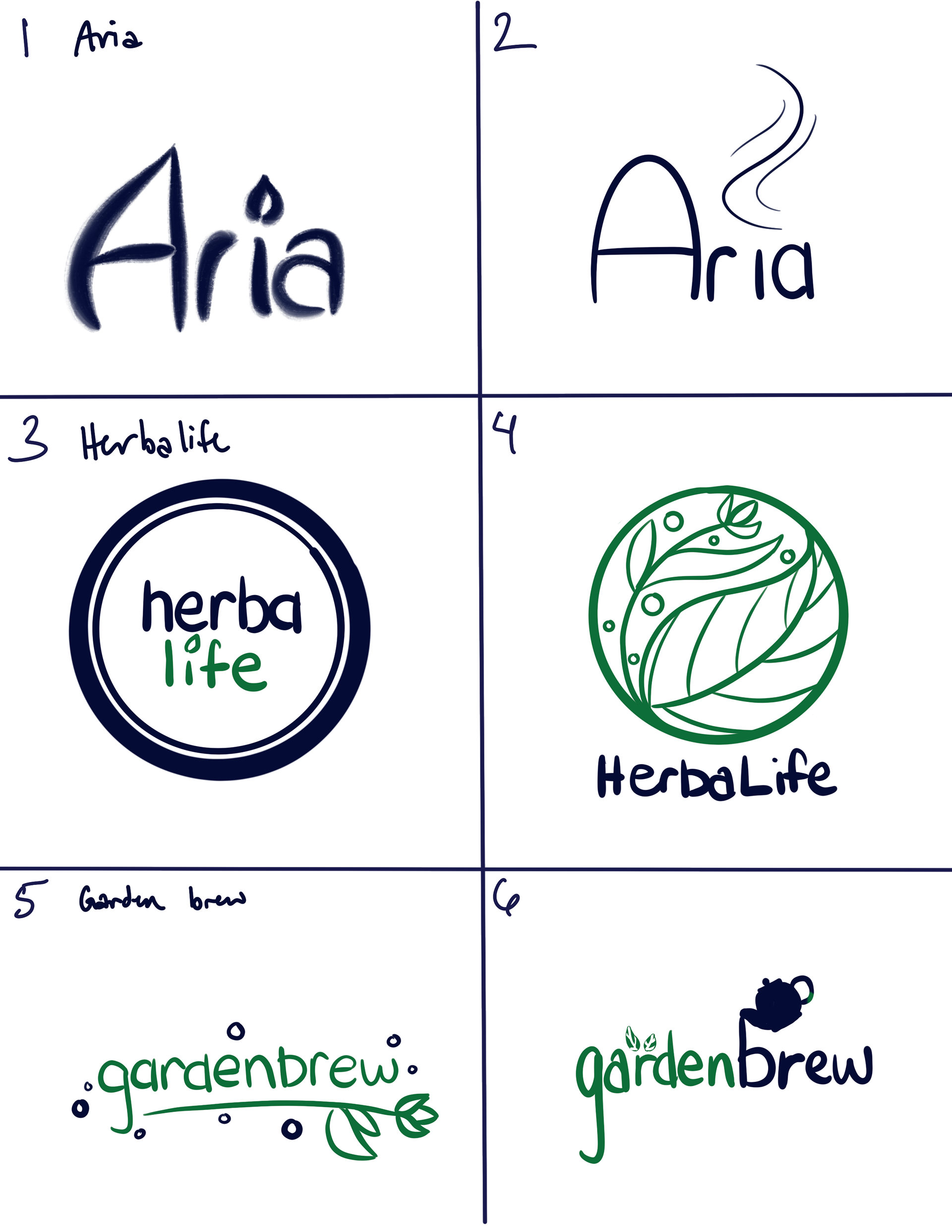
Logo ideation
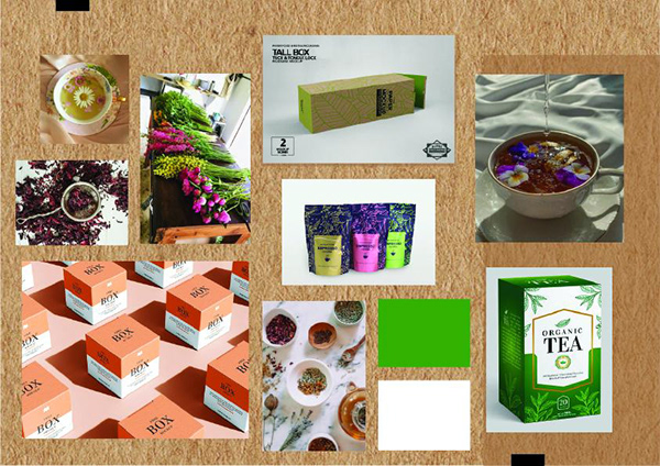
Moodboard:
I created a moodboard to cement the style and feel of the brand, collect packaging inspiration, plus explore potential colors.
4. Design
Logo creation:
Final logo was picked by the client
Old (top picture) versus new (bottom pictures)
5. User testing
Directed study:
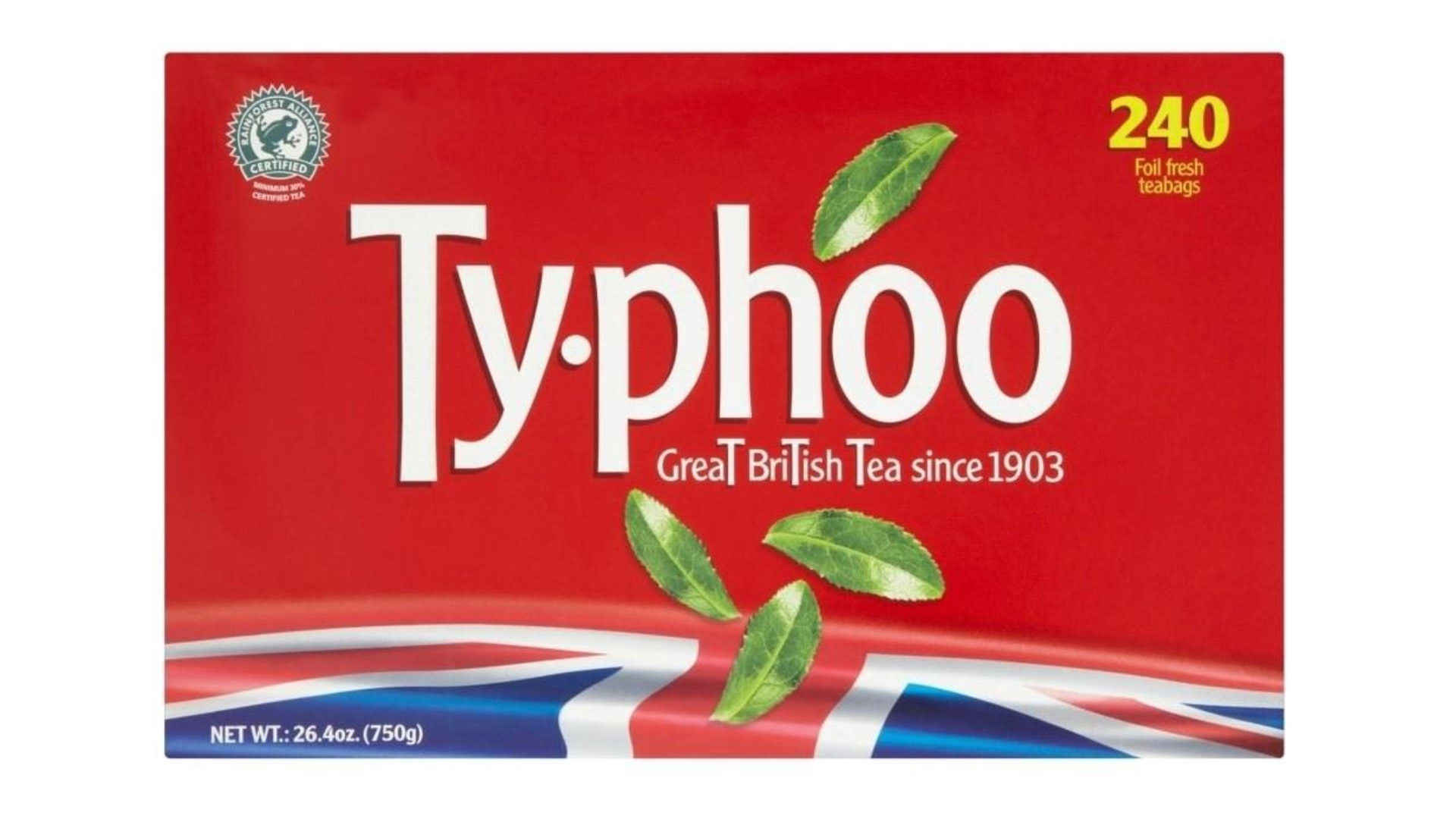
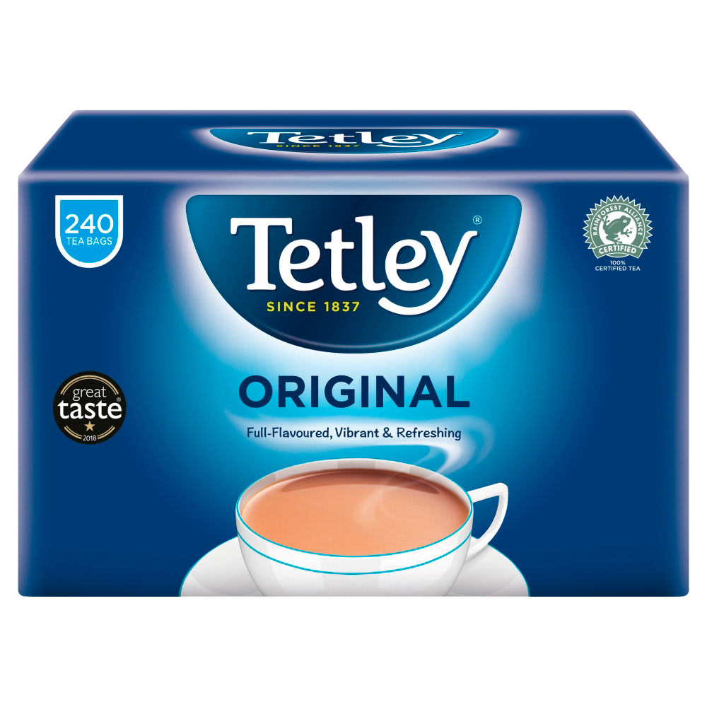
A cardboard prototype was made and placed alongside 3 other UK tea box brands.
Participants had to judge each box and decide which tea box they would actually purchase.
To remove bias in brand familiarity, US participants were used.
Feedback:
- Approx. 50% of participants chose Garden Brew
- Many stated the new cards looked eye-catching and used adjectives that fulfilled the design objective of being "homely and natural"
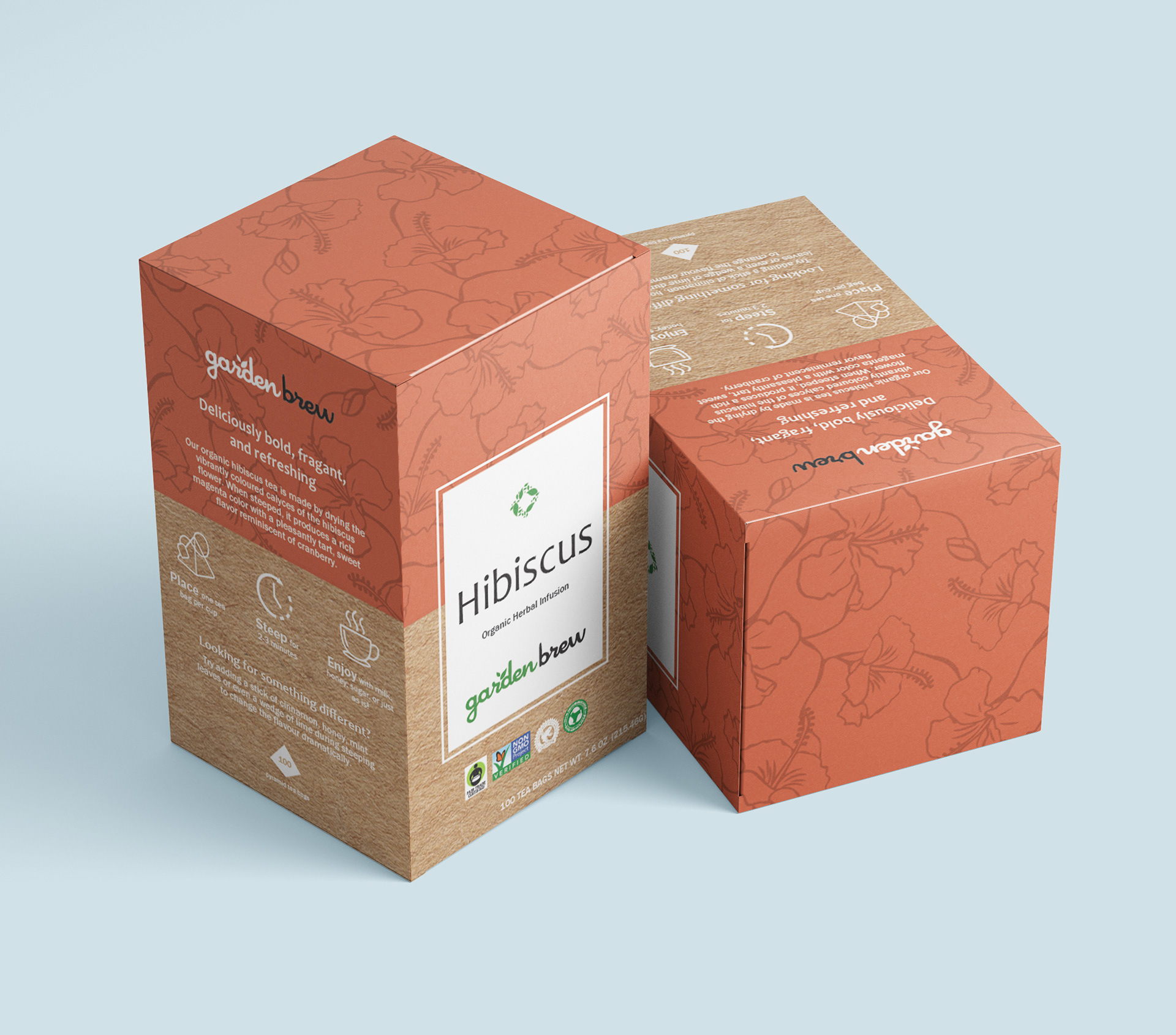
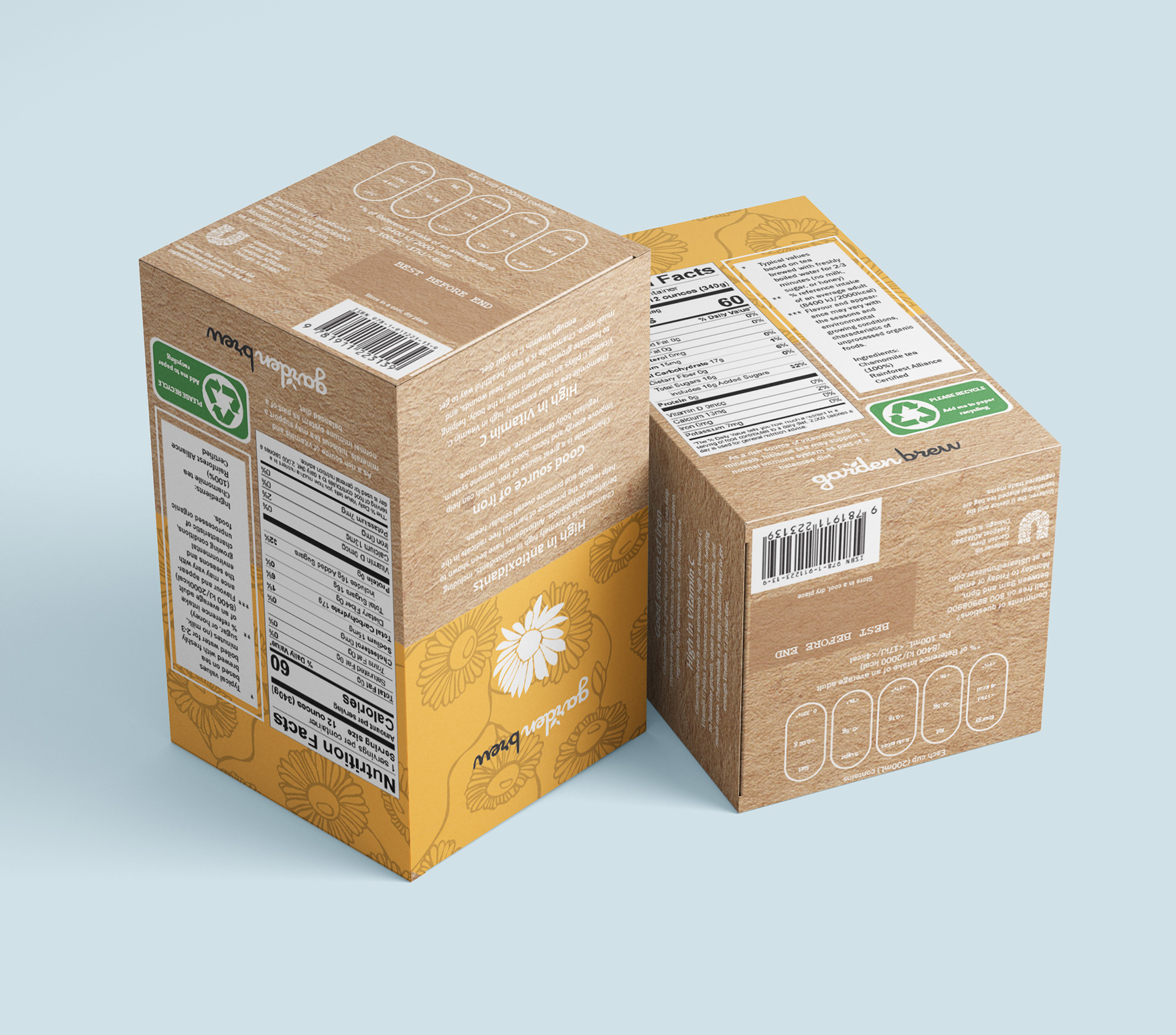
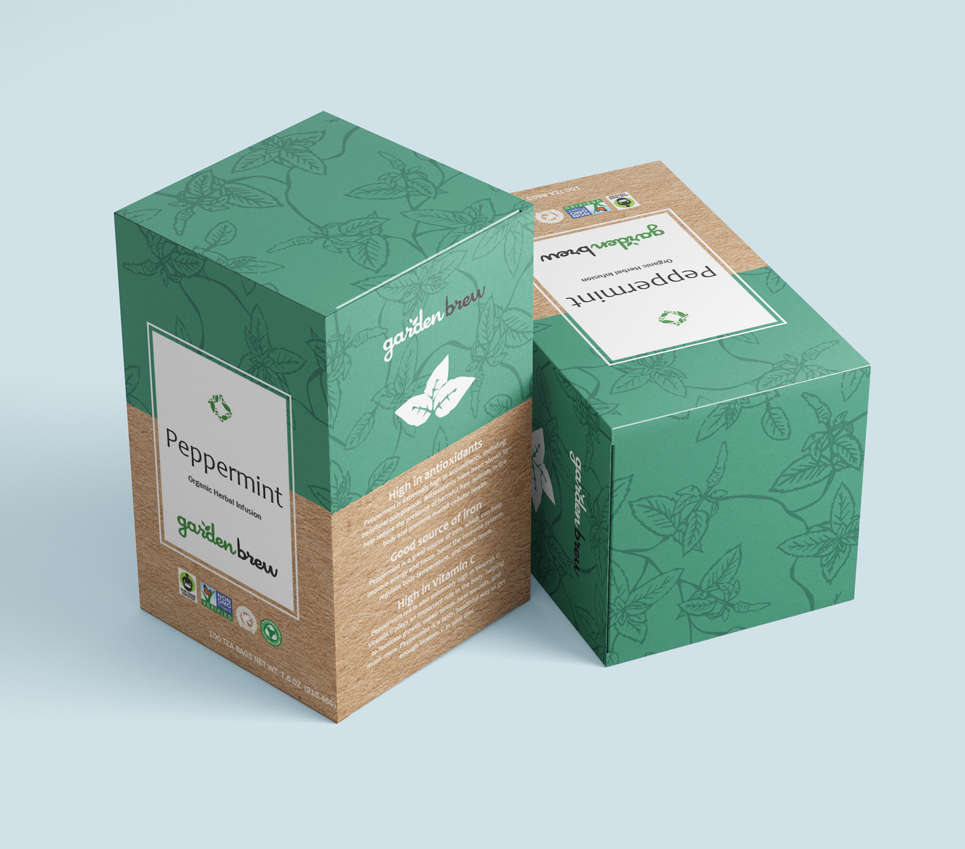
Final deliverable:

Reflection:
I'm very satisfied with the final design knowing that its backed by user research and testing. I believe it accomplishes the aesthetic I was going for, but maintains a professional look. I learned a lot about strategic design placement, translating digital designs to physical products, CMYK color printing, and effective marketing.
If I had more time, I would complete the branding package of the company by designing mockups of social media and posts, merchandise, and in-store advertisements.