
Duration
8 weeks
Tools
Adobe Illustrator
Project brief
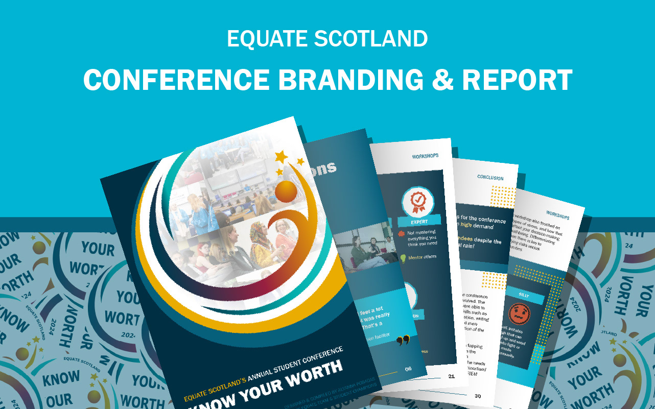
Client is commissioning a conference logo that also works for merchandise design, and a conference report.
For the logo, they wanted it to be inspiring, inclusive, and playful.
For the report, they wanted lots of visualisation diagrams and photos, and NOT to be text-heavy.
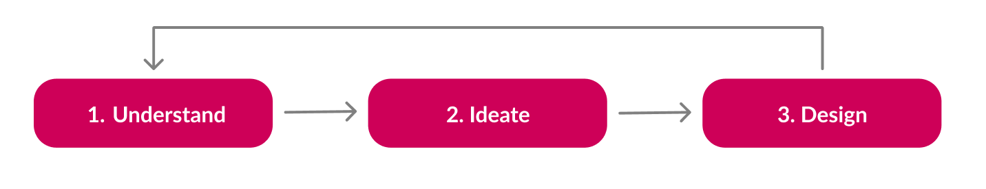
1. Understand
. . . the client
To deliver the best customer experience and ensure the work was accurate to the client's needs, I provided regular email updates on the work.
What I discovered:
- My initial approach was incorrect. Feedback from the first review revealed they wanted more visualisation and pictures, and less text.
. . . the constraints
Existing photos: No communication with the photographer to ensure a suitable variety of photos of the events and attendees.
2. Ideate
Logo design meetings:
Sketches
Met with Equate's Staff and Student Champions to get feedback on the logo sketches
Digital Drafts
The top 6 logos chosen were finalised into digital drafts in multiple color modes
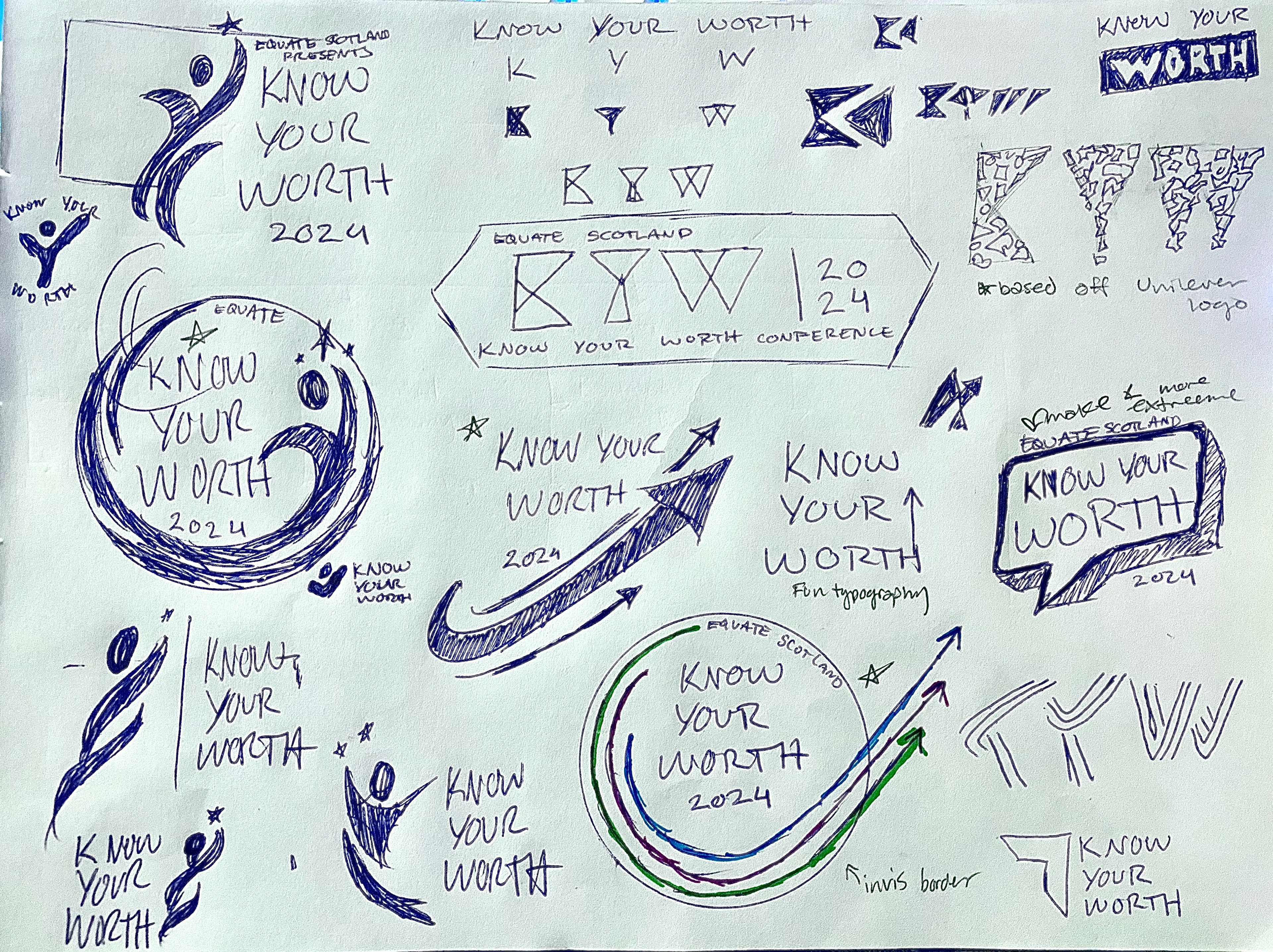
Logo sketches
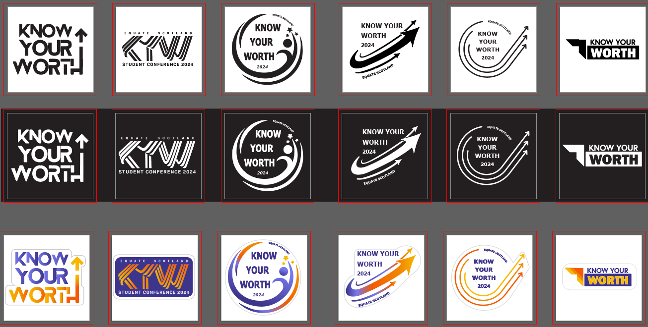
Digital drafts of the favorite sketches (black on white, white on black, and full color)
Initial ideas for the cover:
4 separate covers, with different design directions, were created to:
- gauge the client's preferences
- decide on the design direction based on the cover chosen
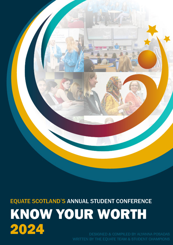
COVER DRAFT 1 - Chosen by client
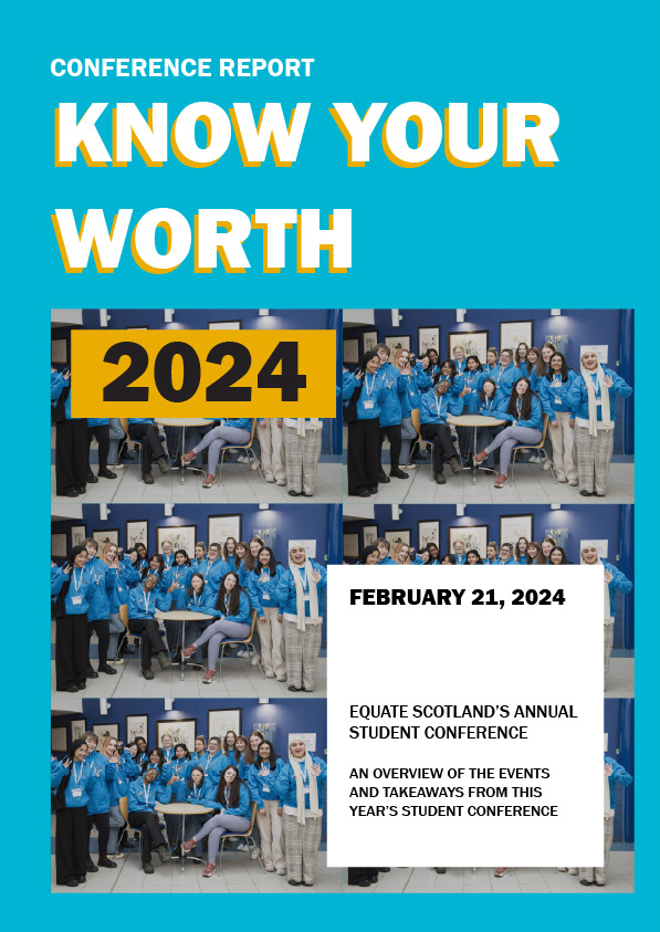
COVER DRAFT 2
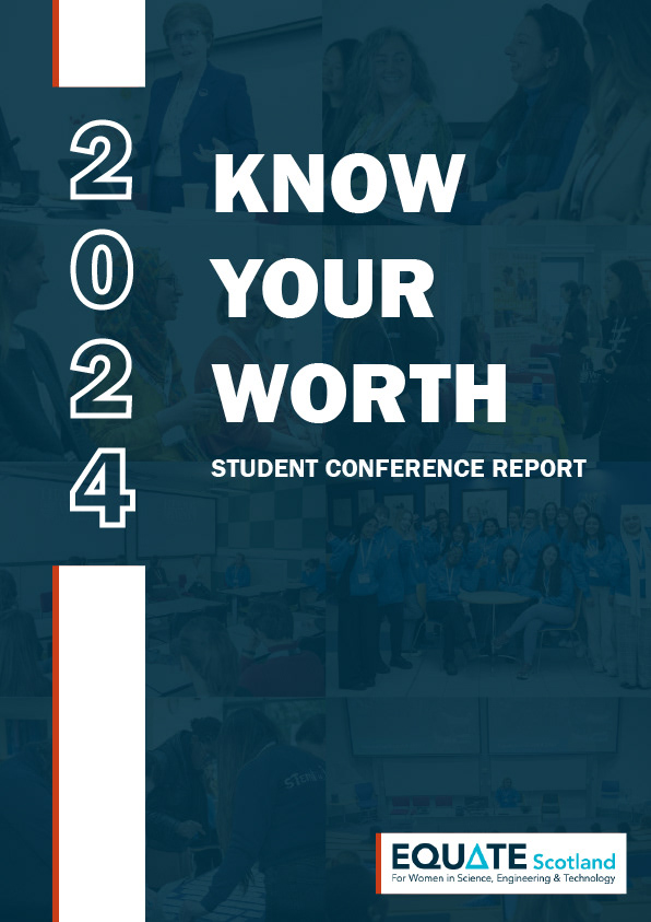
COVER DRAFT 3
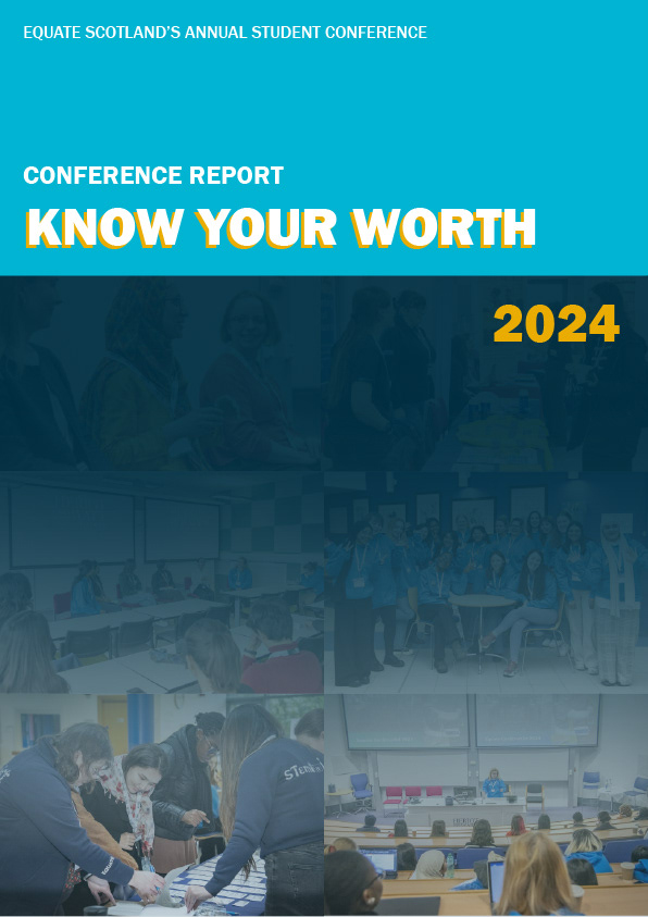
COVER DRAFT 4
3. Final Designs
Conference report:
- Feedback: Pleased about the visuals, good balance of text-content and images/visuals
- Feedback: clients and attendees loved the logo, and that it was available as stickers.
- Reused in many conference design materials
Hoodies with conference logo:
- Feedback: Staff loved the hoodies.
- Stayed within budget by reusing the conference logo and keeping the design placement small
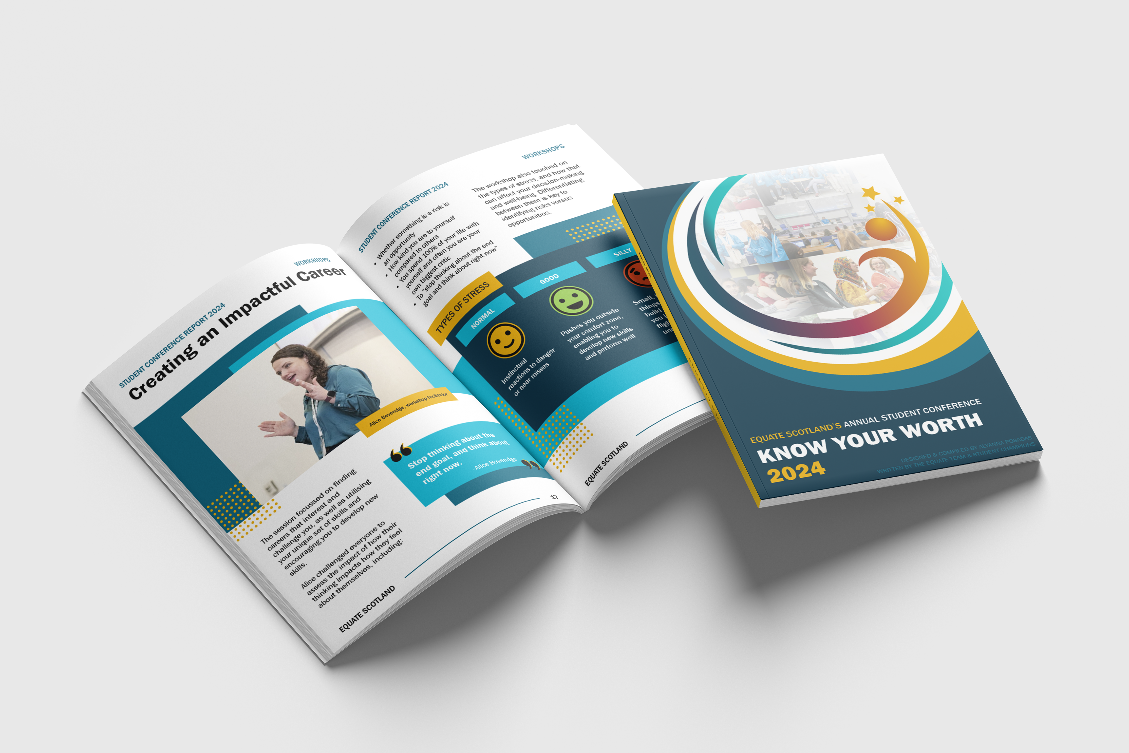
Conference report
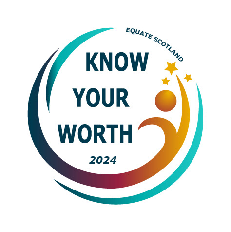
Conference logo and sticker
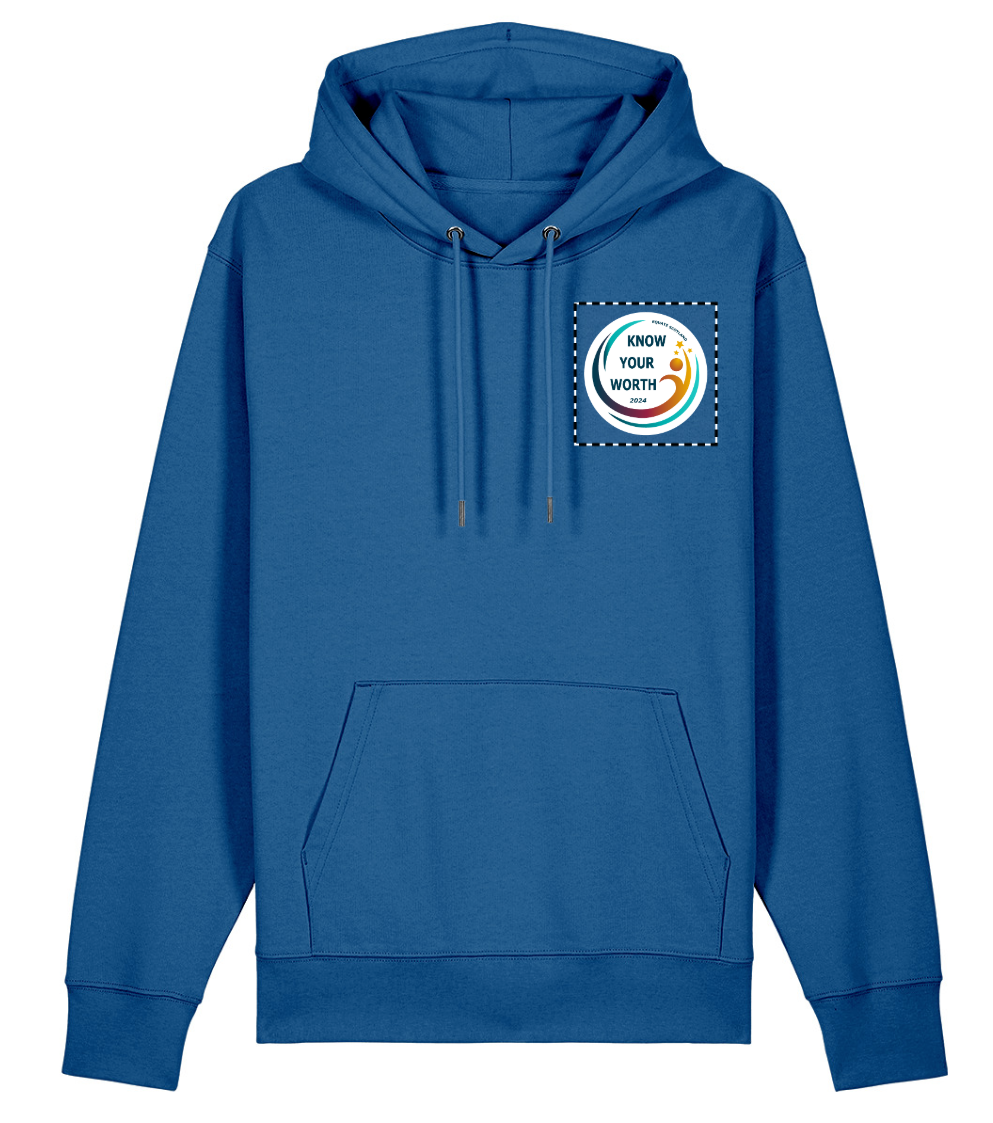
Mockup of sweatshirt
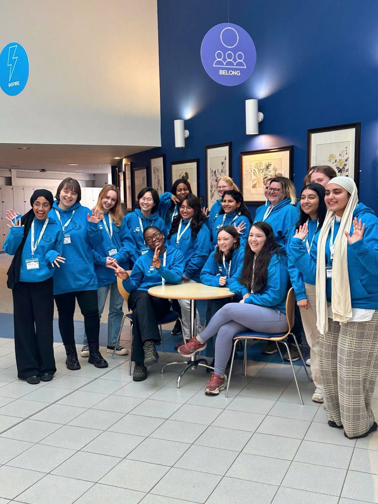
Event staff wearing the hoodies
Reflection:
I learned:
- Time management balancing multiple priorities
- Exploring more visually creative designs while maintaining a professional corporate standard
- Effective prioritisation of features under high stress and pressure
- Balancing project budgets. Lots of merchandise was planned, had to reduce it due to budget.
What I would change:
- Request from photographer variety in the photographs of the events and attendees captured
Overall, I'm extremely pleased with the outcome of this project. I was privileged to have clients who were clear and communicative, allowed me freedom to express my creativity, and a flexible timeline.
My biggest takeaway is that when opportunities like this arise, to use it to push past expectations and try new things.