Testimonial
"From the very start, I was very impressed with Alyanna’s professionalism on the CD project. She had a very clear plan about how the work would get done. In terms of the process, from my perspective, she did everything right. She listened well to my ideas and concepts relating to the project, and based on that, sketched out a series of various rough designs so that I could pick the direction from there.
After that, the execution went very smoothy, where adjustments and fine tunings were turned out rapidly. She was also sensitive to my priorities in terms of which parts of the project I cared a lot about, and which parts I was less picky about, and aligned time and effort spent to match those priorities.
She did a great job!"
- James Schneider
Duration
12 weeks
Tools
Adobe InDesign
Adobe Illustrator
Adobe Photoshop
Project brief
Client is releasing their first album and wants a personalized CD and album sleeve.
They want a retro, American, early 1960s vibe to match the style of music of the album. They also wanted to add many personal details such as their daughter's artwork featured on the album cover and dog illustrations similar to their own dog.
1. Understand
. . . the client
To deliver the best customer experience and ensure the work was accurate to the client's needs, I had dozens of emails and Zoom meetings to discuss the project and bounce ideas back and forth.
What I discovered:
- The project is very personal and is an homage to their 35+ years as a hobbyist musician. Every design element had meaning to the client.
- Insisted on a CD and paper album sleeve as its nostalgic to them
. . . the constraints
Strict budget: the budget affected the level of complexity of the materials
Existing artwork: Design is based around my client's daughter's artwork
2. Ideate
Design meetings:
Workspace presented to client during some of the first design meetings.
Benefit of the live Zoom meetings:
- Can discuss and mockup changes quickly and easily
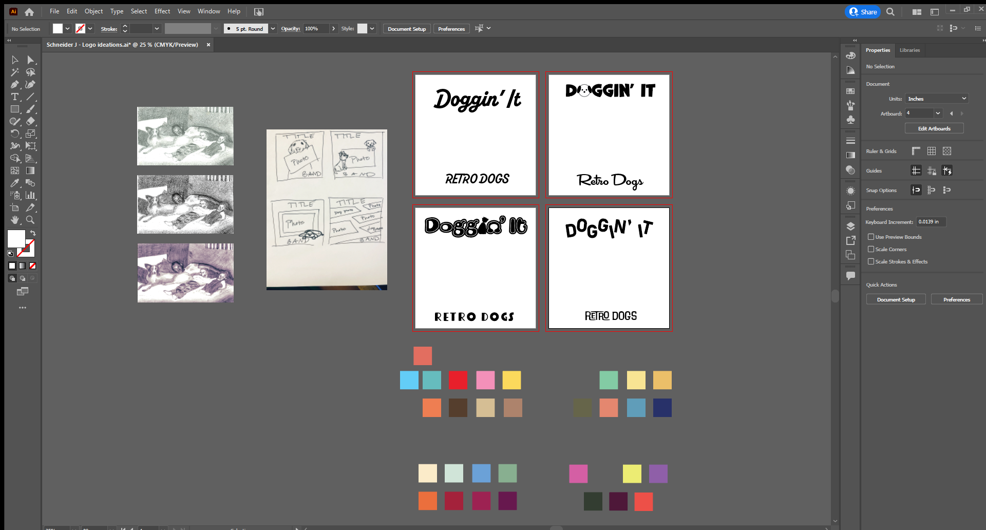
Left to right: Photoshopped versions of client's daughter's artwork, album cover sketches, font and layout considerations for the album cover, potential color palettes
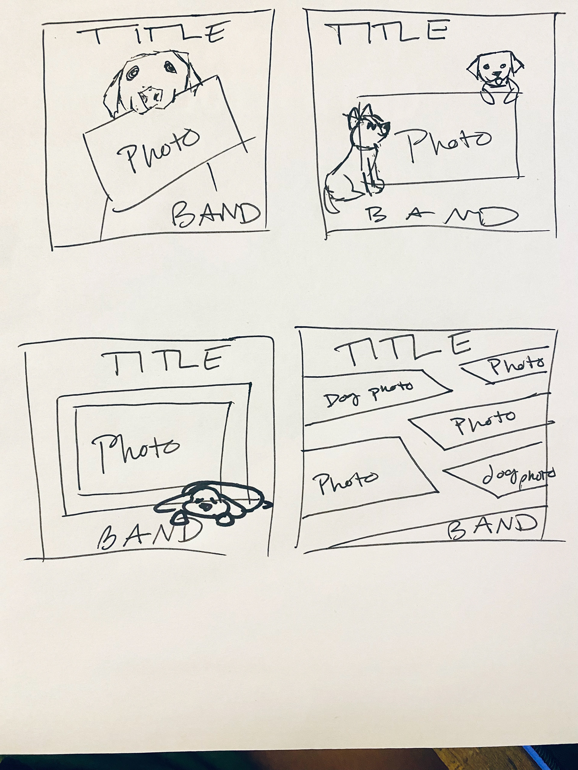
Album cover sketches - close up
Client-supplied materials:
Client provided the graphite drawing of his daughter's artwork to act as the feature on the album cover
Client also created and supplied a mood board to better communicate the theme he was after
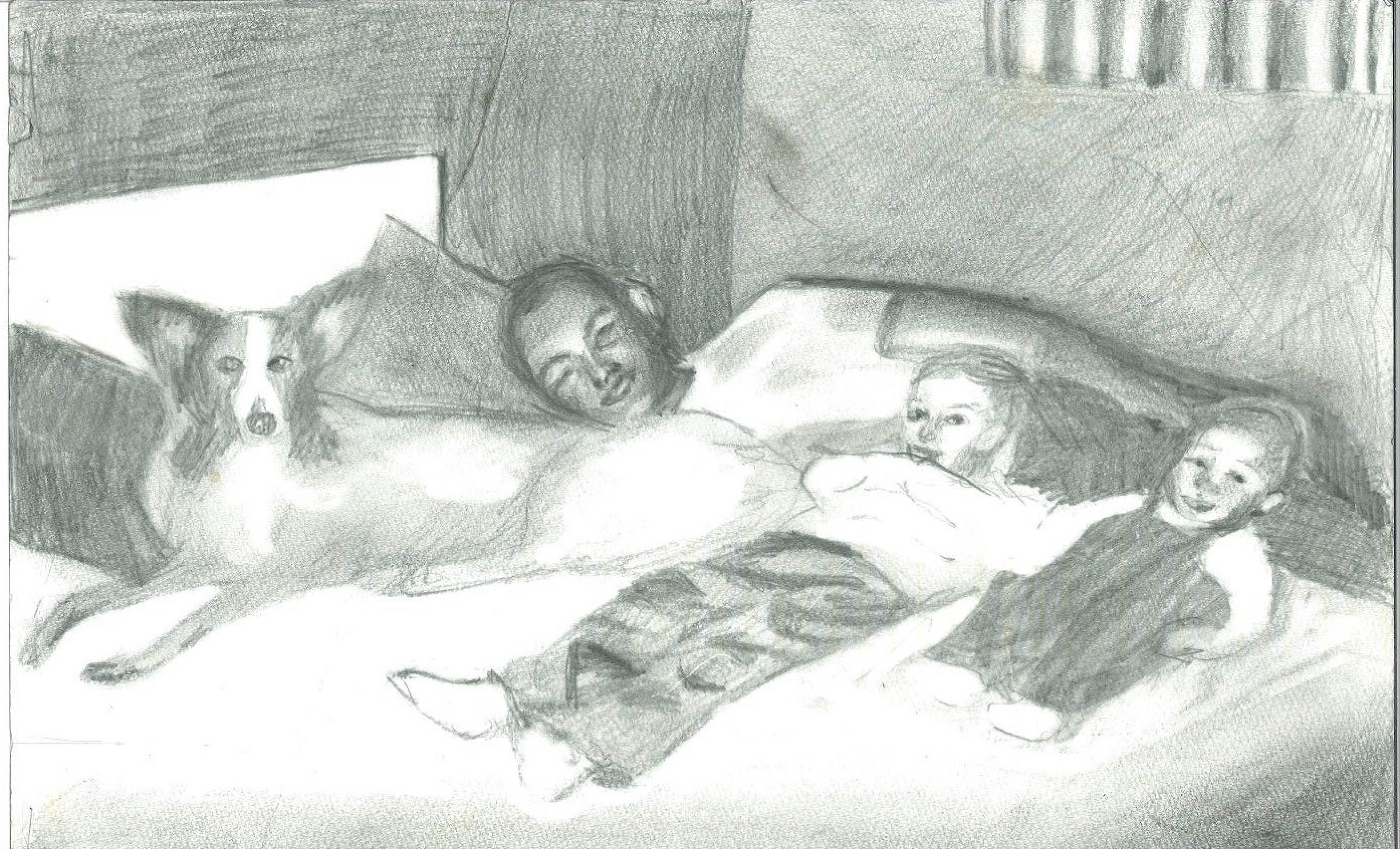
Client's daughter's artwork
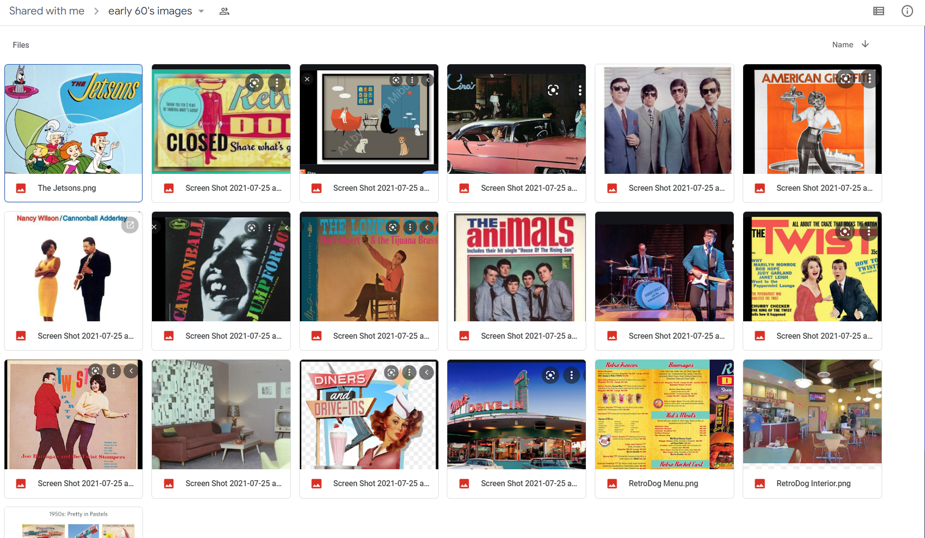
Mood board created by client
3. Design
Design considerations per clients request:
- Created dog line art as an homage to the dogs from his childhood
- Blue, green, salmon are the featured colors because they're his favorites and match the 1960s vibe
- Polaroid style frames of the real photos to further portray the retro aesthetic
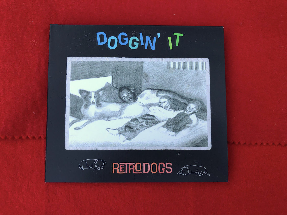
Album cover
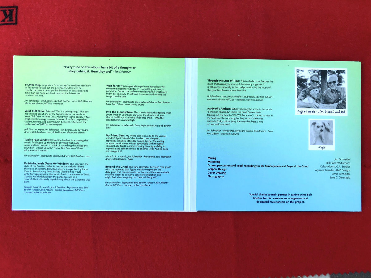
Inside the album
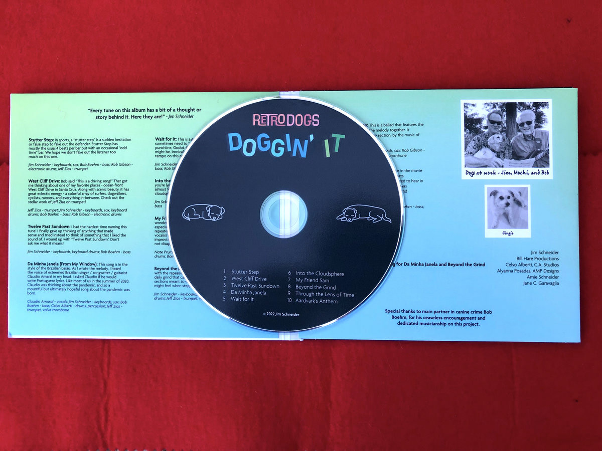
CD and album
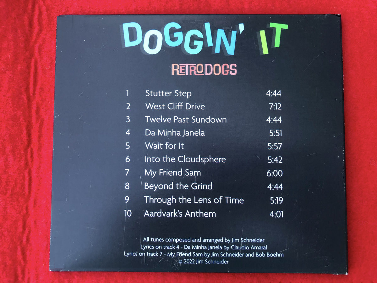
Back of the album
Reflection:
Jim initially came to me for just the album cover. But overtime he continued to contact me to eventually design the entire album and CD. I really enjoyed this project as it was something completely new to me.
I learned so much about delivering files for print (and different types of print like a CD versus a paper album), long-term client relations, managing project timelines, and meeting client expectations.
