
Duration
12 weeks
Tools
Figma
Adobe Illustrator
Procreate
Excel
Miro
Problem
Budgeting is a key skill that can be time-consuming, complicated. and stressful.
Many budgeting and banking mobile apps still struggle to meet Web Content Accessibility guidelines (WCAG).
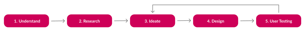
1. Understand
. . . the problem
To whittle down the problem to its core and gain focus, I wrote down all the expectations, assumptions, open questions, and ideas I could think of. This allowed three main things:
- A better understanding of my audience: people who are budgeting novices and want to learn
- Guiding questions for my research and what success for this project looks like
- More innovative ideas as the obvious ones were quickly discovered and dismissed
. . . the constraints
Longer development time: juggling university, work, and mu personal life, this project was squeezed between all of those moments. Plus, being a solo project, I undertook all the roles.
Limited resources: Being a student with limited formal industry experience, my resources were limited to my own expertise (and budget), my university, and the internet. This impacted my testing and primary research most prominently.
2. Research
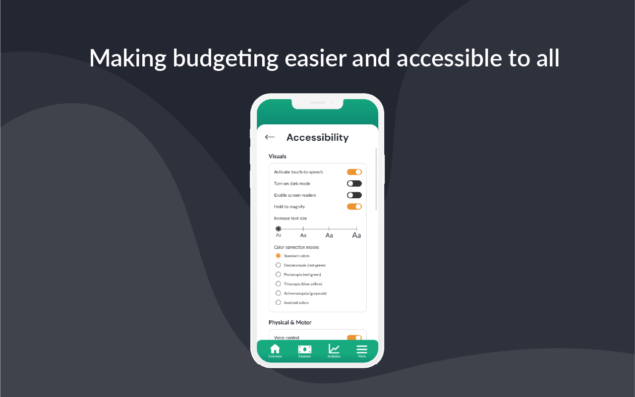
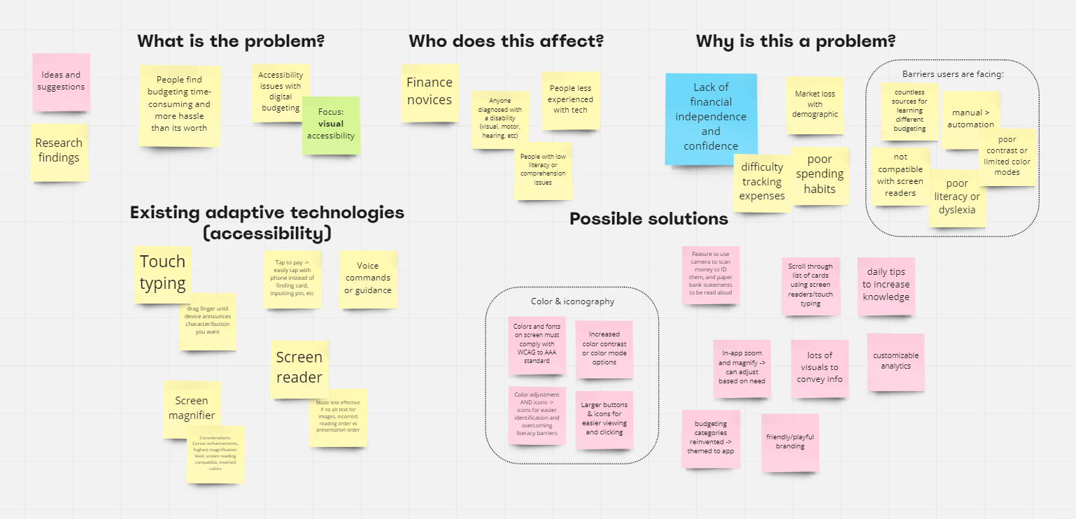
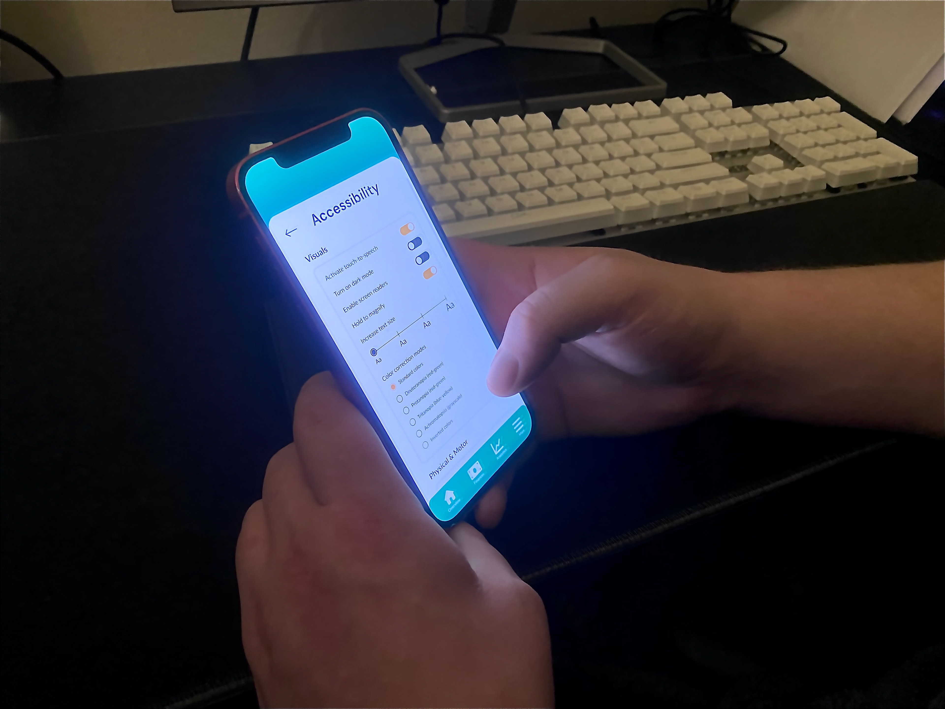
Disclaimer: For the accessibility aspect, I focused on visual accessibility as I believe it is one of the greater challenges with mobile applications.
Affinity diagram:
Primary research: user interviews and surveys
Secondary research: research papers, online forums, videos
Key insights:
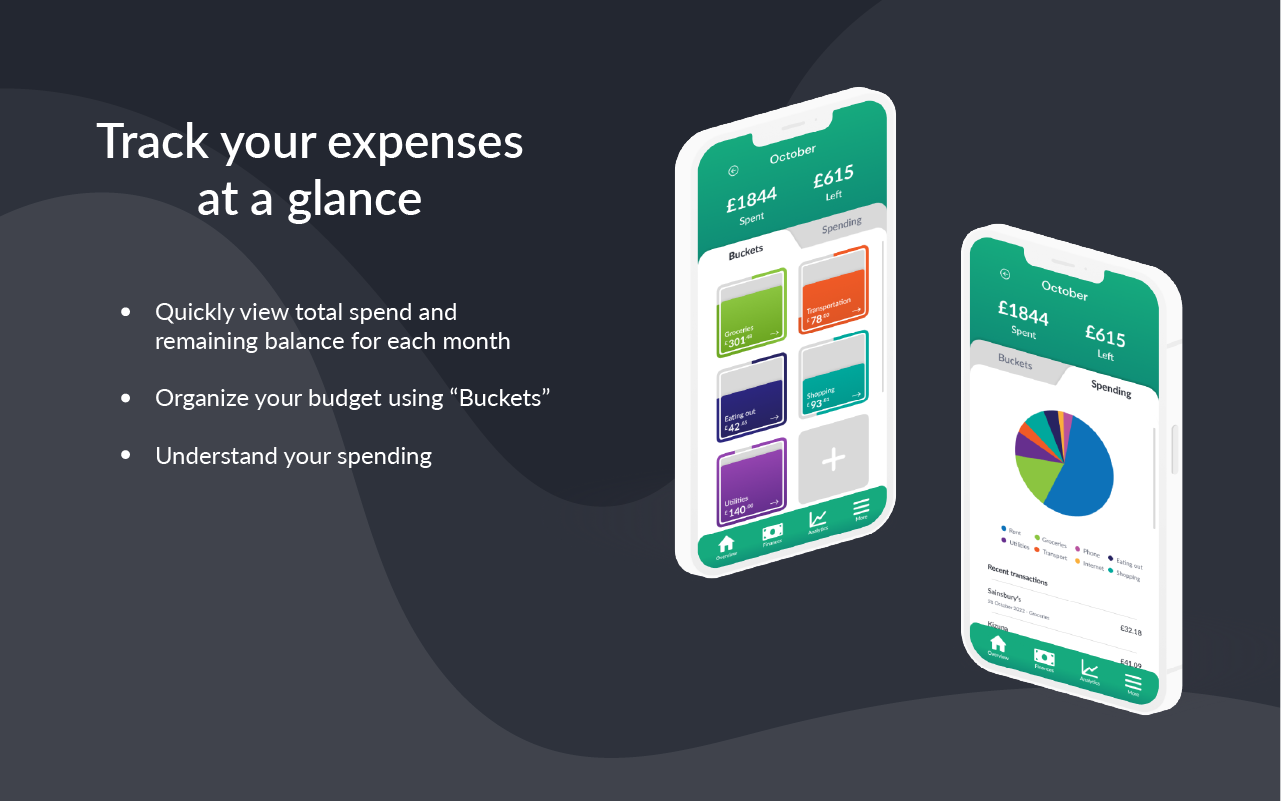
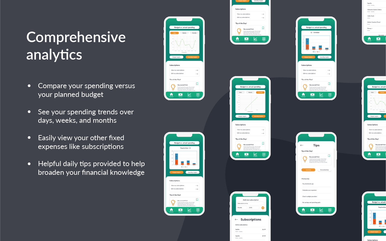
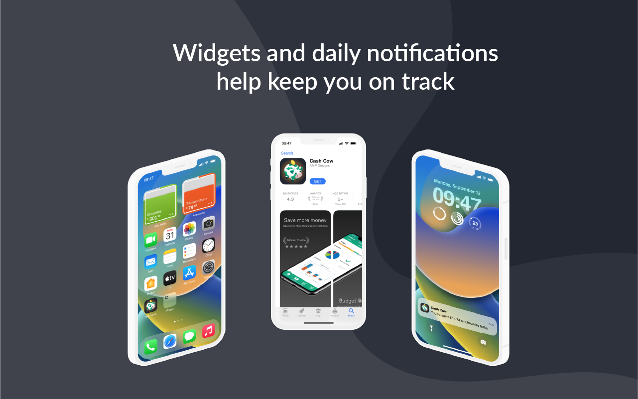
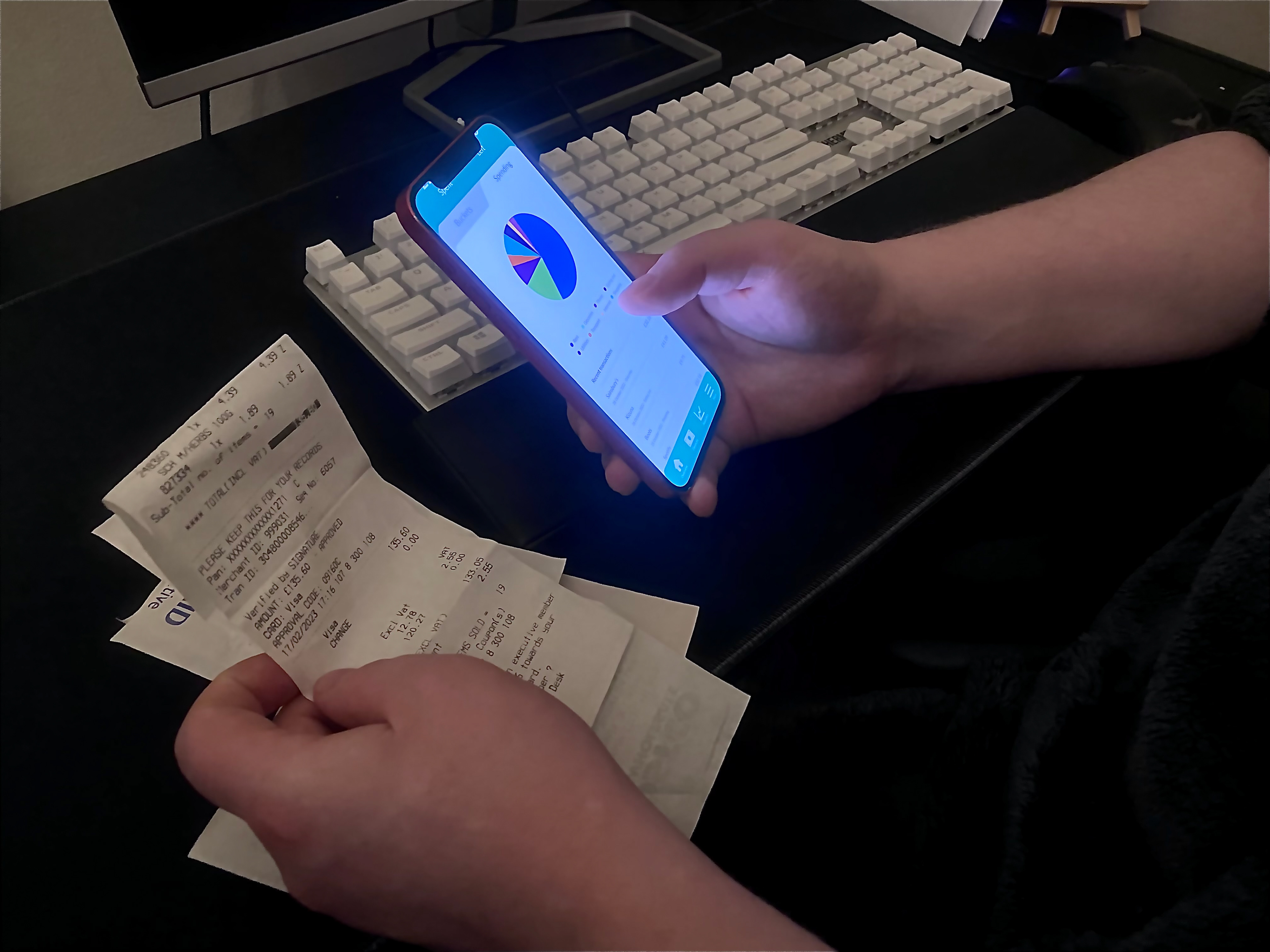
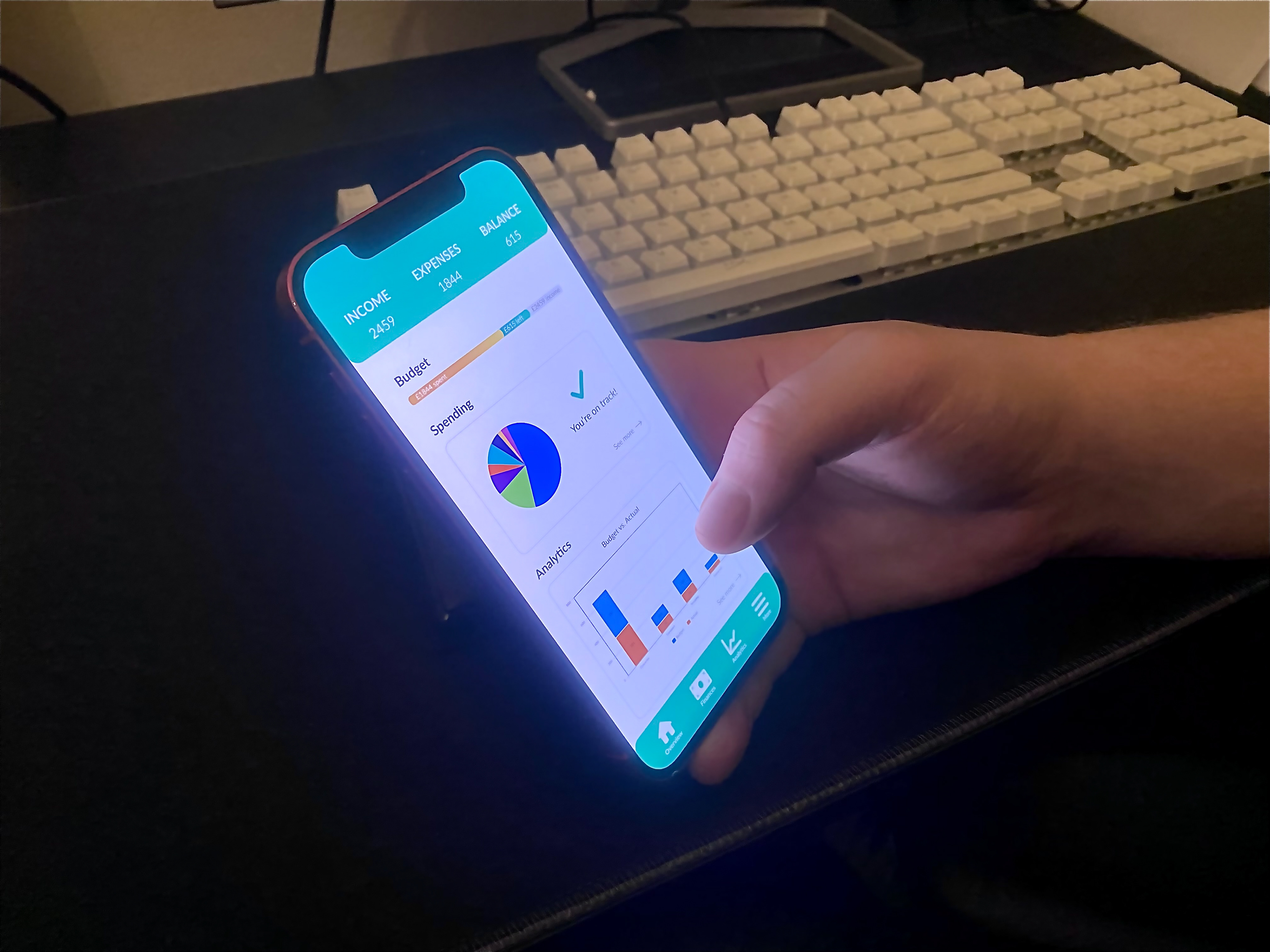
- Users prefer information displayed visually through graphs, icons, diagrams, etc.
- Users want convenience. From the budget, real-time bank info, educational tips, and personalized settings all in the same app
- Users need independence to handle their finances discretion.
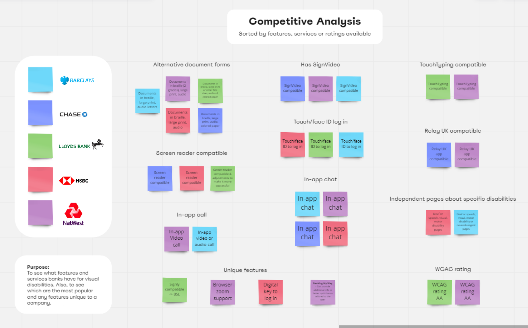
Competitive analysis:
I chose to focus on banks as my initial survey of the most popular budgeting apps in the US and UK showed little to no accessibility features. Banks yielded more data
Accessibility features were the focus to understand existing products strengths, weaknesses, and opportunities to innovate.
Key insights:
- Most features or services were third-party or accessed through helplines → possibility for dissonance as may not fully understand the application its hosted on
- The most common feature included some form of loudspeaker audio → leads to lack of privacy if the user doesn't have headphones
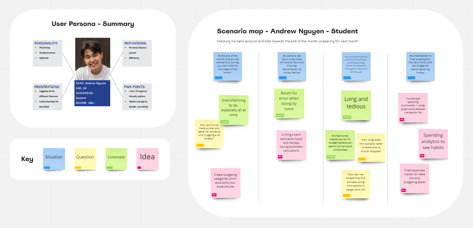
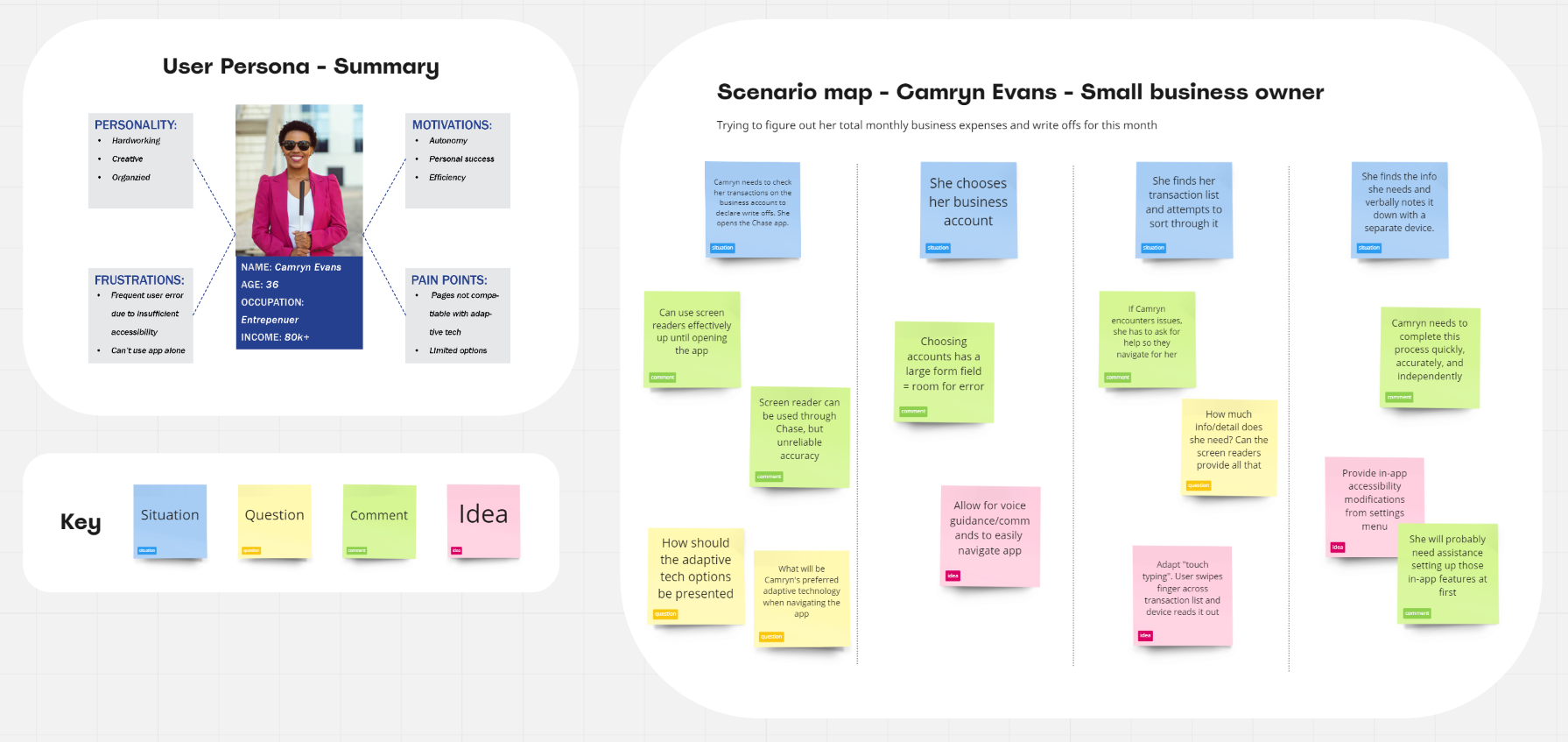
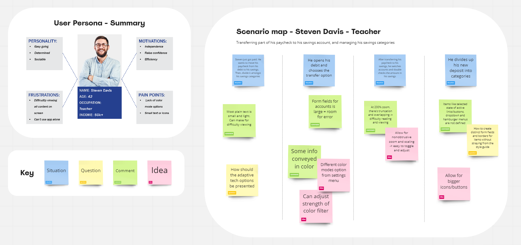
Scenario maps:
From the initial research, user personas were created. Which were then used to create scenario maps to understand the needs of users within context.
This allows for more realistic problem solving to aid my design process later on.
3. Ideate
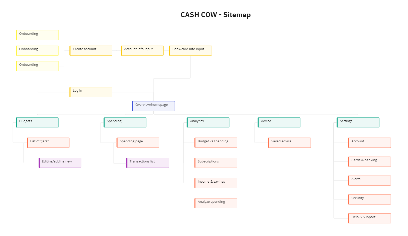
Sitemap:
To ensure I'm implementing all my solutions and user research, I start with a generic sitemap to plan the skeleton of the app.
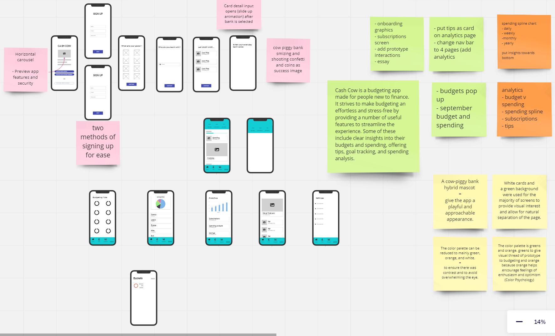
Low-fidelity wireframe:
Using the sitemap as a guide, I created the wireframe. Many iterations were made until the final one, pictured to the right. Notes were included for reminders about features and color coded.
Several user testing sessions were held with the low-fi prototype to make changes easily and freely with little commitment.
4. Design
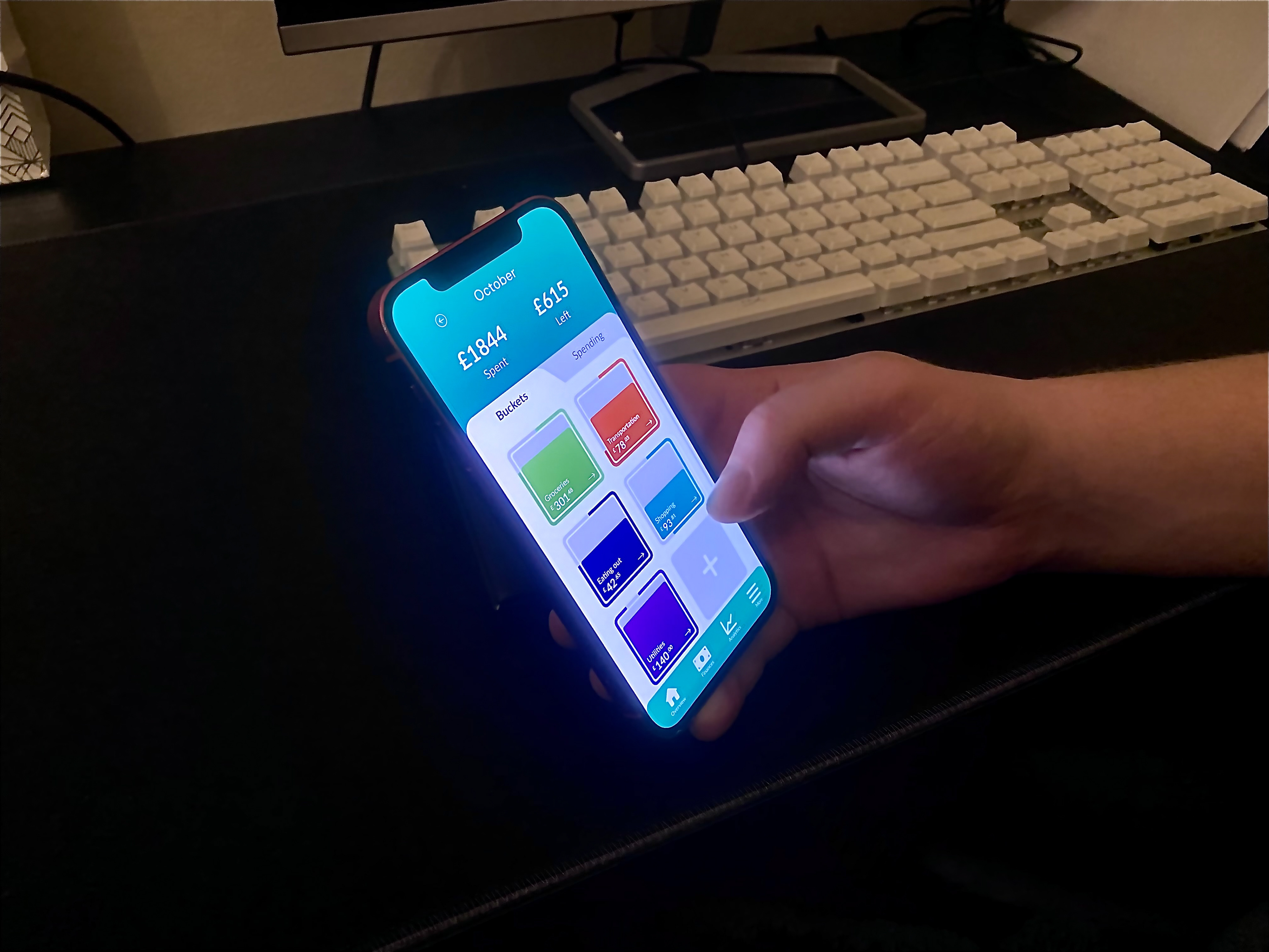
Style guide:
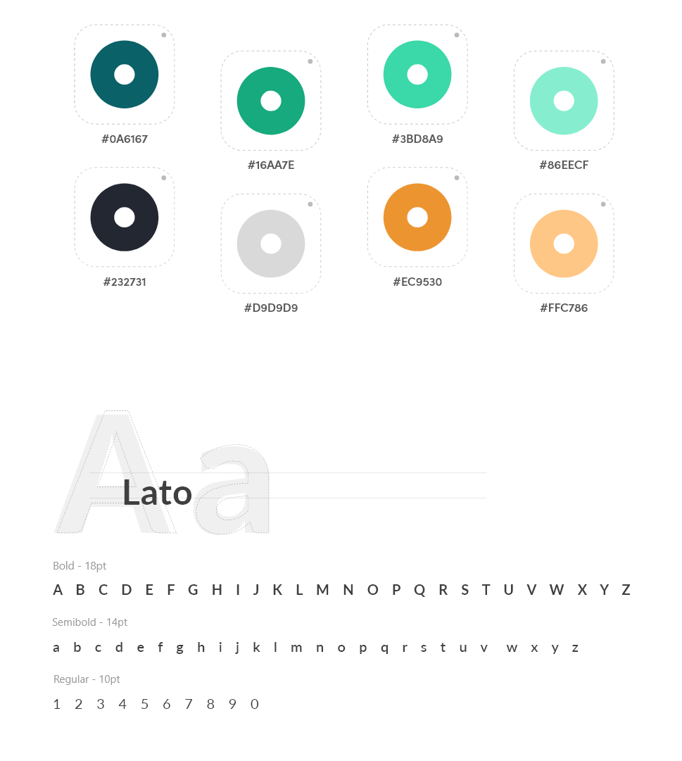
Color palette and typography
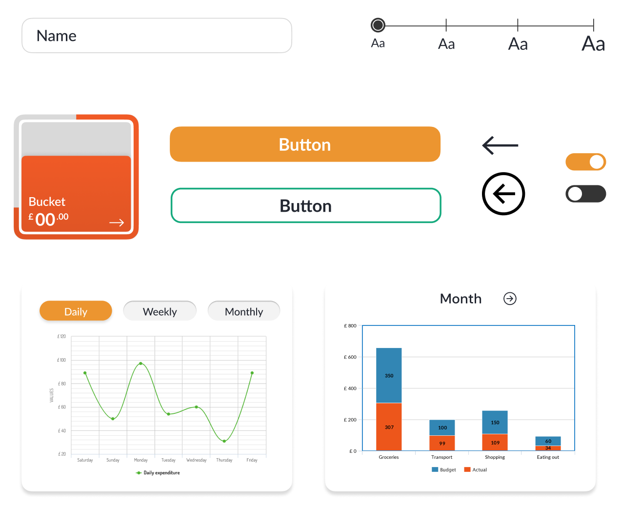
Components, field forms, and example graphs
Visual assets:
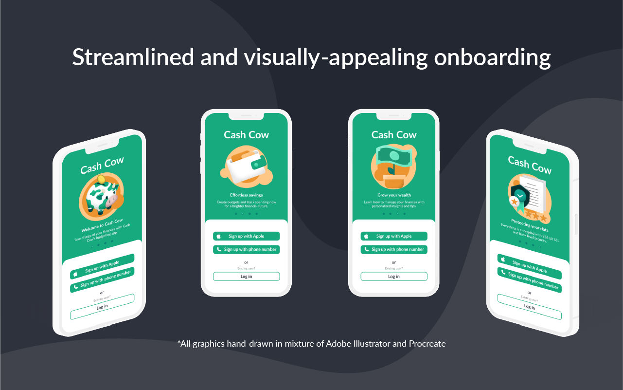
Process: Paper or Procreate sketch → Adobe Illustrator
Mascot was run by multiple people before arriving at the final design to test for its appeal.
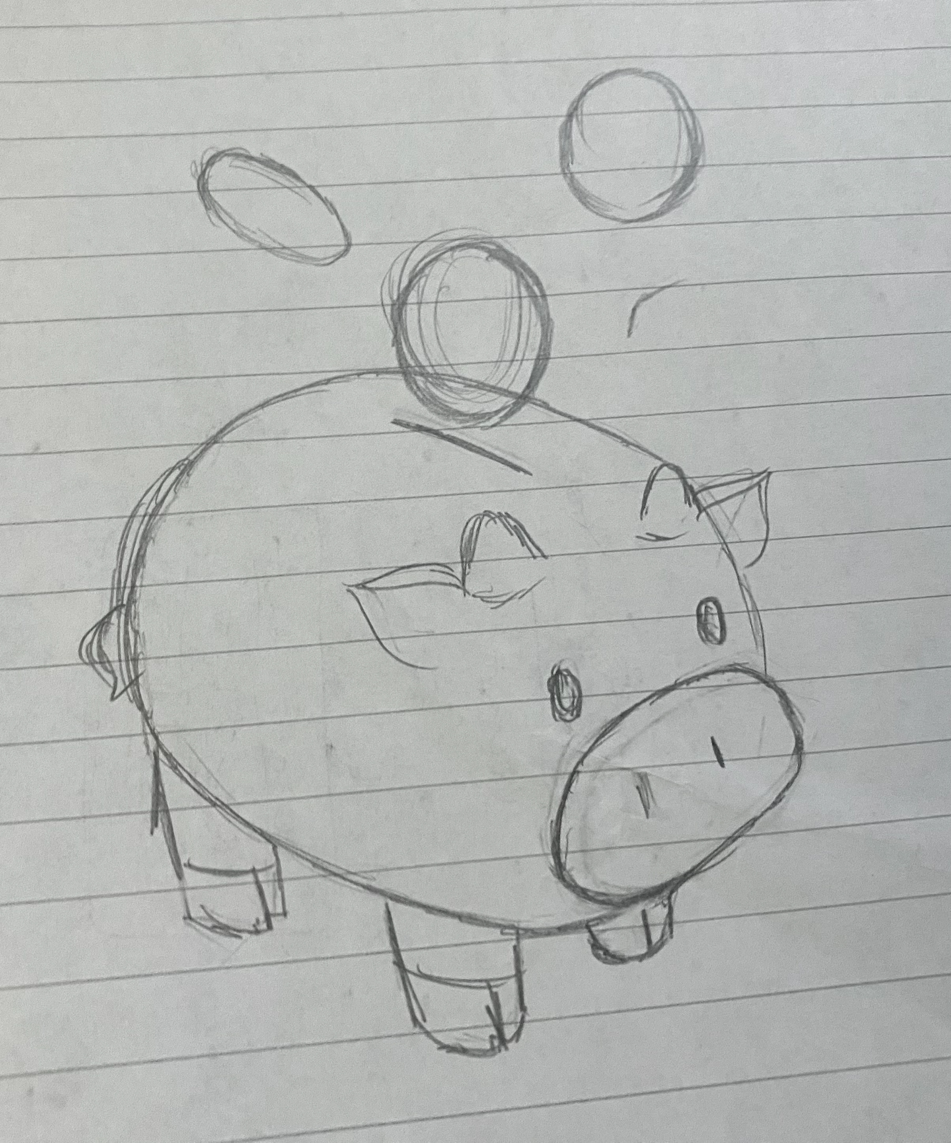
Sketch of mascot

Main mascot graphic


Onboarding graphic 1

Onboarding graphic 2

Onboarding graphic 3
5. User testing
Task-based testing:
I ran a task-based testing session with one of my former interviewees. This was significant to measuring the success of the project because this user is red-green colorblind and a budgeting novice. Both of which were success metrics for this project. It allowed me to gain quantitative data about success rate to see where the roadblocks were in the user flow and if certain features or copy were unclear.
1-week diary testing:
A couple days after, my participant used the app for one week while keeping a diary of their thoughts that they recorded daily. This was key to gain qualitative data and understand the emotions and thoughts my user was experiencing.
Feedback:
- Accessibility features are robust and a welcome feature
- Appreciates the presentation of summaries at first, then an detailed view if necessary
- Choice of shortcuts on bottom navigation bar could be improved → User thinks another shortcut should be added
- Should add manual input of transactions
- Widget showing overall budget/spending
Final deliverable:
Reflection:
I learned:
- Agile UX workflow
- Accessibility best practices in UX and UI design
- Research and participant recruitment: challenges young adults face with their finances, and designing tech solutions for it
If I had more time:
- Build out visual interactions (Pop-ups, animations)
- More impactful site-wide accessibility features
I wanted to challenge myself by taking on a large project exploring a topic I had less knowledge about: accessibility in design.
I was in a constant cycle of design/test/edit. From that, I learned how critical it was to test often, obtain user & stakeholder feedback, and create actionable goals from that.